> ## Documentation Index
> Fetch the complete documentation index at: https://moengage.com/docs/llms.txt
> Use this file to discover all available pages before exploring further.
# Cards
> Set up MoEngage Cards to deliver persistent inbox and newsfeed messages to your Android app users.
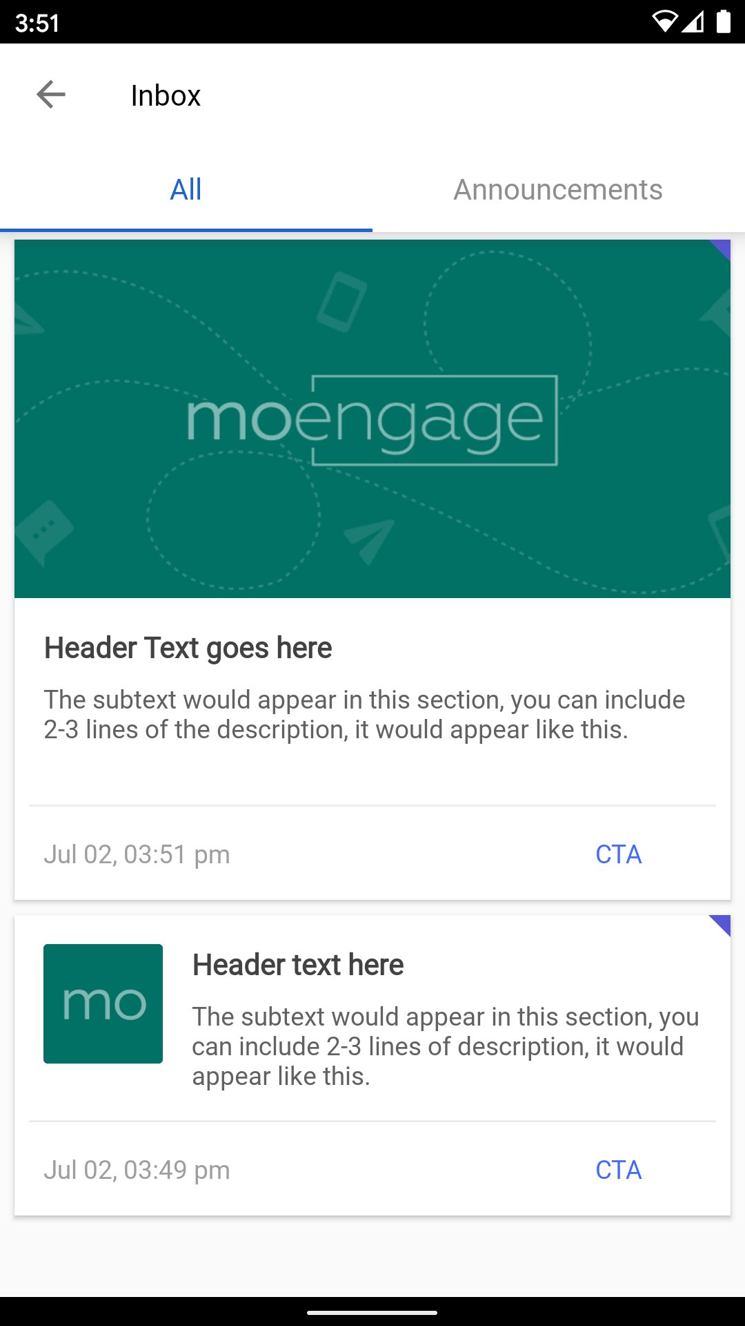
Create targeted or automated App Inbox/NewsFeed messages that can be grouped into various categories, and target your users with different updates or offers that can stay in the Inbox/Feed over a designated period of time. For more information, refer to [Cards](https://www.moengage.com/docs/user-guide/campaigns-and-channels/cards/create/create-a-card-campaign).
 # SDK Installation
## Install using BOM
Integration using BOM is the recommended way of integration; refer to the [Install Using BOM](https://www.moengage.com/docs/developer-guide/android-sdk/sdk-integration/basic-integration/Install-Using-BOM) document. Once you have configured the BOM add the dependency in the app/build.gradle file as shown below
```kotlin build.gradle.kts wrap theme={null}
dependencies {
implementation("com.moengage:cards-core")
}
```
Once the BOM is configured, include the specific MoEngage modules required for the application. \
Note: Version numbers are not required for these dependencies; the BOM automatically manages them.
### **SDK Dependency on Glide for Image and GIF Loading**
SDK uses [Glide](https://bumptech.github.io/glide/) for loading images and gifs. Ensure you add Glide to your application in case you don't have it already. SDK is compiled using library version **4.9.0.** We recommend you use the same version or higher in your application.
# Adding the UI Component
You can integrate the card UI into your application either by inflating the activity provided by the SDK or attaching the Fragment provided by the SDK to an existing Activity in the application.
## Integrating using Activity
The SDK manifest has declared the [*CardActivity*](https://moengage.github.io/android-api-reference/cards-ui/com.moengage.cards.ui/-card-activity/index.html) in the manifest file, and nothing additional is required until and unless you want to customize the theme of the Activity or any other launch property.\
The default declaration is as below.
```xml AndroidManifest.xml wrap theme={null}
```
For more information about how to customize, refer to Customisation.
## Integrating using Fragment
To integrate the Card UI as a fragment, you can inflate the [*CardFragment*](https://moengage.github.io/android-api-reference/cards-ui/com.moengage.cards.ui/-card-fragment/index.html) from the appropriate place inside your application.
# UI Customizations
SDK provides a certain set of UI customizations.
## Activity Customization
If you are integrating the activity provided by the SDK, you can customize the label, theme, etc.\
To customize the theme label you can either re-declare the activity in your app's manifest and provide the desired theme or label.\
Alternatively, you can override the SDK defaults as described below.
### Activity Label
The default label for the activity is **Inbox**. In case you want to change the label add the **moe\_card\_feed\_title** string in your **strings.xml** file with the label name.
```markdown strings.xml wrap theme={null}
[YOUR_LABEL_NAME]
```
### Activity Theme
The default theme applied to the Activity is **MoECardTheme.NoActionBar**.\
The following is the theme definition.
```xml colors.xml wrap theme={null}
```
```xml colors.xml wrap theme={null}
#1C64D0
@color/moe_black
@color/moe_white
@color/moe_black
```
To customize the theme, override any of the color attributes.\
To override, define the attribute with the same name in the **colors.xml** file of the application and specify the desired color.\
For example, if you want to customize the accent color, define **moe\_card\_color\_accent** in your application's **color.xml** as described below and replace **\[YOUR\_COLOR]** with the desired color.
```xml colors.xml wrap theme={null}
[YOUR_COLOR]
```
### Activity Toolbar
The **CardActvity** has a toolbar in the layout with the style below. In case you want to customize any of the properties, override the style below completely, or you can override the individual items as well.
```xml styles.xml wrap theme={null}
```
The background color of the toolbar is set to the primary color of the theme.
## Tab Customisation
The Card UI is built with a tab layout, following is the list of customization options provided by the SDK.
* Text Appearance
* Font
* Text Size
* Tab text color selected/unselected
* Tab background-color selected/unselected
To customize the properties, you can override the styles or color attributes defined by the SDK in your application **colors.xml** or **styles.xml** file.
```xml style.xml wrap theme={null}
```
```xml colors.xml wrap theme={null}
#1C64D0
#8E8E8E
@color/moe_white
@color/moe_white
```
## Text Customization
Each card has three text fields and a button
* Header
* Message
* Call to Action Button(CTA)
* Timestamp
The default style for each of these components can be overridden by overriding the below styles completely or overriding the individual items.\
Certain styling components like color and text formatting (like bold, italic, etc.) for these fields are customizable from the MoEngage Dashboard, while others, like font and text size fixed on the SDK side. Values for these can be overridden and will be applied to all cards.
The color defined in these styles are default colors and will be overridden by the colors selected during campaign creation.
```xml styles.xml wrap theme={null}
{/* Header style */}
{/* Message style */}
{/* Button style */}
{/* Timestamp Style */}
```
```xml colors.xml wrap theme={null}
{/* Text Color */}
#424242
#616161
#9E9E9E
```
### Timestamp format Customization
The default format for the timestamp shown on each card is **MMM dd, hh:mm a** this can be customized by passing the custom format to [*configureCards()*](https://moengage.github.io/android-api-reference/core/com.moengage.core/-mo-engage/-builder/configure-cards.html) of the [*MoEngage.Builder*](https://moengage.github.io/android-api-reference/core/com.moengage.core/-mo-engage/-builder/index.html)object while initializing the SDK.
## Card Customization
You can customize the following properties for a given card
* Un-clicked Indicator Color
* Card Background Color (overridden by the color selected during the campaign creation)
Override the below color resources in the **colors.xml** to use the desired color.
```xml colors.xml wrap theme={null}
#5956D6
@color/moe_white
```
## Empty State
If the inbox does not contain any cards, SDK shows an empty screen with an image and message, as shown below.
# SDK Installation
## Install using BOM
Integration using BOM is the recommended way of integration; refer to the [Install Using BOM](https://www.moengage.com/docs/developer-guide/android-sdk/sdk-integration/basic-integration/Install-Using-BOM) document. Once you have configured the BOM add the dependency in the app/build.gradle file as shown below
```kotlin build.gradle.kts wrap theme={null}
dependencies {
implementation("com.moengage:cards-core")
}
```
Once the BOM is configured, include the specific MoEngage modules required for the application. \
Note: Version numbers are not required for these dependencies; the BOM automatically manages them.
### **SDK Dependency on Glide for Image and GIF Loading**
SDK uses [Glide](https://bumptech.github.io/glide/) for loading images and gifs. Ensure you add Glide to your application in case you don't have it already. SDK is compiled using library version **4.9.0.** We recommend you use the same version or higher in your application.
# Adding the UI Component
You can integrate the card UI into your application either by inflating the activity provided by the SDK or attaching the Fragment provided by the SDK to an existing Activity in the application.
## Integrating using Activity
The SDK manifest has declared the [*CardActivity*](https://moengage.github.io/android-api-reference/cards-ui/com.moengage.cards.ui/-card-activity/index.html) in the manifest file, and nothing additional is required until and unless you want to customize the theme of the Activity or any other launch property.\
The default declaration is as below.
```xml AndroidManifest.xml wrap theme={null}
```
For more information about how to customize, refer to Customisation.
## Integrating using Fragment
To integrate the Card UI as a fragment, you can inflate the [*CardFragment*](https://moengage.github.io/android-api-reference/cards-ui/com.moengage.cards.ui/-card-fragment/index.html) from the appropriate place inside your application.
# UI Customizations
SDK provides a certain set of UI customizations.
## Activity Customization
If you are integrating the activity provided by the SDK, you can customize the label, theme, etc.\
To customize the theme label you can either re-declare the activity in your app's manifest and provide the desired theme or label.\
Alternatively, you can override the SDK defaults as described below.
### Activity Label
The default label for the activity is **Inbox**. In case you want to change the label add the **moe\_card\_feed\_title** string in your **strings.xml** file with the label name.
```markdown strings.xml wrap theme={null}
[YOUR_LABEL_NAME]
```
### Activity Theme
The default theme applied to the Activity is **MoECardTheme.NoActionBar**.\
The following is the theme definition.
```xml colors.xml wrap theme={null}
```
```xml colors.xml wrap theme={null}
#1C64D0
@color/moe_black
@color/moe_white
@color/moe_black
```
To customize the theme, override any of the color attributes.\
To override, define the attribute with the same name in the **colors.xml** file of the application and specify the desired color.\
For example, if you want to customize the accent color, define **moe\_card\_color\_accent** in your application's **color.xml** as described below and replace **\[YOUR\_COLOR]** with the desired color.
```xml colors.xml wrap theme={null}
[YOUR_COLOR]
```
### Activity Toolbar
The **CardActvity** has a toolbar in the layout with the style below. In case you want to customize any of the properties, override the style below completely, or you can override the individual items as well.
```xml styles.xml wrap theme={null}
```
The background color of the toolbar is set to the primary color of the theme.
## Tab Customisation
The Card UI is built with a tab layout, following is the list of customization options provided by the SDK.
* Text Appearance
* Font
* Text Size
* Tab text color selected/unselected
* Tab background-color selected/unselected
To customize the properties, you can override the styles or color attributes defined by the SDK in your application **colors.xml** or **styles.xml** file.
```xml style.xml wrap theme={null}
```
```xml colors.xml wrap theme={null}
#1C64D0
#8E8E8E
@color/moe_white
@color/moe_white
```
## Text Customization
Each card has three text fields and a button
* Header
* Message
* Call to Action Button(CTA)
* Timestamp
The default style for each of these components can be overridden by overriding the below styles completely or overriding the individual items.\
Certain styling components like color and text formatting (like bold, italic, etc.) for these fields are customizable from the MoEngage Dashboard, while others, like font and text size fixed on the SDK side. Values for these can be overridden and will be applied to all cards.
The color defined in these styles are default colors and will be overridden by the colors selected during campaign creation.
```xml styles.xml wrap theme={null}
{/* Header style */}
{/* Message style */}
{/* Button style */}
{/* Timestamp Style */}
```
```xml colors.xml wrap theme={null}
{/* Text Color */}
#424242
#616161
#9E9E9E
```
### Timestamp format Customization
The default format for the timestamp shown on each card is **MMM dd, hh:mm a** this can be customized by passing the custom format to [*configureCards()*](https://moengage.github.io/android-api-reference/core/com.moengage.core/-mo-engage/-builder/configure-cards.html) of the [*MoEngage.Builder*](https://moengage.github.io/android-api-reference/core/com.moengage.core/-mo-engage/-builder/index.html)object while initializing the SDK.
## Card Customization
You can customize the following properties for a given card
* Un-clicked Indicator Color
* Card Background Color (overridden by the color selected during the campaign creation)
Override the below color resources in the **colors.xml** to use the desired color.
```xml colors.xml wrap theme={null}
#5956D6
@color/moe_white
```
## Empty State
If the inbox does not contain any cards, SDK shows an empty screen with an image and message, as shown below.
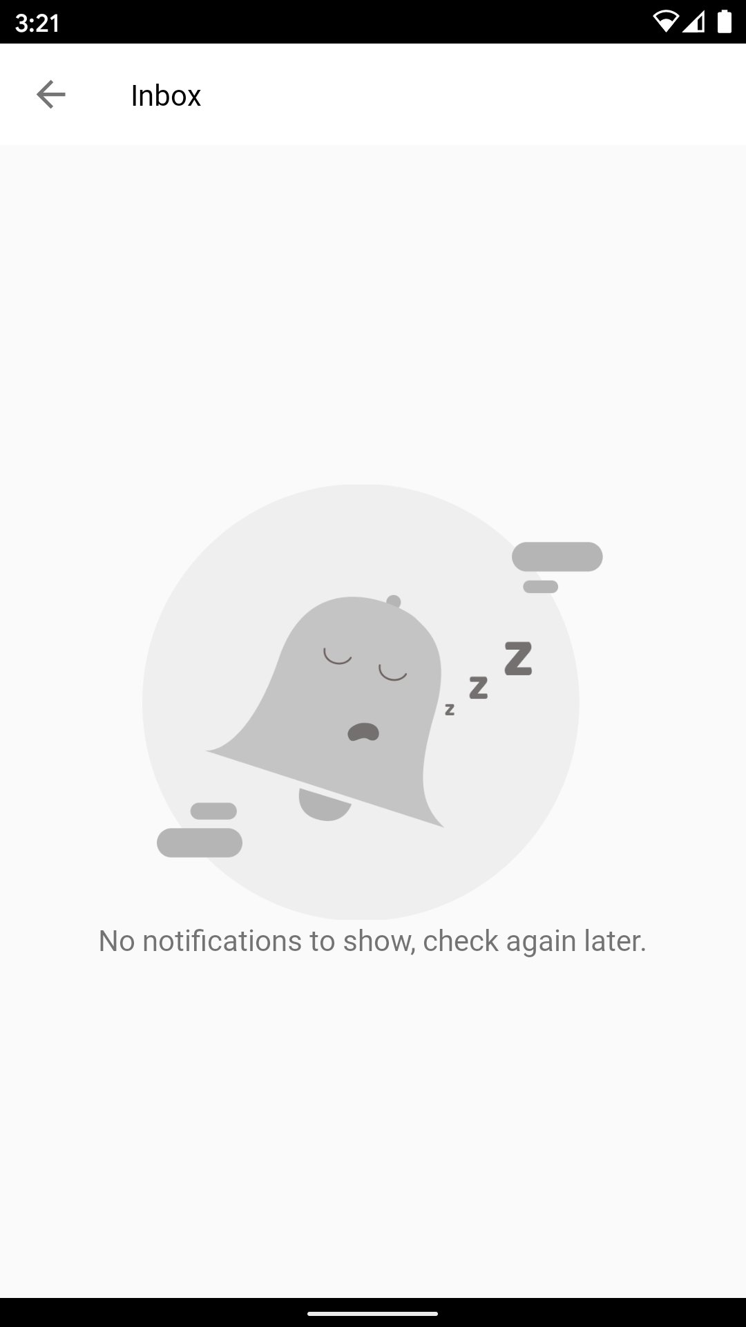 The image and message can be customized if required.
#### Image Customization
To customize the image, pass in the resource id of the image in the [*configureCards()*](https://moengage.github.io/android-api-reference/core/com.moengage.core/-mo-engage/-builder/configure-cards.html) API [MoEngage.Builder](https://moengage.github.io/android-api-reference/core/com.moengage.core/-mo-engage/-builder/index.html) object while initializing the SDK.
#### Message Customisation
To customize the message, override the **moe\_card\_no\_message\_available** in your applications **strings.xml** file.
```xml strings.xml wrap theme={null}
[YOUR_STRING_GOES_HERE]
```
## Customize Delete Text
To customize the message of the delete button, override the below string resource in the **strings.xml** of your application.
```xml xml wrap theme={null}
[YOUR_STRING_GOES_HERE]
```
## Disable Pull to Refresh
By default, the Card Activity/Fragment has the pull to refresh feature enabled, you can disable pull to refresh using the [*configureCards()*](https://moengage.github.io/android-api-reference/core/com.moengage.core/-mo-engage/-builder/configure-cards.html)API in the [*MoEngage.Builder*](https://moengage.github.io/android-api-reference/core/com.moengage.core/-mo-engage/-builder/index.html)*.*
# APIs
## Unclicked Count
The SDK provides an API to fetch the number of cards which hasn't been clicked by the users. To get the count, you can use the below APIs.
```Kotlin Kotlin wrap theme={null}
// Call this API on worker thread as it reads from a file.
MoECardHelper.getUnClickedCardCount(context)
// This API returns the count asynchronously in the listener passed as a parameter.
MoECardHelper.getUnClickedCardCountAsync(context, listener)
```
```Java Java theme={null}
// Call this API on worker thread as it reads from a file.
MoECardHelper.INSTANCE.getUnClickedCardCount(context);
// This API returns the count asynchronously in the listener passed as a parameter.
MoECardHelper.INSTANCE.getUnClickedCardCountAsync(context, listener);
```
Refer to the documentation of [*MoECardHelper.getUnClickedCardCount()*](https://moengage.github.io/android-api-reference/cards-core/com.moengage.cards.core/-mo-e-card-helper/get-un-clicked-card-count.html) and [*MoECardHelper.getUnClickedCardCountAsync()*](https://moengage.github.io/android-api-reference/cards-core/com.moengage.cards.core/-mo-e-card-helper/get-un-clicked-card-count-async.html) for more information.
## New Card Count
The SDK provides an API to get the new cards for the user on the device. To get the count, use the below API.
```Kotlin Kotlin wrap theme={null}
// Call this API on worker thread as it reads from a file.
MoECardHelper.getNewCardCount(context)
// This API returns the count asynchronously in the listener passed as a parameter.
MoECardHelper.getNewCardCountAsync(context, listener)
```
```Java Java theme={null}
// Call this API on worker thread as it reads from a file.
MoECardHelper.INSTANCE.getNewCardCount(context);
// This API returns the count asynchronously in the listener passed as a parameter.
MoECardHelper.INSTANCE.getNewCardCountAsync(context, listener);
```
Refer to the documentation of [*MoECardHelper.getNewCardCount()*](https://moengage.github.io/android-api-reference/cards-core/com.moengage.cards.core/-mo-e-card-helper/get-new-card-count-async.html)and [*MoECardHelper.getNewCardCountAsync()*](https://moengage.github.io/android-api-reference/cards-core/com.moengage.cards.core/-mo-e-card-helper/get-new-card-count-async.html) for more information.
# Callbacks
The SDK provides callbacks when
* Cards are successfully synced on application launch/foreground
* The card is clicked by the user
## Sync Callback
To get a callback for sync completion on application launch/foreground implement the [*SyncCompleteListener*](https://moengage.github.io/android-api-reference/cards-core/com.moengage.cards.core.listener/-sync-complete-listener/index.html) interface and register for the callback using [*MoECardHelper.setSyncCompleteListener()*](https://moengage.github.io/android-api-reference/cards-core/com.moengage.cards.core/-mo-e-card-helper/set-sync-complete-listener.html)*.*
## Click Callback
To get a callback on the card, click implement the [*OnCardClickListener*](https://moengage.github.io/android-api-reference/cards-ui/com.moengage.cards.ui.listener/-on-card-click-listener/index.html) interface and register for the callback using the [*MoECardUiHelper.setClickListener().*](https://moengage.github.io/android-api-reference/cards-ui/com.moengage.cards.ui/-mo-e-card-ui-helper/set-click-listener.html)
The image and message can be customized if required.
#### Image Customization
To customize the image, pass in the resource id of the image in the [*configureCards()*](https://moengage.github.io/android-api-reference/core/com.moengage.core/-mo-engage/-builder/configure-cards.html) API [MoEngage.Builder](https://moengage.github.io/android-api-reference/core/com.moengage.core/-mo-engage/-builder/index.html) object while initializing the SDK.
#### Message Customisation
To customize the message, override the **moe\_card\_no\_message\_available** in your applications **strings.xml** file.
```xml strings.xml wrap theme={null}
[YOUR_STRING_GOES_HERE]
```
## Customize Delete Text
To customize the message of the delete button, override the below string resource in the **strings.xml** of your application.
```xml xml wrap theme={null}
[YOUR_STRING_GOES_HERE]
```
## Disable Pull to Refresh
By default, the Card Activity/Fragment has the pull to refresh feature enabled, you can disable pull to refresh using the [*configureCards()*](https://moengage.github.io/android-api-reference/core/com.moengage.core/-mo-engage/-builder/configure-cards.html)API in the [*MoEngage.Builder*](https://moengage.github.io/android-api-reference/core/com.moengage.core/-mo-engage/-builder/index.html)*.*
# APIs
## Unclicked Count
The SDK provides an API to fetch the number of cards which hasn't been clicked by the users. To get the count, you can use the below APIs.
```Kotlin Kotlin wrap theme={null}
// Call this API on worker thread as it reads from a file.
MoECardHelper.getUnClickedCardCount(context)
// This API returns the count asynchronously in the listener passed as a parameter.
MoECardHelper.getUnClickedCardCountAsync(context, listener)
```
```Java Java theme={null}
// Call this API on worker thread as it reads from a file.
MoECardHelper.INSTANCE.getUnClickedCardCount(context);
// This API returns the count asynchronously in the listener passed as a parameter.
MoECardHelper.INSTANCE.getUnClickedCardCountAsync(context, listener);
```
Refer to the documentation of [*MoECardHelper.getUnClickedCardCount()*](https://moengage.github.io/android-api-reference/cards-core/com.moengage.cards.core/-mo-e-card-helper/get-un-clicked-card-count.html) and [*MoECardHelper.getUnClickedCardCountAsync()*](https://moengage.github.io/android-api-reference/cards-core/com.moengage.cards.core/-mo-e-card-helper/get-un-clicked-card-count-async.html) for more information.
## New Card Count
The SDK provides an API to get the new cards for the user on the device. To get the count, use the below API.
```Kotlin Kotlin wrap theme={null}
// Call this API on worker thread as it reads from a file.
MoECardHelper.getNewCardCount(context)
// This API returns the count asynchronously in the listener passed as a parameter.
MoECardHelper.getNewCardCountAsync(context, listener)
```
```Java Java theme={null}
// Call this API on worker thread as it reads from a file.
MoECardHelper.INSTANCE.getNewCardCount(context);
// This API returns the count asynchronously in the listener passed as a parameter.
MoECardHelper.INSTANCE.getNewCardCountAsync(context, listener);
```
Refer to the documentation of [*MoECardHelper.getNewCardCount()*](https://moengage.github.io/android-api-reference/cards-core/com.moengage.cards.core/-mo-e-card-helper/get-new-card-count-async.html)and [*MoECardHelper.getNewCardCountAsync()*](https://moengage.github.io/android-api-reference/cards-core/com.moengage.cards.core/-mo-e-card-helper/get-new-card-count-async.html) for more information.
# Callbacks
The SDK provides callbacks when
* Cards are successfully synced on application launch/foreground
* The card is clicked by the user
## Sync Callback
To get a callback for sync completion on application launch/foreground implement the [*SyncCompleteListener*](https://moengage.github.io/android-api-reference/cards-core/com.moengage.cards.core.listener/-sync-complete-listener/index.html) interface and register for the callback using [*MoECardHelper.setSyncCompleteListener()*](https://moengage.github.io/android-api-reference/cards-core/com.moengage.cards.core/-mo-e-card-helper/set-sync-complete-listener.html)*.*
## Click Callback
To get a callback on the card, click implement the [*OnCardClickListener*](https://moengage.github.io/android-api-reference/cards-ui/com.moengage.cards.ui.listener/-on-card-click-listener/index.html) interface and register for the callback using the [*MoECardUiHelper.setClickListener().*](https://moengage.github.io/android-api-reference/cards-ui/com.moengage.cards.ui/-mo-e-card-ui-helper/set-click-listener.html)