> ## Documentation Index
> Fetch the complete documentation index at: https://moengage.com/docs/llms.txt
> Use this file to discover all available pages before exploring further.
# Session and Source Analysis
> Configure Session and Source Analysis in MoEngage — select report types, choose source properties, apply filters, and analyze your traffic.
# Step 1: Select Report Type
The first step involves selecting the type of report you want to generate. You have the following options.
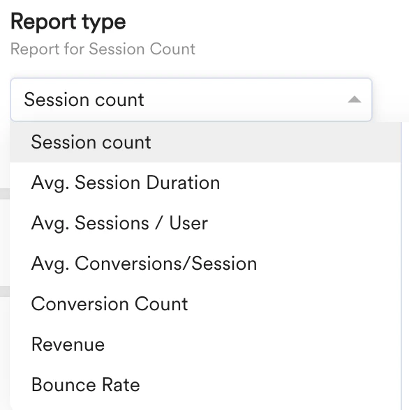 * **Session count**: Session count represents the total number of sessions within a specified timeframe. Each session tracks a user's interaction, starting when they arrive and ending after a period of inactivity. This is measured across the selected source properties, such as *Source* or *Medium*. You will learn about the source properties later in this article. For example, you can use this analysis to measure the adoption of a feature.
* **Average session duration**: Average session duration is the total time users spend across the source properties, divided by the number of sessions. It measures user engagement, indicating how long visitors interact with your website or features. Higher average durations often suggest more engaging experiences.
* **Conversion count**: Conversion count gives the total number of desired actions completed by users on a website or app across the selected source properties. For conversion report calculation, MoEngage takes the conversion activity/event present in the MoEngage Dashboard in **Settings** > **Account** > **General settings**. It directly measures the success of your conversion strategy.
* **Bounce rate**: All sessions with a duration of less than 10 seconds are defined as Bounced Sessions. Bounce rate is the percentage of bounced sessions relative to the total number of sessions. This report is available across the selected source properties. A high bounce rate indicates that visitors aren't finding what they expect or aren't engaging with the content.
For more information on advanced Session and Source types, refer to [Advanced](/user-guide/analyze/analytics/session-and-source/advanced-session-and-source-analysis).
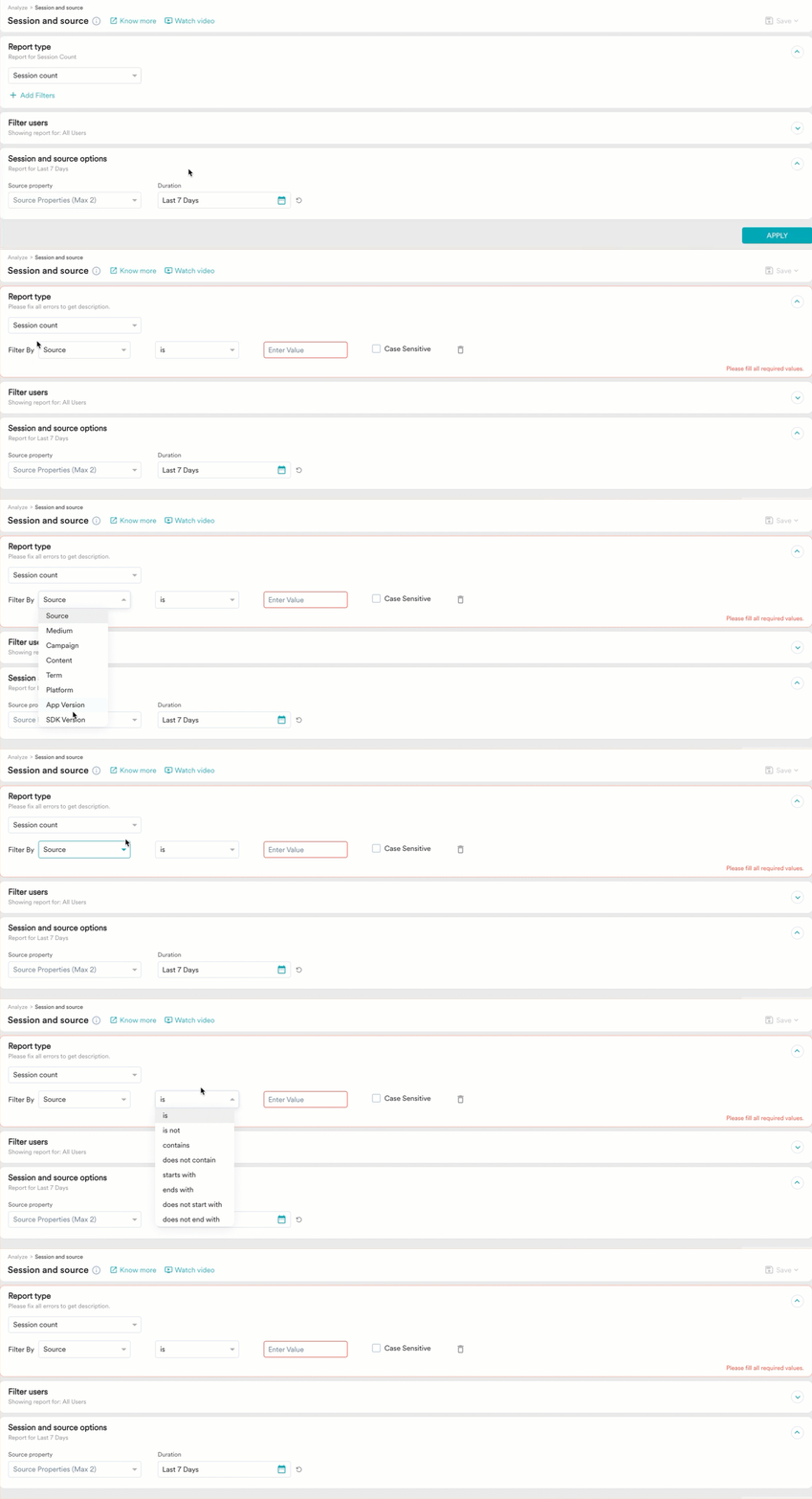
After selecting the report type, you can apply filters by clicking **Add Filters**. You can filter reports based on one source property. For example, filter reports on a medium like an email.
* **Session count**: Session count represents the total number of sessions within a specified timeframe. Each session tracks a user's interaction, starting when they arrive and ending after a period of inactivity. This is measured across the selected source properties, such as *Source* or *Medium*. You will learn about the source properties later in this article. For example, you can use this analysis to measure the adoption of a feature.
* **Average session duration**: Average session duration is the total time users spend across the source properties, divided by the number of sessions. It measures user engagement, indicating how long visitors interact with your website or features. Higher average durations often suggest more engaging experiences.
* **Conversion count**: Conversion count gives the total number of desired actions completed by users on a website or app across the selected source properties. For conversion report calculation, MoEngage takes the conversion activity/event present in the MoEngage Dashboard in **Settings** > **Account** > **General settings**. It directly measures the success of your conversion strategy.
* **Bounce rate**: All sessions with a duration of less than 10 seconds are defined as Bounced Sessions. Bounce rate is the percentage of bounced sessions relative to the total number of sessions. This report is available across the selected source properties. A high bounce rate indicates that visitors aren't finding what they expect or aren't engaging with the content.
For more information on advanced Session and Source types, refer to [Advanced](/user-guide/analyze/analytics/session-and-source/advanced-session-and-source-analysis).
After selecting the report type, you can apply filters by clicking **Add Filters**. You can filter reports based on one source property. For example, filter reports on a medium like an email.
 # Step 2: Filter Users
By default, you can perform this analysis on all users. However, you can also query for a group of users filtered using **User property**, **User activity**, **User affinity**, or **Custom segments**. Filtering users is similar to creating a segment. For more information, refer to [Create Segment](/user-guide/segment/segment-operations/create-segments).
# Step 2: Filter Users
By default, you can perform this analysis on all users. However, you can also query for a group of users filtered using **User property**, **User activity**, **User affinity**, or **Custom segments**. Filtering users is similar to creating a segment. For more information, refer to [Create Segment](/user-guide/segment/segment-operations/create-segments).
 # Step 3: Choose the Source Property and Duration
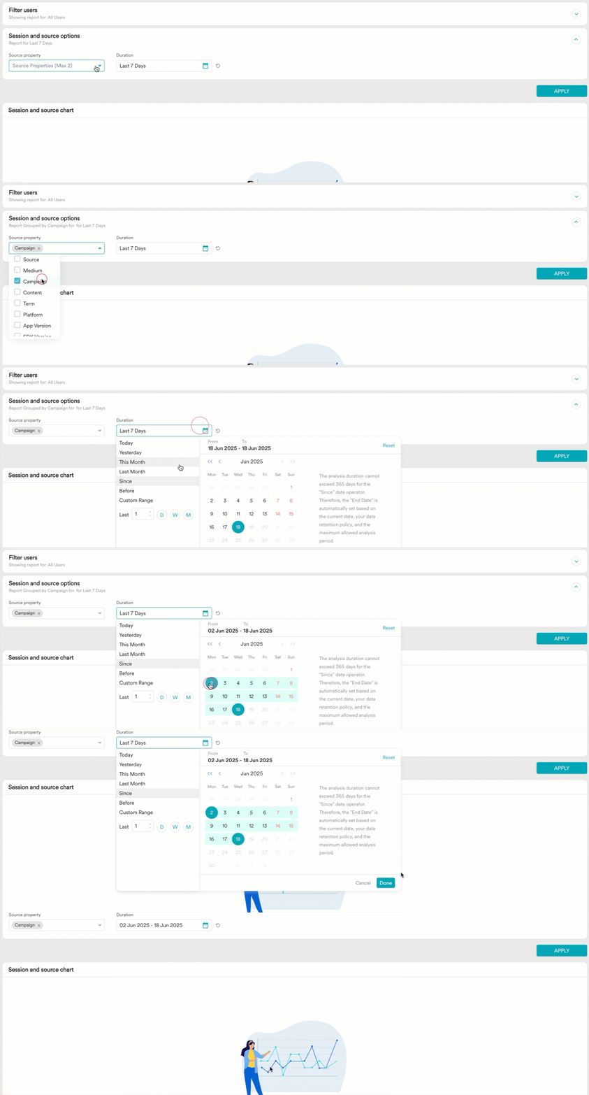
All reports are analyzed based on the source properties. Select a maximum of two properties for the analysis. By default, reports are not split by any property. For more information on source properties, refer [here](/user-guide/analyze/analytics/session-and-source/session-and-source-overview).
After selecting the properties, specify the duration for your analysis and click **APPLY**.
# Step 3: Choose the Source Property and Duration
All reports are analyzed based on the source properties. Select a maximum of two properties for the analysis. By default, reports are not split by any property. For more information on source properties, refer [here](/user-guide/analyze/analytics/session-and-source/session-and-source-overview).
After selecting the properties, specify the duration for your analysis and click **APPLY**.
 # Step 4: Charts
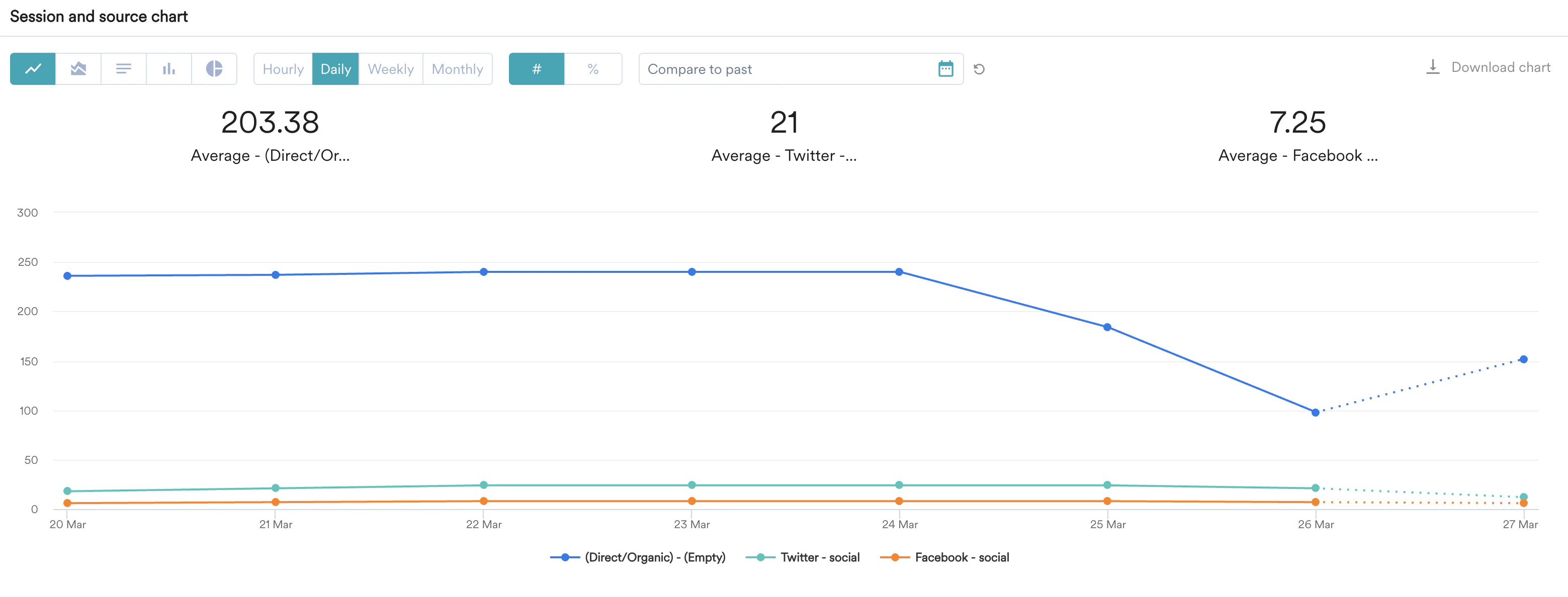
After your query is generated, choose your preferred visualization type. By default, the report is shown in a Line chart, sorted by the highest count. You can change between **Line**, **Area**, **Bar**, **Column**, and **Pie** charts. Every chart has its own significance.
* Line charts are widely used for analyzing data trends, changes, or patterns. They are frequently used to display and compare data over time.
# Step 4: Charts
After your query is generated, choose your preferred visualization type. By default, the report is shown in a Line chart, sorted by the highest count. You can change between **Line**, **Area**, **Bar**, **Column**, and **Pie** charts. Every chart has its own significance.
* Line charts are widely used for analyzing data trends, changes, or patterns. They are frequently used to display and compare data over time.
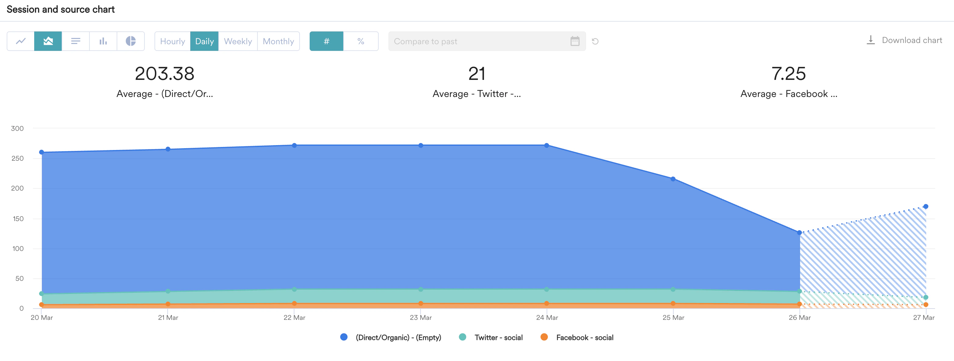
 * Area charts combine a line chart and a bar chart to show how data changes over time. They show how one or more groups' numeric values change over time. They are often used to show trends in data.
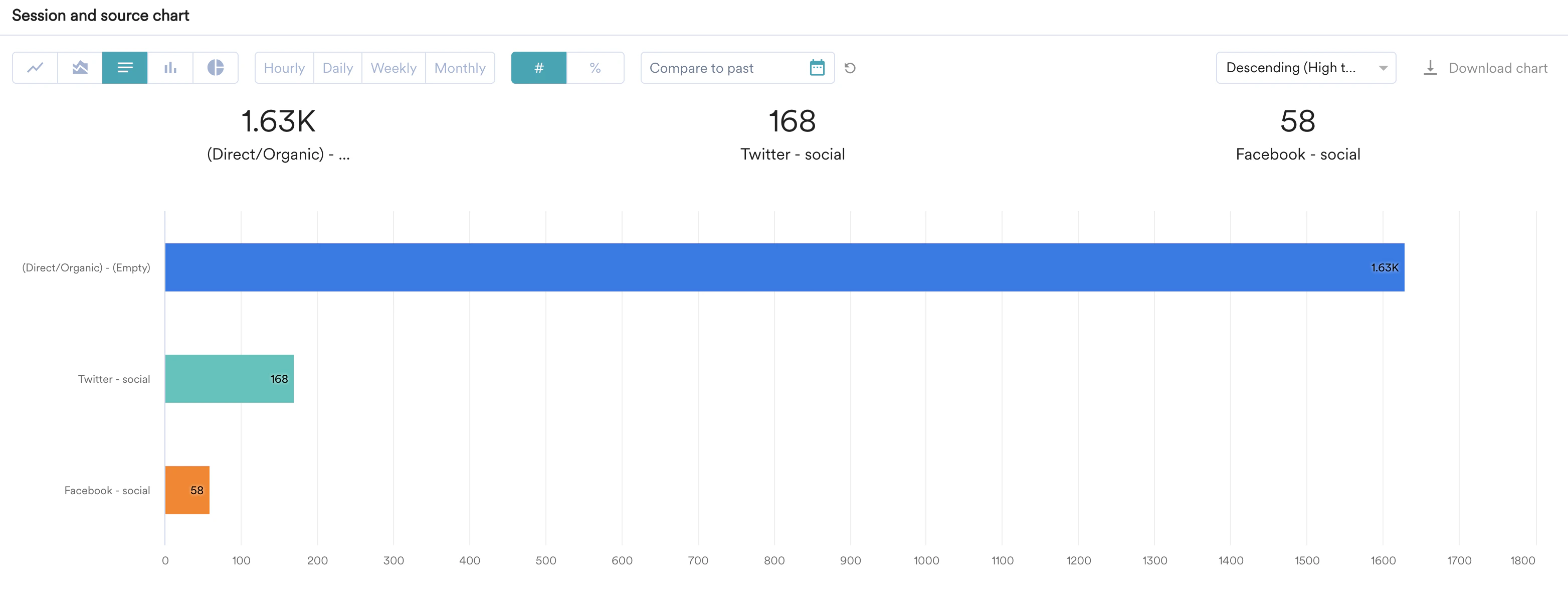
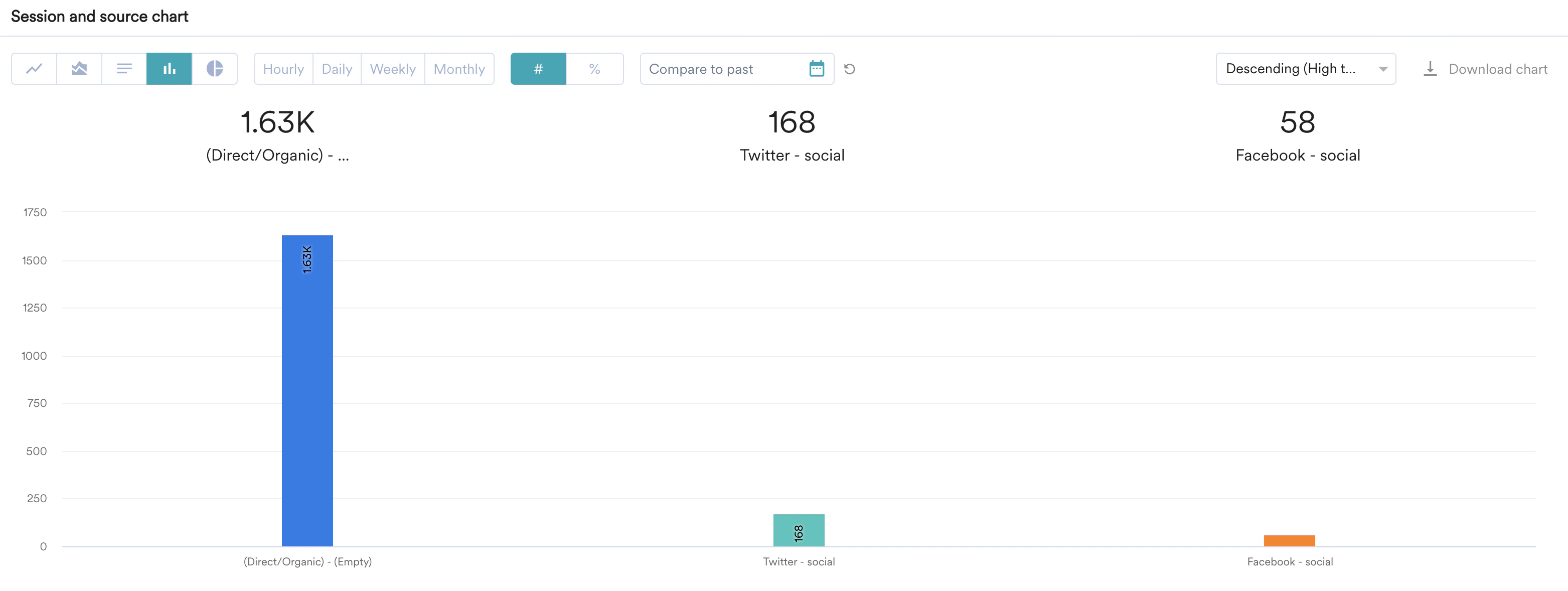
 * A bar or column chart is a graph used to compare different measures across various data categories or series.
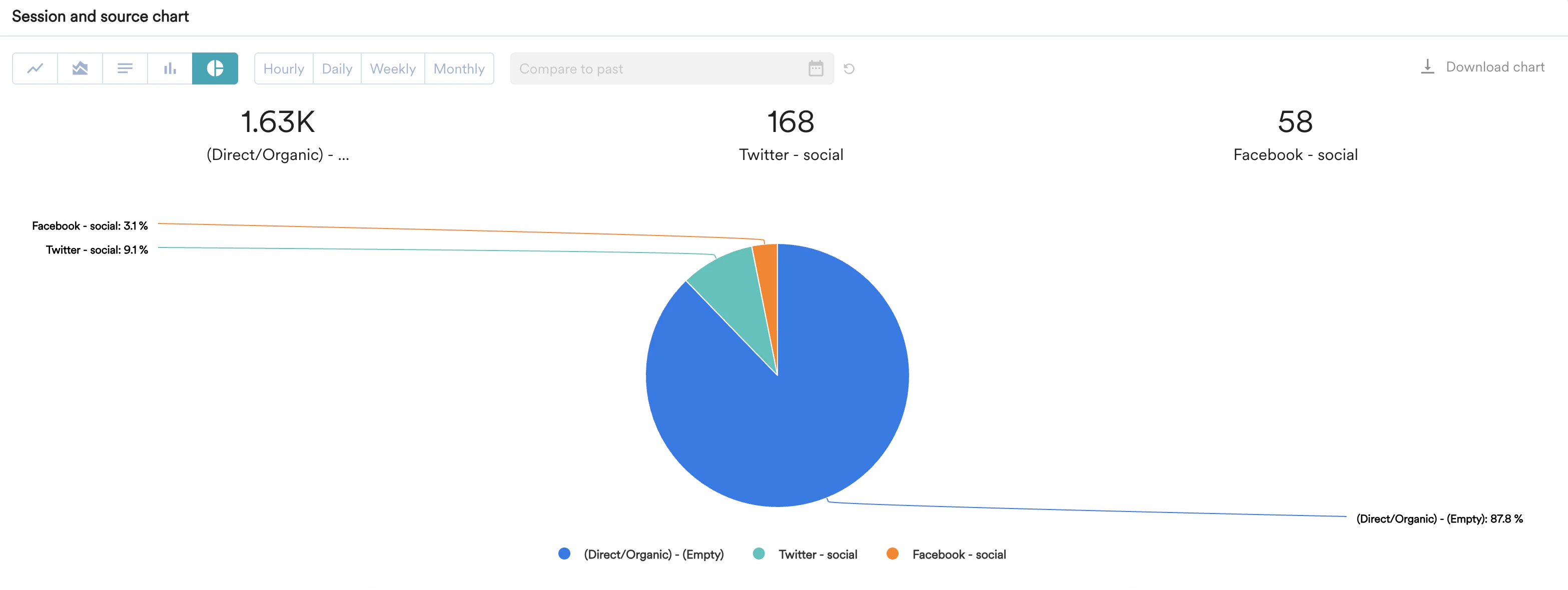
 * Pie charts are commonly used to visualize categorical data that can be divided into distinct parts. They display the relative proportions or contributions of various categories within a whole.
 Line, area, column, and bar charts are scaled relative to percentages using an absolute number or a percentage. You can switch between numerical and percentage views for line, area, bar, and column charts.
 ### Granularity
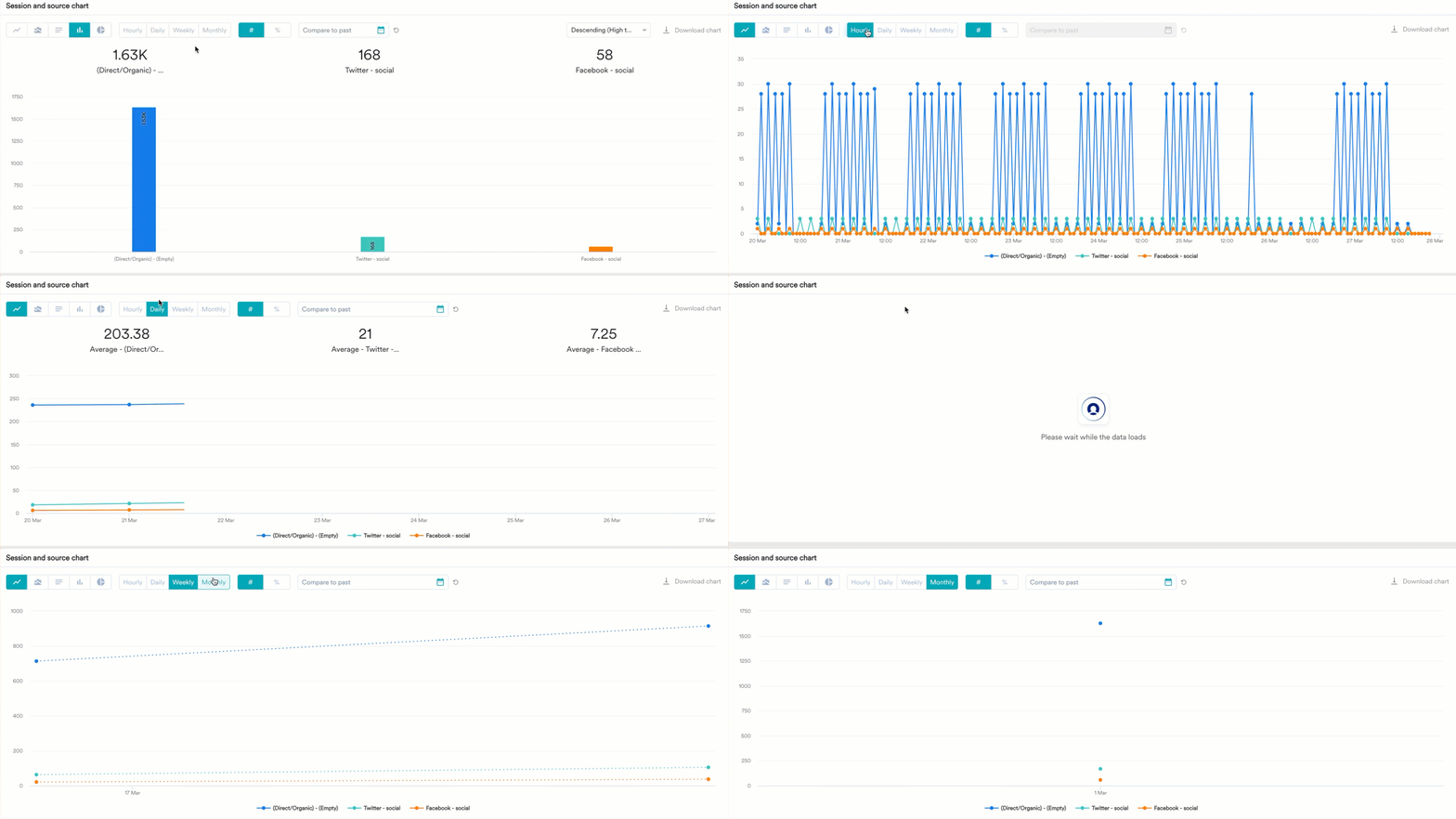
You can also break down the report into Hourly, Daily, Weekly, or Monthly granularities for easy visualization. Based on the granularity you select, unique users will be displayed.
### Granularity
You can also break down the report into Hourly, Daily, Weekly, or Monthly granularities for easy visualization. Based on the granularity you select, unique users will be displayed.

 ### Compare to Past
This will allow you to compare the current chart with past trends. You can compare any data point over a period of time with the corresponding data point from the previous period.
### Compare to Past
This will allow you to compare the current chart with past trends. You can compare any data point over a period of time with the corresponding data point from the previous period.
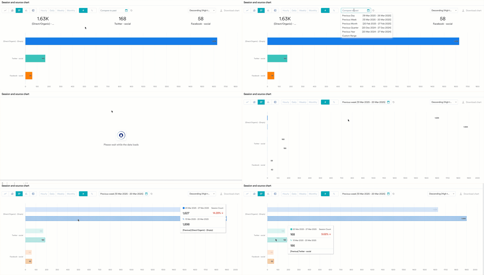 You can compare the chart for the following periods:
* Previous Day
* Previous Week
* Previous Month
* Previous Quarter
* Previous Year
* Custom Range
For more information, refer to [Compare Mode in Analytics](/user-guide/analyze/analytics/compare-mode-in-analytics).
### Sorting
When viewing a bar and column chart, you have the following options to sort the charts:
* Descending (High to low)
* Ascending (Low to high)
* Alphabetical (A to Z)
* Reverse Alphabetical (Z to A)
* Sort by date (Chronological sort)
You can compare the chart for the following periods:
* Previous Day
* Previous Week
* Previous Month
* Previous Quarter
* Previous Year
* Custom Range
For more information, refer to [Compare Mode in Analytics](/user-guide/analyze/analytics/compare-mode-in-analytics).
### Sorting
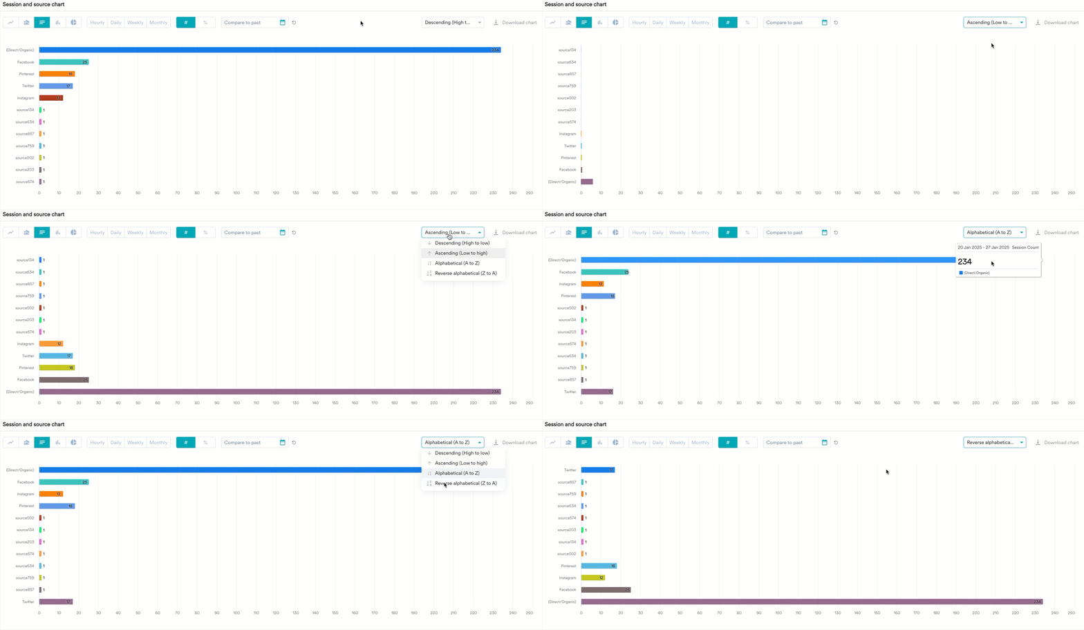
When viewing a bar and column chart, you have the following options to sort the charts:
* Descending (High to low)
* Ascending (Low to high)
* Alphabetical (A to Z)
* Reverse Alphabetical (Z to A)
* Sort by date (Chronological sort)
 # Step 5: Tables
In addition to charts, the data is also available for analysis in a tabular format. You can sort the table or change its view using the transpose feature. Additionally, you can download the data in CSV format. For more information, refer [here](/user-guide/settings/account/security/overview).
# Save to My Studio or Custom Dashboard
Your analysis is now ready. To access this later, you can save the analysis.
To save:
1. Click the icon in the upper-right corner and click **Save to My Studio.**
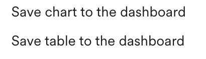
2. Additionally, you can save the analysis to a custom dashboard. Choose the required option from the list.
# Step 5: Tables
In addition to charts, the data is also available for analysis in a tabular format. You can sort the table or change its view using the transpose feature. Additionally, you can download the data in CSV format. For more information, refer [here](/user-guide/settings/account/security/overview).
# Save to My Studio or Custom Dashboard
Your analysis is now ready. To access this later, you can save the analysis.
To save:
1. Click the icon in the upper-right corner and click **Save to My Studio.**
2. Additionally, you can save the analysis to a custom dashboard. Choose the required option from the list.
 3. Select the dashboard where you want to save the analysis. You can choose an existing dashboard or create a new one.
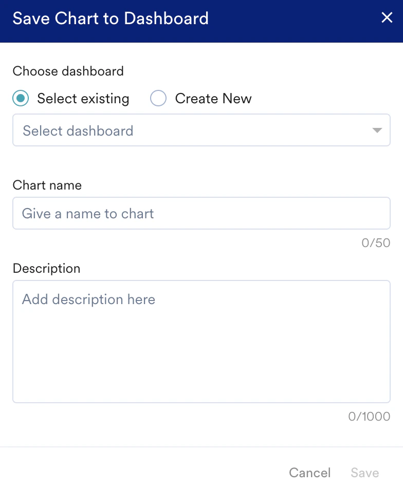 4. Enter a name for your analysis to help you identify.
5. Enter a brief description of the analysis.
6. Click **Save**.
You can access the analysis by navigating to **Analyze** > **My Studio**. To access the custom dashboard, navigate to **Dashboards**.
# Next Steps
* [MoEngage Dashboards](/user-guide/analyze/dashboards/overview)
* [Advanced](/user-guide/analyze/analytics/session-and-source/advanced-session-and-source-analysis)
* [User Paths](/user-guide/analyze/analytics/user-paths)
4. Enter a name for your analysis to help you identify.
5. Enter a brief description of the analysis.
6. Click **Save**.
You can access the analysis by navigating to **Analyze** > **My Studio**. To access the custom dashboard, navigate to **Dashboards**.
# Next Steps
* [MoEngage Dashboards](/user-guide/analyze/dashboards/overview)
* [Advanced](/user-guide/analyze/analytics/session-and-source/advanced-session-and-source-analysis)
* [User Paths](/user-guide/analyze/analytics/user-paths)