> ## Documentation Index
> Fetch the complete documentation index at: https://moengage.com/docs/llms.txt
> Use this file to discover all available pages before exploring further.

# Configure Accessibility for Cards

> Configure accessibility features for your MoEngage Cards inbox to ensure inclusive experiences for all users, with step-by-step setup instructions.

You can configure accessibility features for your cards inbox within MoEngage to ensure inclusivity for all users. For a comprehensive understanding of the accessibility feature, refer [here](/docs/user-guide/campaigns-and-channels/getting-started/campaign-content/accessible-campaigns-in-moengage).

# Set Up Accessibility for Cards

Perform the below-mentioned step-by-step instructions to configure accessibility for the cards inbox.

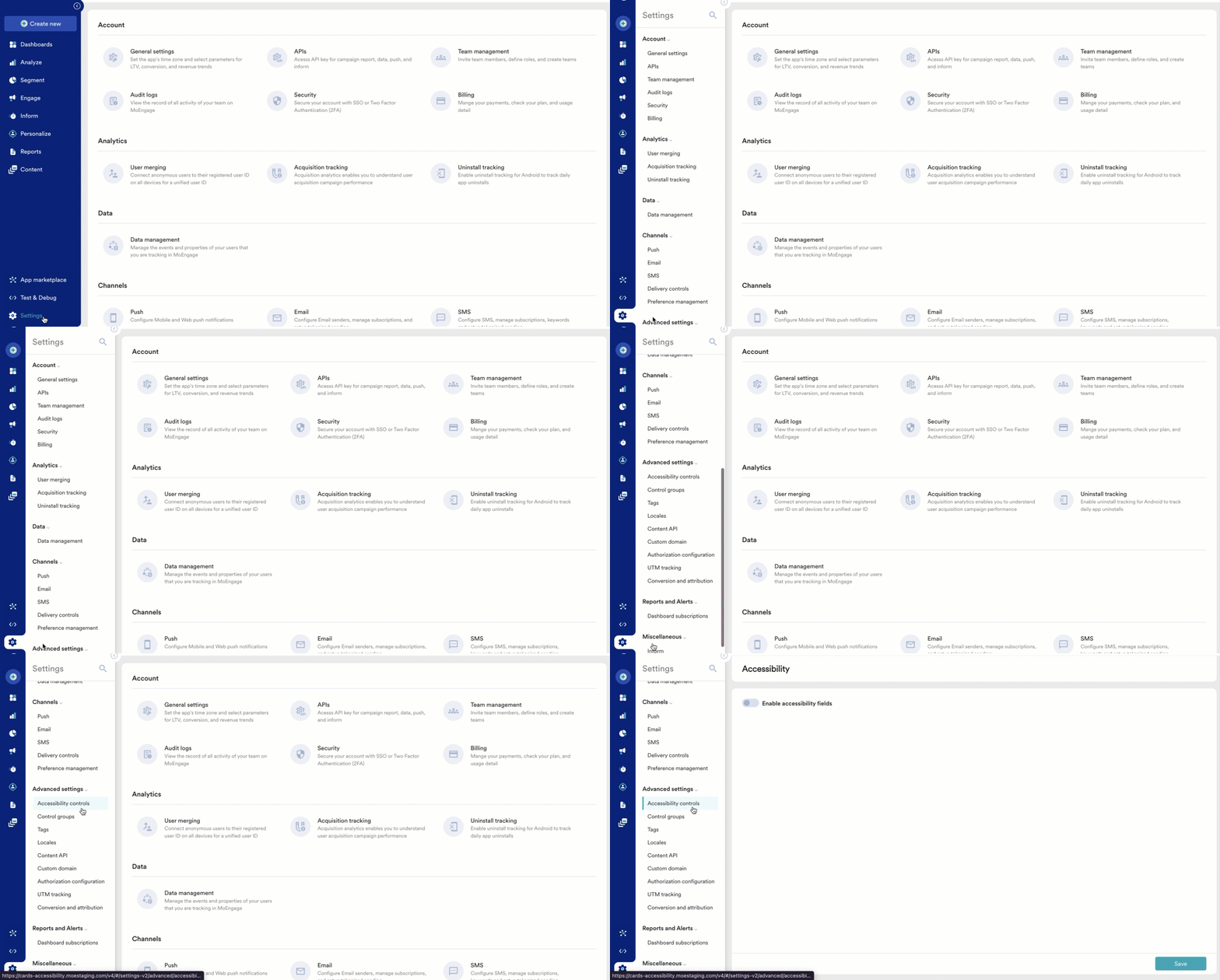
1. On the left navigation menu in the MoEngage dashboard, click **Settings**, and then click **Advanced Settings** > **Accessibility Controls**. <img src="https://mintcdn.com/moengage/TTNPRzWn21XF5uj0/images/moengage_fbc371.png?s=0bc1c33266ccb48397ec0156e24805a0" alt="cardsaccessibility1.gif" width="1432" height="768" data-path="images/moengage_fbc371.png" />
2. On the **Accessibility** page, turn on the **Enable accessibility fields** toggle. The **Accessibility fields for Cards inbox** section appear. <img src="https://mintcdn.com/moengage/S2vOz7ciYYqlhjCf/images/moengage_6a97c4.png?s=31eee1dba58a16a36f3d329282abe01b" alt="cardsaccessibility2.gif" width="1354" height="728" data-path="images/moengage_6a97c4.png" />
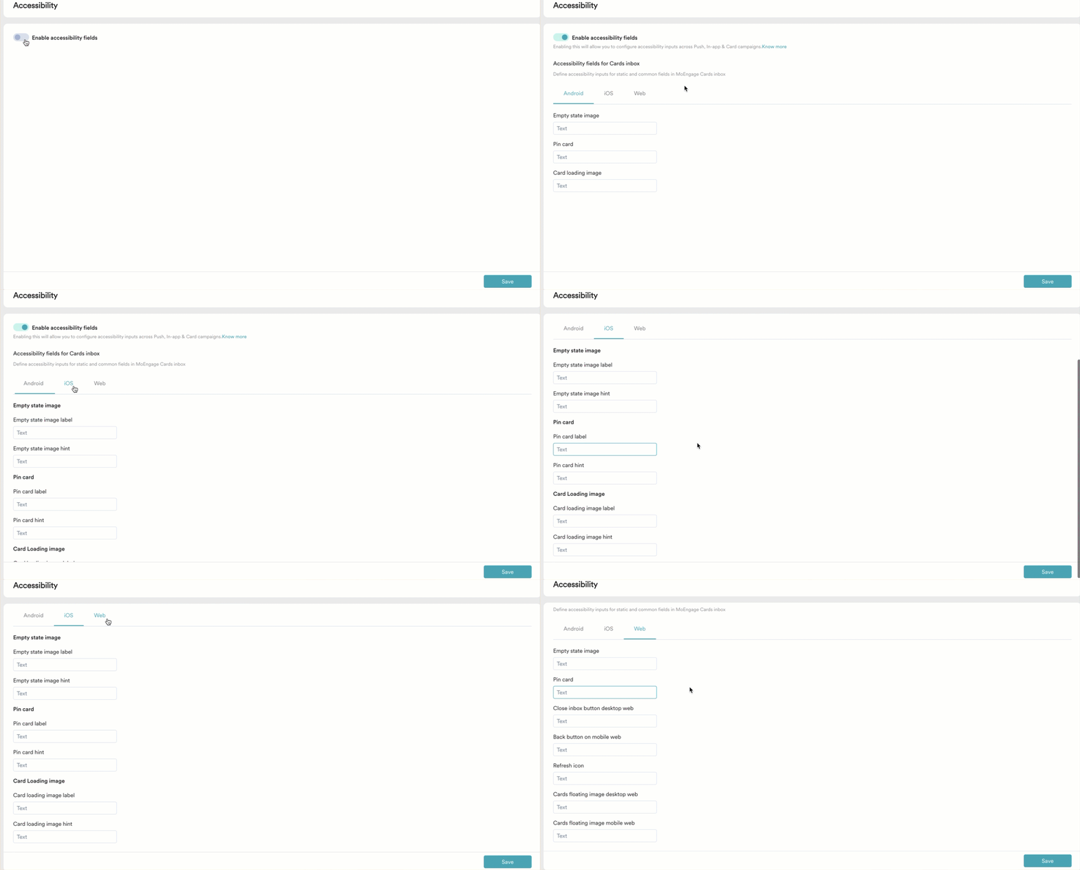
3. Define the below-mentioned field values:

<table>
  <thead>
    <tr>
      <th>Platform</th>
      <th>Field</th>
      <th>Description</th>
    </tr>
  </thead>

  <tbody>
    <tr>
      <td rowspan="3">Android</td>
      <td>Empty state image</td>
      <td>Enter a concise, descriptive text that conveys the purpose of the empty state image. For example, ’<em>No new messages. Your inbox is empty.</em>’</td>
    </tr>

    <tr>
      <td>Pin card</td>
      <td>Enter a brief, descriptive text that identifies the action of pinning a card in the inbox.</td>
    </tr>

    <tr>
      <td>Card loading image</td>
      <td>Enter a concise, descriptive text that informs users that a card is loading in the inbox.</td>
    </tr>

    <tr>
      <td rowspan="6">iOS</td>
      <td>Empty state image label</td>
      <td>Enter a brief, descriptive label that help users identify the purpose of the empty state image.</td>
    </tr>

    <tr>
      <td>Empty state image hint</td>
      <td>Enter additional context or guidance that explains the empty state image’s action or expected user interaction.</td>
    </tr>

    <tr>
      <td>Pin card label</td>
      <td>Enter a brief, descriptive label that identifies the purpose of the pin card option.</td>
    </tr>

    <tr>
      <td>Pin card hint</td>
      <td>Enter additional context or guidance that explains the action of pinning a card or what users can expect after tapping the button.</td>
    </tr>

    <tr>
      <td>Card loading image label</td>
      <td>Enter a brief, descriptive label that identifies the purpose of the card loading image.</td>
    </tr>

    <tr>
      <td>Card loading image hint</td>
      <td>Enter additional context or guidance that explains the card loading image’s action or expected behavior. For example, ‘<em>Please wait while we fetch the details</em>.’</td>
    </tr>

    <tr>
      <td rowspan="7">Web</td>
      <td>Empty state image</td>
      <td>Enter a concise, descriptive text that conveys the purpose of the empty state image in the inbox.</td>
    </tr>

    <tr>
      <td>Pin card</td>
      <td>Enter a brief, descriptive text that identifies the action of pinning a card in the inbox.</td>
    </tr>

    <tr>
      <td>Close inbox button desktop web</td>
      <td>Enter a concise, descriptive text that conveys the purpose of the close inbox button on desktop.</td>
    </tr>

    <tr>
      <td>Back button on mobile web</td>
      <td>Enter a concise, descriptive text that conveys the action of returning to the previous screen on mobile web. For example, ’<em>Go back to the previous page</em>.’</td>
    </tr>

    <tr>
      <td>Refresh icon</td>
      <td>Enter a brief, descriptive text that identifies the action of reloading or refreshing the inbox content.</td>
    </tr>

    <tr>
      <td>Cards floating image desktop web</td>
      <td>Enter a concise, descriptive text that conveys the purpose of the floating image alongside cards on desktop.</td>
    </tr>

    <tr>
      <td>Cards floating image mobile web</td>
      <td>Enter a concise, descriptive text that conveys the purpose of the floating image alongside cards on mobile.</td>
    </tr>
  </tbody>
</table>

For more information on the best practices for accessibility, refer [here](/docs/user-guide/campaigns-and-channels/getting-started/campaign-content/accessible-campaigns-in-moengage).

4. Click **Save**. The configuration for the Cards inbox accessibility is completed.

# Next Steps

* [Create a Card Campaign](/docs/user-guide/campaigns-and-channels/cards/create/create-a-card-campaign)
* [Edit Card Campaign and Show/Hide Cards](/docs/user-guide/campaigns-and-channels/cards/create/edit-card-campaigns-and-showhide-cards)

# Additional resources

* [Accessible Campaigns in MoEngage](/docs/user-guide/campaigns-and-channels/getting-started/campaign-content/accessible-campaigns-in-moengage)
* [Web Content Accessibility Guidelines (WCAG)](https://www.w3.org/WAI/standards-guidelines/wcag/)