> ## Documentation Index
> Fetch the complete documentation index at: https://moengage.com/docs/llms.txt
> Use this file to discover all available pages before exploring further.

# Icon Shortcuts Template for Android

> Send a push notification on Android 12 and above with a row of three to six tappable icons, each opening a different destination in your app.

export const IconShortcutsPayloadBuilder = () => {
  const SHELL = {
    fontFamily: 'Inter, sans-serif',
    border: '1px solid #e1e8ed',
    borderRadius: '12px',
    background: '#fff',
    maxWidth: '950px',
    margin: '20px auto',
    overflow: 'hidden'
  };
  const BAR = {
    background: '#023047',
    color: 'white',
    padding: '12px 20px',
    display: 'flex',
    justifyContent: 'space-between',
    alignItems: 'center'
  };
  const BTN = {
    background: 'rgba(255,255,255,0.2)',
    border: '1px solid rgba(255,255,255,0.3)',
    color: 'white',
    fontSize: '10px',
    padding: '4px 8px',
    borderRadius: '4px',
    cursor: 'pointer'
  };
  const LABEL = {
    display: 'block',
    fontSize: '11px',
    fontWeight: '800',
    color: '#6a7c92',
    textTransform: 'uppercase',
    marginBottom: '6px'
  };
  const FIELD = {
    width: '100%',
    padding: '8px',
    border: '1px solid #e1e8ed',
    borderRadius: '6px',
    fontSize: '13px',
    boxSizing: 'border-box'
  };
  const MONO = {
    ...FIELD,
    fontFamily: 'monospace'
  };
  const ACTIONS = [{
    name: 'navigate',
    label: 'Open a destination'
  }, {
    name: 'share',
    label: 'Share text'
  }, {
    name: 'call',
    label: 'Start a call'
  }, {
    name: 'copy',
    label: 'Copy a code'
  }, {
    name: 'track',
    label: 'Record behavior'
  }, {
    name: 'custom',
    label: 'App-defined action'
  }];
  const VALUE_HINT = {
    deepLink: 'myapp://category/headphones',
    screenName: 'com.yourcompany.store.ProductActivity',
    richLanding: 'https://example.com/autumn-sale',
    share: 'Explore the current offers',
    call: '+14155550123',
    copy: 'PROMO2026',
    event: 'icon_shortcut_clicked',
    userAttribute: 'last_shortcut_tapped',
    custom: '{"screen":"wallet"}'
  };
  const blankIcon = () => ({
    content: '',
    iat: '',
    action: 'navigate',
    navType: 'deepLink',
    trackType: 'event',
    valueOf: '',
    value: ''
  });
  const DEFAULT_STYLE = {
    shape: 'sq',
    corner: 16,
    useBg: true,
    bgColor: '#FFF3E0',
    showLargeIcon: false
  };
  const byteLength = s => typeof TextEncoder !== 'undefined' ? new TextEncoder().encode(s).length : s.length;
  const [style, setStyle] = useState(DEFAULT_STYLE);
  const [icons, setIcons] = useState([blankIcon(), blankIcon(), blankIcon()]);
  const [json, setJson] = useState('');
  const [issues, setIssues] = useState([]);
  const [copied, setCopied] = useState(false);
  const setIcon = (i, patch) => setIcons(prev => prev.map((ic, idx) => idx === i ? {
    ...ic,
    ...patch
  } : ic));
  const addIcon = () => setIcons(prev => prev.length < 6 ? [...prev, blankIcon()] : prev);
  const removeIcon = i => setIcons(prev => prev.length > 3 ? prev.filter((_, idx) => idx !== i) : prev);
  const reset = () => {
    setStyle(DEFAULT_STYLE);
    setIcons([blankIcon(), blankIcon(), blankIcon()]);
  };
  useEffect(() => {
    const found = [];
    const widgets = icons.map((ic, idx) => {
      const n = idx + 1;
      if (!ic.content.trim()) found.push(`Icon ${n} has no image URL.`); else if (!(/^https:\/\//i).test(ic.content.trim())) found.push(`Icon ${n} image URL must start with https://.`);
      if (!ic.value.trim()) found.push(`Icon ${n} has no action value.`);
      if (ic.action === 'track' && !ic.valueOf.trim()) found.push(`Icon ${n} track action needs a recorded value.`);
      let action;
      if (ic.action === 'navigate') {
        action = {
          name: 'navigate',
          type: ic.navType,
          value: ic.value.trim()
        };
      } else if (ic.action === 'track') {
        action = {
          name: 'track',
          type: ic.trackType,
          value: ic.value.trim(),
          kvPairs: {
            valueOf: ic.valueOf.trim()
          }
        };
      } else {
        action = {
          name: ic.action,
          value: ic.value.trim()
        };
      }
      const widget = {
        id: n,
        type: 'image',
        content: ic.content.trim()
      };
      if (ic.iat.trim()) widget.iat = ic.iat.trim();
      widget.actions = [action];
      return widget;
    });
    const styleObj = {
      i_sh: style.shape
    };
    if (Number(style.corner) > 0) styleObj.co_r = Number(style.corner);
    if (style.useBg) styleObj.bgColor = style.bgColor;
    const payload = {
      richPush: {
        displayName: 'IconShortcuts',
        android: {
          showLargeIcon: style.showLargeIcon
        },
        expanded: {
          type: 'iconShortcuts',
          style: styleObj,
          cards: [{
            id: 1,
            type: 'iconShortcuts',
            widgets
          }]
        }
      }
    };
    setJson(JSON.stringify(payload));
    setIssues(found);
  }, [icons, style]);
  const copy = async () => {
    try {
      await navigator.clipboard.writeText(json);
      setCopied(true);
      setTimeout(() => setCopied(false), 1800);
    } catch (e) {
      setCopied(false);
    }
  };
  const bytes = byteLength(json);
  const heavy = bytes > 3000;
  return <div style={SHELL}>
      <div style={BAR}>
        <span style={{
    fontSize: '13px',
    fontWeight: 'bold',
    textTransform: 'uppercase'
  }}>Icon Shortcuts Payload Builder</span>
        <button onClick={reset} style={BTN}>RESET</button>
      </div>

      <div style={{
    display: 'flex',
    flexWrap: 'wrap',
    background: '#e1e8ed',
    gap: '1px'
  }}>
        <div style={{
    flex: '1.4',
    minWidth: '340px',
    background: '#fff',
    padding: '20px',
    display: 'flex',
    flexDirection: 'column',
    gap: '18px'
  }}>

          <div>
            <label style={LABEL}>Card and icon appearance</label>
            <div style={{
    display: 'flex',
    gap: '10px',
    flexWrap: 'wrap'
  }}>
              <div style={{
    flex: '1',
    minWidth: '120px'
  }}>
                <div style={{
    fontSize: '10px',
    color: '#6a7c92',
    marginBottom: '4px'
  }}>Icon shape</div>
                <select value={style.shape} onChange={e => setStyle(p => ({
    ...p,
    shape: e.target.value
  }))} style={FIELD}>
                  <option value="ci">Circle</option>
                  <option value="sq">Square</option>
                </select>
              </div>
              <div style={{
    flex: '1',
    minWidth: '120px'
  }}>
                <div style={{
    fontSize: '10px',
    color: '#6a7c92',
    marginBottom: '4px'
  }}>Corner rounding</div>
                <input type="number" min="0" value={style.corner} onChange={e => setStyle(p => ({
    ...p,
    corner: parseInt(e.target.value, 10) || 0
  }))} style={MONO} />
              </div>
            </div>
          </div>

          <div style={{
    display: 'flex',
    gap: '14px',
    alignItems: 'center',
    flexWrap: 'wrap'
  }}>
            <label style={{
    fontSize: '12px',
    color: '#475569',
    display: 'flex',
    alignItems: 'center',
    gap: '6px'
  }}>
              <input type="checkbox" checked={style.useBg} onChange={e => setStyle(p => ({
    ...p,
    useBg: e.target.checked
  }))} />
              Background color
            </label>
            {style.useBg && <>
                <input type="color" value={style.bgColor} onChange={e => setStyle(p => ({
    ...p,
    bgColor: e.target.value.toUpperCase()
  }))} style={{
    width: '38px',
    height: '30px',
    border: '1px solid #e1e8ed',
    borderRadius: '6px',
    padding: '2px',
    cursor: 'pointer'
  }} />
                <span style={{
    fontFamily: 'monospace',
    fontSize: '12px',
    color: '#023047'
  }}>{style.bgColor}</span>
              </>}
            <label style={{
    fontSize: '12px',
    color: '#475569',
    display: 'flex',
    alignItems: 'center',
    gap: '6px'
  }}>
              <input type="checkbox" checked={style.showLargeIcon} onChange={e => setStyle(p => ({
    ...p,
    showLargeIcon: e.target.checked
  }))} />
              Large icon on the Basic notification
            </label>
          </div>

          <div>
            <div style={{
    display: 'flex',
    justifyContent: 'space-between',
    alignItems: 'center',
    marginBottom: '8px'
  }}>
              <label style={{
    ...LABEL,
    marginBottom: 0
  }}>Icons ({icons.length} of 6)</label>
              <button onClick={addIcon} disabled={icons.length >= 6} style={{
    background: icons.length >= 6 ? '#e1e8ed' : '#023047',
    color: icons.length >= 6 ? '#6a7c92' : '#fff',
    border: 'none',
    fontSize: '11px',
    padding: '5px 10px',
    borderRadius: '4px',
    cursor: icons.length >= 6 ? 'not-allowed' : 'pointer'
  }}>
                + Add icon
              </button>
            </div>

            <div style={{
    display: 'flex',
    flexDirection: 'column',
    gap: '10px'
  }}>
              {icons.map((ic, i) => <div key={i} style={{
    border: '1px solid #e1e8ed',
    borderRadius: '8px',
    padding: '12px',
    background: '#f8fafc'
  }}>
                  <div style={{
    display: 'flex',
    justifyContent: 'space-between',
    alignItems: 'center',
    marginBottom: '8px'
  }}>
                    <span style={{
    fontSize: '11px',
    fontWeight: '800',
    color: '#023047'
  }}>Icon {i + 1}</span>
                    <button onClick={() => removeIcon(i)} disabled={icons.length <= 3} style={{
    background: 'none',
    border: 'none',
    color: icons.length <= 3 ? '#b8c2cc' : '#c1121f',
    fontSize: '11px',
    cursor: icons.length <= 3 ? 'not-allowed' : 'pointer',
    padding: 0
  }}>
                      Remove
                    </button>
                  </div>

                  <div style={{
    display: 'flex',
    flexDirection: 'column',
    gap: '8px'
  }}>
                    <input placeholder="Image URL (https://)" value={ic.content} onChange={e => setIcon(i, {
    content: e.target.value
  })} style={MONO} />
                    <input placeholder="Screen reader label (optional)" value={ic.iat} onChange={e => setIcon(i, {
    iat: e.target.value
  })} style={FIELD} />

                    <div style={{
    display: 'flex',
    gap: '8px',
    flexWrap: 'wrap'
  }}>
                      <select value={ic.action} onChange={e => setIcon(i, {
    action: e.target.value,
    value: ''
  })} style={{
    ...FIELD,
    flex: '1',
    minWidth: '150px'
  }}>
                        {ACTIONS.map(a => <option key={a.name} value={a.name}>{a.label}</option>)}
                      </select>

                      {ic.action === 'navigate' && <select value={ic.navType} onChange={e => setIcon(i, {
    navType: e.target.value,
    value: ''
  })} style={{
    ...FIELD,
    flex: '1',
    minWidth: '130px'
  }}>
                          <option value="deepLink">Deep link</option>
                          <option value="screenName">Screen name</option>
                          <option value="richLanding">Web page in app</option>
                        </select>}

                      {ic.action === 'track' && <select value={ic.trackType} onChange={e => setIcon(i, {
    trackType: e.target.value,
    value: ''
  })} style={{
    ...FIELD,
    flex: '1',
    minWidth: '130px'
  }}>
                          <option value="event">Custom event</option>
                          <option value="userAttribute">User attribute</option>
                        </select>}
                    </div>

                    <input placeholder={VALUE_HINT[ic.action === 'navigate' ? ic.navType : ic.action === 'track' ? ic.trackType : ic.action] || 'Value'} value={ic.value} onChange={e => setIcon(i, {
    value: e.target.value
  })} style={MONO} />

                    {ic.action === 'track' && <input placeholder="Recorded value (kvPairs.valueOf)" value={ic.valueOf} onChange={e => setIcon(i, {
    valueOf: e.target.value
  })} style={MONO} />}
                  </div>
                </div>)}
            </div>
          </div>
        </div>

        <div style={{
    flex: '1',
    minWidth: '290px',
    background: '#f8fafc',
    padding: '20px',
    borderLeft: '1px solid #e1e8ed',
    display: 'flex',
    flexDirection: 'column',
    gap: '12px'
  }}>
          <div>
            <div style={{
    display: 'flex',
    justifyContent: 'space-between',
    alignItems: 'center',
    marginBottom: '6px'
  }}>
              <label style={{
    ...LABEL,
    marginBottom: 0
  }}>Value for moeFeatures</label>
              <button onClick={copy} style={{
    background: '#023047',
    color: '#fff',
    border: 'none',
    fontSize: '11px',
    padding: '5px 10px',
    borderRadius: '4px',
    cursor: 'pointer'
  }}>
                {copied ? 'Copied' : 'Copy'}
              </button>
            </div>
            <textarea readOnly value={json} rows={12} style={{
    width: '100%',
    padding: '10px',
    border: '1px solid #e1e8ed',
    borderRadius: '6px',
    fontSize: '11px',
    fontFamily: 'monospace',
    lineHeight: '1.5',
    background: '#fff',
    color: '#023047',
    resize: 'vertical',
    boxSizing: 'border-box'
  }} />
          </div>

          <div style={{
    background: '#fff',
    border: '1px solid #e1e8ed',
    borderRadius: '8px',
    padding: '12px',
    borderLeft: `4px solid ${heavy ? '#d46b08' : '#023047'}`
  }}>
            <div style={{
    fontSize: '10px',
    color: '#6a7c92',
    textTransform: 'uppercase',
    marginBottom: '4px'
  }}>Payload size</div>
            <div style={{
    fontSize: '18px',
    fontWeight: '800',
    fontFamily: 'monospace',
    color: heavy ? '#d46b08' : '#023047'
  }}>{bytes.toLocaleString()} bytes</div>
            <div style={{
    fontSize: '11px',
    color: '#475569',
    lineHeight: '1.5',
    marginTop: '6px'
  }}>
              FCM rejects a push message above 4 KB, and this payload is only part of that message. Shorten your image URLs if the campaign approaches the limit.
            </div>
          </div>

          <div style={{
    background: '#fff',
    border: '1px solid #e1e8ed',
    borderRadius: '8px',
    padding: '12px',
    borderLeft: `4px solid ${issues.length ? '#c1121f' : '#2a9d8f'}`
  }}>
            <div style={{
    fontSize: '10px',
    color: '#6a7c92',
    textTransform: 'uppercase',
    marginBottom: '6px'
  }}>
              {issues.length ? `${issues.length} item${issues.length > 1 ? 's' : ''} to fix` : 'Ready to paste'}
            </div>
            {issues.length ? <ul style={{
    margin: 0,
    paddingLeft: '16px',
    fontSize: '11px',
    color: '#475569',
    lineHeight: '1.7'
  }}>
                {issues.map((m, i) => <li key={i}>{m}</li>)}
              </ul> : <div style={{
    fontSize: '11px',
    color: '#475569',
    lineHeight: '1.5'
  }}>
                Every icon has an image URL and an action. Send a test campaign to a device running Android 12 or above before you launch.
              </div>}
          </div>
        </div>
      </div>
    </div>;
};

## Overview

<Note>
  Icon Shortcuts is a Beta feature. You configure it through a key-value pair rather than through a template tile on the dashboard. For more information, refer to [FAQs](#faqs) and [Feature or Product in Beta](/docs/user-guide/getting-started/overview/feature-or-product-in-beta).
</Note>

Icon Shortcuts is an Android push template that displays a row of three to six tappable icons. Each icon carries a destination of its own, so a single notification offers up to six entry points into your app.

A standard push notification directs every user who taps the notification to the same screen. Icon Shortcuts allows each user to select the destination that matches their interest.

| Collapsed | Expanded |
| - | - |
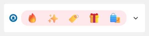
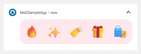
| <img src="https://mintcdn.com/moengage/csh_IKgpBpwIG6PE/images/icon-shortcuts-bgcolor-collapsed.png?fit=max&auto=format&n=csh_IKgpBpwIG6PE&q=85&s=af9f336d414afe87b17e004d487f69a3" alt="A collapsed notification whose icon card uses a pale pink background behind five offer icons: a flame, sparkles, a price tag, a gift, and shopping bags" width="483" height="118" data-path="images/icon-shortcuts-bgcolor-collapsed.png" /> | <img src="https://mintcdn.com/moengage/csh_IKgpBpwIG6PE/images/icon-shortcuts-bgcolor-expanded.png?fit=max&auto=format&n=csh_IKgpBpwIG6PE&q=85&s=65649bc30baab7807aaa904a611a8b4b" alt="The same notification expanded, showing the pink card and the five offer icons at a larger size" width="483" height="185" data-path="images/icon-shortcuts-bgcolor-expanded.png" /> |

Every notification above carries five icons. The notification drawer displays the collapsed state first, and the expanded state appears when the user pulls the notification down. This campaign sets a background color on the card that holds the icons.

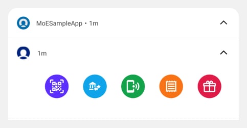
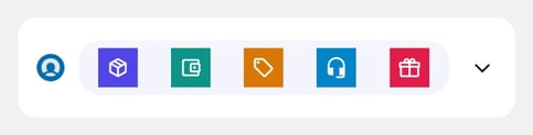
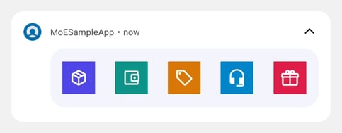
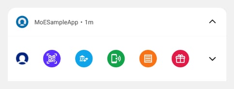
You choose the icon shape and the card color. The following notifications show the two icon shapes.

| Icon shape | Collapsed | Expanded |
| - | - | - |
| Circle | <img src="https://mintcdn.com/moengage/csh_IKgpBpwIG6PE/images/icon-shortcuts-circle-collapsed.png?fit=max&auto=format&n=csh_IKgpBpwIG6PE&q=85&s=7cdd06952635e22665f548cf36b6fb94" alt="A collapsed notification from a sample app, showing a row of five circular icons: scan, transfer, recharge, bills, and rewards" width="483" height="184" data-path="images/icon-shortcuts-circle-collapsed.png" /> | <img src="https://mintcdn.com/moengage/csh_IKgpBpwIG6PE/images/icon-shortcuts-circle-expanded.png?fit=max&auto=format&n=csh_IKgpBpwIG6PE&q=85&s=07bcac18bb0f772a682da2302dc6bb87" alt="The same notification expanded, showing the five circular icons at a larger size" width="483" height="251" data-path="images/icon-shortcuts-circle-expanded.png" /> |
| Square | <img src="https://mintcdn.com/moengage/csh_IKgpBpwIG6PE/images/icon-shortcuts-square-collapsed.png?fit=max&auto=format&n=csh_IKgpBpwIG6PE&q=85&s=52bec13aae74947ee36afca3114b1b64" alt="A collapsed notification from a sample app, showing a row of five square icons: orders, wallet, offers, support, and rewards" width="483" height="123" data-path="images/icon-shortcuts-square-collapsed.png" /> | <img src="https://mintcdn.com/moengage/csh_IKgpBpwIG6PE/images/icon-shortcuts-square-expanded.png?fit=max&auto=format&n=csh_IKgpBpwIG6PE&q=85&s=9c99eef6b18415746f5e8ff29a246b59" alt="The same notification expanded, showing the five square icons at a larger size" width="483" height="189" data-path="images/icon-shortcuts-square-expanded.png" /> |

For the keys that set the shape and the color, refer to [Card and Icon Appearance](#card-and-icon-appearance).
<Warning>
  Icon Shortcuts requires a device running **Android 12 and above** and an app built with **MoEngage Android SDK BOM 4.5.0 or above**. Every other user receives the Basic notification that the campaign carries, so compose its title and message as a complete notification. For more information, refer to [Before You Begin](#before-you-begin).
</Warning>

## Use Cases

One Icon Shortcuts notification can serve several intents at once. The following patterns are common:

* Retail and commerce: You can open a different category from each icon, such as Trending, Bestseller, and New Arrival, or reserve one icon for the current sale.
* Marketplaces and aggregators: You can show one icon per partner brand and open that brand's storefront, which suits a shop-by-brand campaign.
* Offers and promotions: You can dedicate each icon to an offer, such as a seasonal sale, a buy-one-get-one deal, or a cashback campaign.
* Account and servicing: You can link users to orders, wallet, offers, and support from a single notification, which shortens the path to a routine task.
* Content and media: You can open a section from each icon, such as news, sport, and video, or give each icon a channel that opens that channel's live stream.

Each image conveys its meaning on its own, because Icon Shortcuts displays no text beside the icons. Recognizable logos and category symbols work best. For the format, size, and legibility requirements, refer to [Choosing Icon Images](#choosing-icon-images).

## How Icon Shortcuts Work

Icon Shortcuts builds on the Basic notification template. You create a Basic notification campaign and add Icon Shortcuts as a key-value pair. The campaign carries the complete template, so an app that meets the requirements in [Before You Begin](#before-you-begin) requires no code change to render it.

### What the User Sees

Icon Shortcuts forms the entire content of the notification. The collapsed state and the expanded state use the same icons and differ only in size, so you supply one set of images for both states. A tap on an icon runs that icon's action and closes the notification by default.

A tap outside the icons runs the click action of the Basic notification. Set that click action to the destination that suits a user who taps the notification without choosing an icon, such as your home screen or the campaign's landing page.

### What Happens When Icon Shortcuts Does Not Render

The campaign carries one message, and Icon Shortcuts sits on top of it. Whenever Icon Shortcuts does not render, the device displays the title, message, and image that you entered on the Basic notification. [Requirements and Validation Rules](#requirements-and-validation-rules) lists every condition that leads to this outcome.

The **Template Backup** option does not apply to Icon Shortcuts. The campaign builder offers **Template Backup** for every template except the Basic notification, and Icon Shortcuts builds on the Basic notification.

### Icon Count and Rendered Size

MoEngage fits the icons within the width that the notification area allows, so the number of icons determines the rendered size of each icon. The following table lists the sizes in dp (density-independent pixels), the unit that Android uses to size elements consistently across screens.

| Icons | Collapsed size | Expanded size |
| - | - | - |
| 3 to 5 | 34dp | 44dp |
| 6 | 30dp | 40dp |

A sixth icon adds a destination and reduces the size of every icon. Select six icons when the sixth destination matters more than icon size, and select five or fewer when each image needs the larger size to stay recognizable.

Some devices use a more compact notification layout, where MoEngage reduces the spacing around the icons. The icon sizes in the preceding table do not change.

### Choosing Icon Images

Supply each icon as a square PNG, JPEG, or WebP image. An unsupported format prevents Icon Shortcuts from rendering. Nothing else is enforced, but three choices affect the result:

* **192 x 192 pixels.** A smaller image renders, but appears less sharp on high-density screens.
* **10 KB or less.** Heavier images reduce the rate at which the template posts. When the template does not post, the device displays the Basic notification.
* **One high-contrast symbol.** Icons render at 30dp to 44dp, where fine detail and small text are not legible. Place any label inside the image, in one or two words.

## Before You Begin

<Tip>
  Ensure the following before you build the campaign:

  * **SDK version**: Your app is built with MoEngage Android SDK [BOM](/docs/developer-guide/android-sdk/sdk-integration/basic-integration/Install-Using-BOM) 4.5.0 or above, and includes the Rich Notification module (`com.moengage:rich-notification`). The BOM sets the version of that module, but your app must still include it. Confirm both with your development team.
  * **Icon images**: You have three to six square icon images in PNG, JPEG, or WebP format, hosted at public HTTPS URLs that anyone can open in a browser. MoEngage recommends 192 x 192 pixels and 10 KB or less per image. For more information, refer to [Choosing Icon Images](#choosing-icon-images).
  * **Destinations**: You have the destination for each icon. Your development team provides the deep link or the screen name. An icon that opens a web page inside the app requires no developer involvement.
</Tip>

## Step-by-Step Instructions for Sending an Icon Shortcuts Campaign

### Step 1: Build the Basic Notification

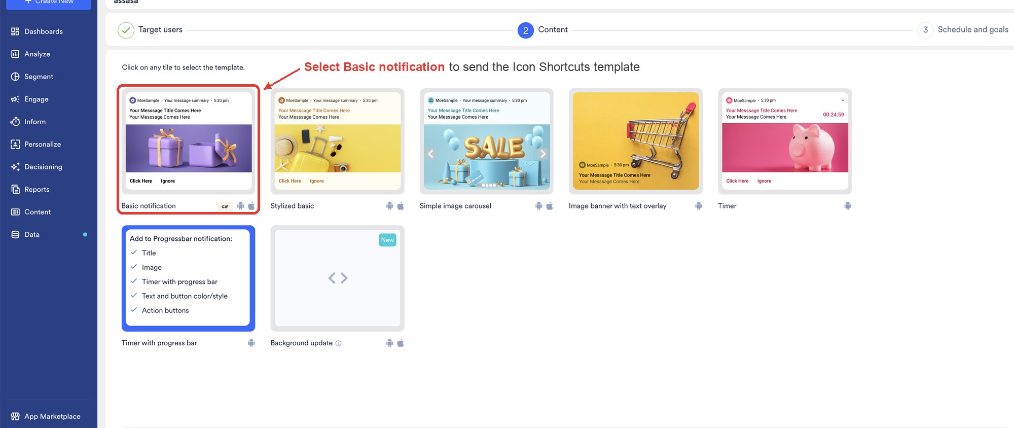
1. Create a push campaign. On the **Content** step, select the **Basic notification** template.

<img src="https://mintcdn.com/moengage/csh_IKgpBpwIG6PE/images/icon-shortcuts-select-basic-notification.png?fit=max&auto=format&n=csh_IKgpBpwIG6PE&q=85&s=0c34faf224425e3b4668507a2f9c321f" alt="The Content step of the push campaign builder, showing the template tiles with Basic notification as the first tile" width="2000" height="844" data-path="images/icon-shortcuts-select-basic-notification.png" />

2. Enter the title, message, and image. For more information, refer to [Create Push Campaigns](/docs/user-guide/campaigns-and-channels/mobile-push/create/create-push-campaigns).
3. Compose the title and message as a complete notification, because every user outside the supported device and SDK version receives this Basic notification in place of Icon Shortcuts.

### Step 2: Add Icon Shortcuts as a Key-Value Pair

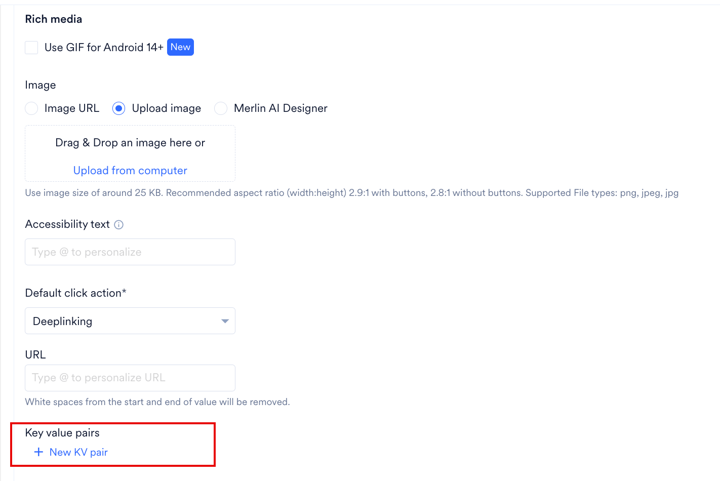
1. In **Basic Details**, locate **Key value pairs**, then click **+ New KV pair**.
   <img src="https://mintcdn.com/moengage/csh_IKgpBpwIG6PE/images/icon-shortcuts-new-kv-pair.png?fit=max&auto=format&n=csh_IKgpBpwIG6PE&q=85&s=bcdc3e67dbb3053acef40765e03a024b" alt="The Key value pairs section at the end of Basic Details, below Default click action and URL, with the New KV pair link highlighted" width="1422" height="950" data-path="images/icon-shortcuts-new-kv-pair.png" />

2. Enter `moeFeatures` in the **Enter key** box.

3. Paste the Icon Shortcuts payload into the **Enter value** box. Use the following example as the starting point.
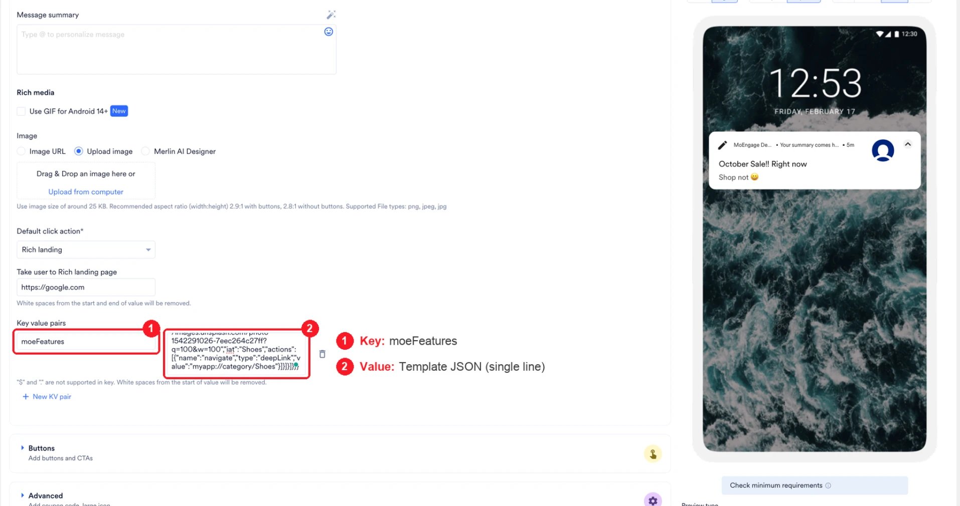
<img src="https://mintcdn.com/moengage/csh_IKgpBpwIG6PE/images/icon-shortcuts-kv-pair.webp?fit=max&auto=format&n=csh_IKgpBpwIG6PE&q=85&s=283ee38e8bb590472045b82096704fdb" alt="The Key value pairs section in Basic Details, below Default click action, with moeFeatures entered as the key and the single-line template JSON entered as the value" width="1914" height="1010" data-path="images/icon-shortcuts-kv-pair.webp" />

#### Build the Payload

Enter your icons and destinations below, then copy the result into the **Enter value** box. The builder assembles the same structure as the example that follows, on a single line and ready to paste.

<IconShortcutsPayloadBuilder />

#### Start from the Example Instead

The value of the `moeFeatures` key is a JSON block that defines Icon Shortcuts. The example defines five square icons, each of which opens a product category.

Copy the **Ready to Paste** version into the dashboard, and use the **Formatted** version to read the structure while you replace the values that belong to your campaign. Both versions define the same Icon Shortcuts template.

The example points at Unsplash URLs so that you can send a test campaign without hosting images first. Replace them with your own images before you launch. MoEngage does not control third-party URLs, which can change or stop resolving at any time.

<CodeGroup>
  ```json Ready to Paste wrap theme={null}
  {"richPush":{"displayName":"IconShortcuts","android":{"showLargeIcon":false},"expanded":{"type":"iconShortcuts","style":{"i_sh":"sq","co_r":16,"bgColor":"#FFF3E0"},"cards":[{"id":1,"type":"iconShortcuts","widgets":[{"id":1,"type":"image","content":"https://images.unsplash.com/photo-1545127398-14699f92334b?q=60&w=192","iat":"Headphones","actions":[{"name":"navigate","type":"deepLink","value":"myapp://category/headphones"}]},{"id":2,"type":"image","content":"https://images.unsplash.com/photo-1511499767150-a48a237f0083?q=60&w=192","iat":"Sunglasses","actions":[{"name":"navigate","type":"deepLink","value":"myapp://category/sunglasses"}]},{"id":3,"type":"image","content":"https://images.unsplash.com/photo-1523170335258-f5ed11844a49?q=60&w=192","iat":"Watches","actions":[{"name":"navigate","type":"deepLink","value":"myapp://category/watches"}]},{"id":4,"type":"image","content":"https://images.unsplash.com/photo-1598532163257-ae3c6b2524b6?q=60&w=192","iat":"Handbags","actions":[{"name":"navigate","type":"deepLink","value":"myapp://category/handbags"}]},{"id":5,"type":"image","content":"https://images.unsplash.com/photo-1542291026-7eec264c27ff?q=60&w=192","iat":"Shoes","actions":[{"name":"navigate","type":"deepLink","value":"myapp://category/shoes"}]}]}]}}}
  ```

  ```json Formatted wrap theme={null}
  {
    "richPush": {
      "displayName": "IconShortcuts",
      "android": { "showLargeIcon": false },
      "expanded": {
        "type": "iconShortcuts",
        "style": { "i_sh": "sq", "co_r": 16, "bgColor": "#FFF3E0" },
        "cards": [
          {
            "id": 1,
            "type": "iconShortcuts",
            "widgets": [
              {
                "id": 1,
                "type": "image",
                "content": "https://images.unsplash.com/photo-1545127398-14699f92334b?q=60&w=192",
                "iat": "Headphones",
                "actions": [
                  { "name": "navigate", "type": "deepLink", "value": "myapp://category/headphones" }
                ]
              },
              {
                "id": 2,
                "type": "image",
                "content": "https://images.unsplash.com/photo-1511499767150-a48a237f0083?q=60&w=192",
                "iat": "Sunglasses",
                "actions": [
                  { "name": "navigate", "type": "deepLink", "value": "myapp://category/sunglasses" }
                ]
              },
              {
                "id": 3,
                "type": "image",
                "content": "https://images.unsplash.com/photo-1523170335258-f5ed11844a49?q=60&w=192",
                "iat": "Watches",
                "actions": [
                  { "name": "navigate", "type": "deepLink", "value": "myapp://category/watches" }
                ]
              },
              {
                "id": 4,
                "type": "image",
                "content": "https://images.unsplash.com/photo-1598532163257-ae3c6b2524b6?q=60&w=192",
                "iat": "Handbags",
                "actions": [
                  { "name": "navigate", "type": "deepLink", "value": "myapp://category/handbags" }
                ]
              },
              {
                "id": 5,
                "type": "image",
                "content": "https://images.unsplash.com/photo-1542291026-7eec264c27ff?q=60&w=192",
                "iat": "Shoes",
                "actions": [
                  { "name": "navigate", "type": "deepLink", "value": "myapp://category/shoes" }
                ]
              }
            ]
          }
        ]
      }
    }
  }
  ```
</CodeGroup>

#### Editable Fields

| Element to change | Field to edit |
| - | - |
| The image that an icon displays | `content`, which holds the image URL. |
| The destination of an icon | `value` inside `actions`. For more information, refer to [Icon Actions](#icon-actions). |
| The label that a screen reader announces | `iat`. |
| The number of icons | Add or remove a block inside `widgets`, and retain a count between three and six. Assign a different `id` to each block. |
| The icon shape, and the color and corners of the card | `style`. For more information, refer to [Card and Icon Appearance](#card-and-icon-appearance). |

Retain the structural keys exactly as the example defines them: `expanded.type`, `cards[].type`, `widgets[].type`, and `showLargeIcon`. Icon Shortcuts renders only when `expanded.type` reads `iconShortcuts` and each widget's `type` reads `image`. For more information, refer to [Requirements and Validation Rules](#requirements-and-validation-rules).

Set `displayName` to `IconShortcuts`. The key is mandatory, and its value affects reporting rather than rendering. MoEngage sends the value as the `template_name` attribute on the Notification Clicked Android event, so `IconShortcuts` keeps the click data of every Icon Shortcuts campaign together in one group. For more information, refer to [Reporting](#reporting).

<Warning>
  The **Ready to Paste** version carries no line breaks. If you reformat the JSON while you edit the payload, remove the line breaks and spaces before you paste the payload into the dashboard, and confirm that the payload remains valid JSON. A formatting error prevents Icon Shortcuts from rendering.

  The 4 KB limit that FCM enforces applies to the complete push message, which carries this payload and the Basic notification together. FCM rejects a message above the limit, so the device receives no notification at all.
</Warning>

### Step 3: Test and Launch

1. Send a test campaign to a device running Android 12 or above.
2. Confirm that Icon Shortcuts appears. On a standard notification channel, the device shows the Basic notification first and replaces it with Icon Shortcuts a moment later, so a brief appearance of the title and message is expected. On a [heads-up notification](/docs/user-guide/campaigns-and-channels/mobile-push/notification-features-and-behavior/android-push-heads-up-notifications) channel, MoEngage posts Icon Shortcuts directly.
3. Tap each icon and confirm that the icon opens the destination that you configured.
4. Publish the campaign once Icon Shortcuts and every destination behave as expected.

## Requirements and Validation Rules

Icon Shortcuts renders only when all of the following conditions are true. Icon Shortcuts renders in full or not at all, so one unmet condition under **Device and app**, **Payload structure**, or **Icons** replaces Icon Shortcuts with the Basic notification. The condition under **Delivery** behaves differently: FCM rejects an oversized message, so nothing reaches the device.

Review this checklist before you launch a campaign, and review it again when a test notification arrives without Icon Shortcuts.

**Device and app**

1. The device runs Android 12 or above.
2. The app version on the device is built with MoEngage Android SDK BOM 4.5.0 or above and includes the Rich Notification module.

**Payload structure**

3. The `moeFeatures` value is valid JSON.
4. `richPush` contains `displayName` and an `android` object that contains `showLargeIcon`. Both keys are mandatory. Neither value affects whether Icon Shortcuts renders: `displayName` sets the reporting name, and `showLargeIcon` controls the large icon on the Basic notification.
5. `expanded.type` is `iconShortcuts`.
6. The first entry in `cards` carries three keys: a whole-number `id`, a `type`, and a `widgets` list. MoEngage ignores every further entry in `cards`.

**Icons**

7. The first card has three to six widgets whose `type` is `image`. Widgets of other types do not count toward the total.
8. Every widget carries a whole-number `id` and a `content` URL.
9. Every icon has at least one action. A single icon without an action prevents Icon Shortcuts from rendering.
10. Every image URL uses HTTPS and is publicly reachable, and every image is a PNG, JPEG, or WebP. Dimensions and file size are not enforced. For more information, refer to [Choosing Icon Images](#choosing-icon-images).
11. All images finish downloading within 10 seconds in total. A single slow image prevents Icon Shortcuts from rendering.

**Delivery**

12. The complete push payload remains within the FCM limit of 4 KB. FCM rejects a message above the limit, so the device receives no notification at all, not even the Basic notification.

<Info>
  A campaign that does not meet one of these conditions raises no error and reports no warning in the dashboard. The user receives the Basic notification instead, which is the only signal that Icon Shortcuts did not render. A payload above 4 KB is the exception, because FCM rejects the message and no notification arrives. Send a test campaign to a device running Android 12 or above before every launch.
</Info>

## Icon Actions

Every icon requires at least one action. Most campaigns open a screen in the app, and an icon can also share text, start a call, copy a code, or record an event.

| What the icon does | Action to use | What you need |
| - | - | - |
| Opens a screen in your app | `navigate` with `deepLink` | The deep link from your development team. |
| Opens a specific app screen by name | `navigate` with `screenName` | The screen name from your development team. |
| Opens a web page inside the app | `navigate` with `richLanding` | The page URL. This option requires no developer involvement. |
| Shares text through the share sheet | `share` | The text to share. |
| Starts a call | `call` | The phone number. |
| Copies a code to the clipboard | `copy` | The code. |
| Records an event or updates a user attribute | `track` | The event name or the attribute name, confirmed with your development team. |
| Runs an action that your app defines | `custom` | Developer configuration. For more information, refer to [Callbacks and Customization](/docs/developer-guide/android-sdk/push/advanced/callbacks-and-customisation#custom-action-on-action-button-click). |

A tap on any icon runs that icon's action and closes the notification by default. Icons support no dismiss action, so an icon cannot serve as a close control.

### Action Examples

Copy the block that you need into an icon's `actions` list, and replace the example values with your own.

**Open a destination**

<CodeGroup>
  ```json Deep Link wrap theme={null}
  { "name": "navigate", "type": "deepLink", "value": "myapp://category/headphones" }
  ```

  ```json Deep Link with Extra Data wrap theme={null}
  {
    "name": "navigate",
    "type": "deepLink",
    "value": "myapp://product/10482",
    "kvPairs": { "coupon": "SAVE10", "source": "push" }
  }
  ```

  ```json Screen Name wrap theme={null}
  {
    "name": "navigate",
    "type": "screenName",
    "value": "com.yourcompany.store.ProductActivity",
    "kvPairs": { "productId": "10482" }
  }
  ```

  ```json Web Page wrap theme={null}
  { "name": "navigate", "type": "richLanding", "value": "https://cdn.example.com/landing/autumn-sale.html" }
  ```
</CodeGroup>

`myapp://category/headphones` and `com.yourcompany.store.ProductActivity` are placeholders. Use the values that your development team provides.

**Record behavior**

<CodeGroup>
  ```json Track an Event wrap theme={null}
  {
    "name": "track",
    "type": "event",
    "value": "icon_shortcut_clicked",
    "kvPairs": { "valueOf": "homepage" }
  }
  ```

  ```json Set a User Attribute wrap theme={null}
  {
    "name": "track",
    "type": "userAttribute",
    "value": "last_shortcut_tapped",
    "kvPairs": { "valueOf": "offers" }
  }
  ```
</CodeGroup>

**Act on the device**

<CodeGroup>
  ```json Share wrap theme={null}
  { "name": "share", "value": "Explore the current offers" }
  ```

  ```json Call wrap theme={null}
  { "name": "call", "value": "+14155550123" }
  ```

  ```json Copy wrap theme={null}
  { "name": "copy", "value": "PROMO2026" }
  ```

  ```json Custom wrap theme={null}
  { "name": "custom", "value": "{\"screen\":\"wallet\",\"tab\":\"offers\"}" }
  ```
</CodeGroup>

### Custom Data in Actions

A `navigate` action can carry your own values in `kvPairs`. MoEngage passes each value to the app when the user taps the icon, and appends the values to the deep link as query parameters. Use `kvPairs` to identify the campaign or the offer that drove the tap. Confirm the key names with your development team, because the app reads the key names.

`kvPairs` applies to `navigate` and `track` actions. The `share`, `call`, `copy`, `custom`, and `coupon` actions ignore `kvPairs`.

## Reporting

A tap on an icon records the [Notification Clicked Android](/docs/user-guide/getting-started/integration/default-android-sdk) event, and MoEngage adds three attributes that identify the icon.

| Attribute | Value |
| - | - |
| `template_name` | The `displayName` in the payload, which is `IconShortcuts`. |
| `card_id` | The `id` of the first entry in `cards`. |
| `widget_id` | The `id` of the widget that holds the tapped icon. |

Assign a distinct `widgets[].id` to every icon, so that `widget_id` identifies the destination that the user selected.

To compare taps across icons, run a [Behavior analysis](/docs/user-guide/analyze/analytics/behavior/behavior-analysis) on the Notification Clicked Android event and apply **Split by** to `widget_id`.

A tap outside the icons records the same event with `template_name` alone. The absence of `widget_id` marks the tap as a tap on the notification body.

To record an event under a name of your own, add a `track` action to the icon. MoEngage then records that event in addition to the Notification Clicked Android event. For more information, refer to [Icon Actions](#icon-actions).

## Card and Icon Appearance

Set the following three keys inside `style` to control the shape of the icons and the appearance of the card that holds them.

| Setting | Key | Applies to | Values |
| - | - | - | - |
| Icon shape | `i_sh` | Each icon | `ci` for a circle, `sq` for a square. MoEngage applies a circle when you omit the key or enter another value. |
| Corner rounding | `co_r` | The card | A whole number of dp, applied to all four corners of the card. MoEngage applies no rounding when you omit the key. |
| Background color | `bgColor` | The card | A hex color, such as `#FFF3E0`. The card follows the light or dark theme of the device when you omit the key. |

The first notification at the top of this page sets `bgColor` to a pale pink. The color fills the card that holds the icons, and the notification keeps its own background around it.

Choose a color that holds its contrast against your icon images. The icons sit directly on this color, so a light icon on a light card loses its edges.

## Advanced Settings

### Settings That Work with Icon Shortcuts

Configure the following settings in the **Advanced** section of the Basic notification:

* **Auto Dismiss**, which clears the notification after the time that you set.
* **Group Key**, which groups the notifications that share the key under one summary. Device manufacturers handle grouping in their own way, so the grouping appears on most devices rather than on all. For more information, refer to [Push Notification Grouping](/docs/user-guide/campaigns-and-channels/mobile-push/notification-features-and-behavior/push-notification-grouping).
* **Update Key**, which replaces an earlier notification that shares the key. The replacement also applies when the campaign delivers the Basic notification. For more information, refer to [Push Notification Update](/docs/user-guide/campaigns-and-channels/mobile-push/notification-features-and-behavior/push-notification-update).

### Settings That Do Not Apply to Icon Shortcuts

* **Text.** Icon Shortcuts carries no title, message, or summary. That text reaches the user only through the Basic notification.
* **Action buttons.** The buttons that you configure on the campaign appear only with the Basic notification.
* **A large icon.** The template reserves no space for one, so a large icon on the campaign appears only with the Basic notification.
* **A separate click action for the notification body.** A tap outside the icons runs the click action of the Basic notification.

## Payload Reference

Use the following tables to verify a value or to review a payload that someone else assembled.

### richPush Fields

| Key | Type | Required | Description |
| - | - | - | - |
| `displayName` | String | Yes | Set `displayName` to `IconShortcuts`. MoEngage sends the value as the `template_name` attribute on the Notification Clicked Android event. A different value renders Icon Shortcuts as usual, and reports that campaign's clicks under the name you entered. For more information, refer to [Reporting](#reporting). |
| `android` | Object | Yes | Wrapper object that carries `showLargeIcon`, which the payload requires. The value of `showLargeIcon` affects the Basic notification rather than Icon Shortcuts: it determines whether the Basic notification carries a large icon. |
| `expanded` | Object | Yes | Defines Icon Shortcuts. |
| `title`, `body`, `summary` | String | No effect | Icon Shortcuts carries no text. |
| `dismissCta` | String | No effect | Icon Shortcuts has no dismiss action. |
| `defaultActions` | Array | No effect | Icon Shortcuts has no tap action of its own. |
| `collapsed` | Object | No effect | MoEngage builds the collapsed view from `expanded.cards`, and reuses the same icons at a smaller size. |

MoEngage ignores unrecognized keys, so an unsupported key leaves Icon Shortcuts intact.

### expanded Fields

| Key | Type | Required | Description |
| - | - | - | - |
| `type` | String | Yes | Set `expanded.type` to `iconShortcuts`. |
| `style` | Object | No | Icon shape, corner radius, and background color. |
| `cards` | Array | Yes | Holds the icon definitions. Only the first entry renders. |

### Card and Widget Fields

| Key | Type | Required | Description |
| - | - | - | - |
| `cards[].id` | Integer | Yes | A whole number that identifies the card. The example uses `1`. |
| `cards[].type` | String | Yes | Required key. Set `cards[].type` to `iconShortcuts`, as the example does. |
| `cards[].widgets` | Array | Yes | Holds three to six image entries. |
| `widgets[].id` | Integer | Yes | A whole number that identifies the icon. Assign a different value to each icon, because MoEngage reports it as `widget_id`. For more information, refer to [Reporting](#reporting). |
| `widgets[].type` | String | Yes | Set `widgets[].type` to `image`. Entries of other types do not count as icons. |
| `widgets[].content` | String | Yes | Public URL of the icon image. |
| `widgets[].iat` | String | No | Label that screen readers announce for the icon. |
| `widgets[].actions` | Array | Yes | Holds at least one action. |

### Action Types

| `name` | Required keys | Optional keys | Behavior |
| - | - | - | - |
| `navigate` | `type`, `value` | `kvPairs` | Opens a deep link, an app screen, or a web page. |
| `track` | `type`, `value`, `kvPairs.valueOf` | None | Records a custom event or sets a user attribute. |
| `share` | `value` | None | Opens the Android share sheet with `value` as the text. |
| `call` | `value` | None | Opens the Android dialer with the number in `value`. |
| `copy` | `value` | None | Copies `value` to the clipboard. |
| `custom` | `value` | None | Passes `value` to the app as a raw string for the app to interpret. |
| `coupon` | `value` | None | Copies `value` to the clipboard, the same as `copy`. Use `copy`, and keep `coupon` only in payloads that already carry it. |

### Navigate Action Types

| `type` | Destination | `value` holds |
| - | - | - |
| `deepLink` | A screen in your app. | The deep link, such as `myapp://category/headphones`. |
| `screenName` | A named screen in your app. | The full screen name, such as `com.yourcompany.store.ProductActivity`. |
| `richLanding` | A web page that opens inside the app. | The page URL. |

### Track Action Types

| `type` | Records | `value` holds | `kvPairs.valueOf` holds |
| - | - | - | - |
| `event` | A custom event. | The event name. | The attribute value recorded with the event. |
| `userAttribute` | A user attribute. | The attribute name. | The attribute value to set on the user. `kvPairs.valueOf` is mandatory for a `userAttribute` action, and MoEngage drops the action when the payload omits `kvPairs.valueOf`. |

`kvPairs.valueOf` carries one value, so a `track` action records a single event attribute or sets a single user attribute. The `kvPairs` on a `navigate` action do not serve as an alternative, because MoEngage passes those values to the app rather than recording them. For more information, refer to [Custom Data in Actions](#custom-data-in-actions).

## FAQs

<AccordionGroup>
  <Accordion title="Why does Icon Shortcuts have no template tile on the dashboard?">
    Icon Shortcuts is a Beta feature. During the beta, the campaign builder does not provide a dedicated template tile, so you configure the template in the `moeFeatures` key-value pair rather than through on-screen fields.

    This affects campaign configuration only. After delivery, Icon Shortcuts renders and reports in the same way as every other push template.

    To request a dedicated template tile in the campaign builder, submit a feature request through your MoEngage account manager or [MoEngage Support](https://help.moengage.com/hc/en-us/requests/new).
  </Accordion>

  <Accordion title="Does an Icon Shortcuts campaign require developer involvement?">
    An app already built with MoEngage Android SDK BOM 4.5.0 or above, with the Rich Notification module included, requires no change to its code, because the campaign carries the entire template in the `moeFeatures` key-value pair. Your development team confirms the version and supplies the deep link or the screen name for each icon. An icon that opens a web page inside the app requires neither.

    An app on an earlier version needs an SDK upgrade and an app release before Icon Shortcuts reaches your users. For more information, refer to [Push Templates for Android Developers](/docs/developer-guide/android-sdk/push/optional/push-templates).
  </Accordion>

  <Accordion title="Why do the icon shortcuts not appear in the notification?">
    The device, the app, or the payload does not meet one of the requirements for Icon Shortcuts, and every cause produces the same result. Review [Requirements and Validation Rules](#requirements-and-validation-rules) in order.
  </Accordion>

  <Accordion title="Why does an icon open no destination?">
    Icon Shortcuts renders and the action runs, so review the destination. Confirm with your development team that the app recognizes the deep link or the screen name that you entered, and that you copied the value exactly.
  </Accordion>

  <Accordion title="Why does a tap on the notification open a different destination?">
    A tap outside the icons runs the click action of the Basic notification rather than an icon action. Set that click action to the destination that suits a tap outside the icons.
  </Accordion>

  <Accordion title="Can Icon Shortcuts include a title or a message?">
    Icon Shortcuts carries no text, and each image conveys its meaning on its own. The title and the message that you enter on the Basic notification reach the users who receive the Basic notification. An icon that needs a label carries the label inside the icon image.
  </Accordion>

  <Accordion title="Can one of the icons close the notification?">
    Every icon runs the action that you configure and then closes the notification, so an icon cannot serve as a close control. To clear the notification without a user action, set **Auto Dismiss** on the Basic notification.
  </Accordion>

  <Accordion title="What do users on Android 11 and below, or on an earlier SDK version, receive?">
    These users receive the title, message, and image that you entered on the Basic notification, which is the only message that reaches them. Compose it as a complete message.
  </Accordion>

  <Accordion title="Can I see which icon each user tapped?">
    Yes. MoEngage records the icon in the `widget_id` attribute on the Notification Clicked Android event, alongside `template_name` and `card_id`. For more information, refer to [Reporting](#reporting).
  </Accordion>
</AccordionGroup>

## Related Articles

* [Create Push Campaigns](/docs/user-guide/campaigns-and-channels/mobile-push/create/create-push-campaigns)
* [Push Templates](/docs/user-guide/campaigns-and-channels/mobile-push/create/push-templates)
* [Push Templates for Android Developers](/docs/developer-guide/android-sdk/push/optional/push-templates)
* [Android Push Heads-up Notifications](/docs/user-guide/campaigns-and-channels/mobile-push/notification-features-and-behavior/android-push-heads-up-notifications)
* [Push Notification Grouping](/docs/user-guide/campaigns-and-channels/mobile-push/notification-features-and-behavior/push-notification-grouping)
* [Default Android SDK Events and Attributes](/docs/user-guide/getting-started/integration/default-android-sdk)


This documentation is built and hosted on [Mintlify](https://mintlify.com), a developer documentation platform.