> ## Documentation Index
> Fetch the complete documentation index at: https://moengage.com/docs/llms.txt
> Use this file to discover all available pages before exploring further.
# Adding Widgets
> Add MoEngage widgets like images, custom scripts, and product grids to your website pages using the Personalize editor's Add widget feature.
The **Add widget** feature enables you to add MoEngage widgets like Images, custom scripts, and Product grids to your application.
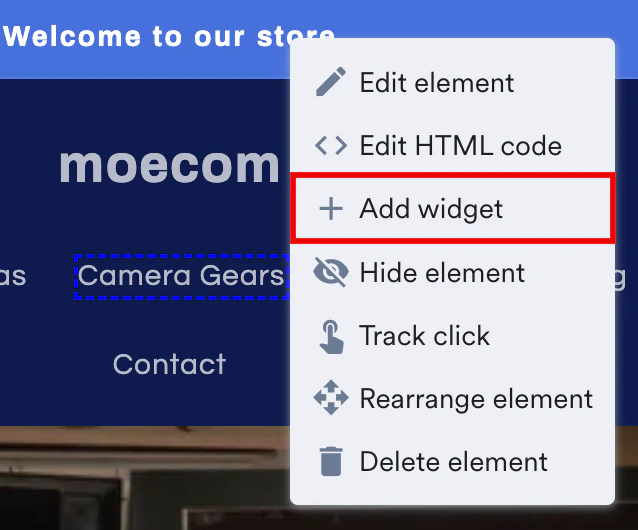 Follow the steps below to insert an image:
1. Click the Image tab.
Follow the steps below to insert an image:
1. Click the Image tab. 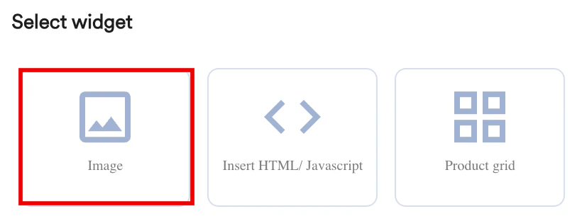 2. You are prompted to select a location to define whether the grid should be added before or after the selected element.
 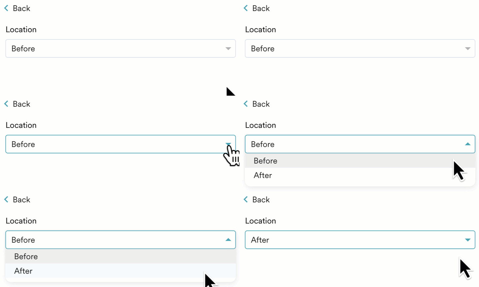 3. Customize the inserted image in the following three sections:
* **Appearance**
* Embed an image **URL** or **Upload** an image from your local storage.
* **Dimensions** - Customize the Height, Width, and Border radius of the image in pixels or percentages.
* **Margin** - Customize the Top, Bottom, Left, and Right margins for the image in pixels or percentages.
* **Padding** - Customize the Top, Bottom, Left, and Right padding to generate space around the image, and inside the borders of the selected element\
3. Customize the inserted image in the following three sections:
* **Appearance**
* Embed an image **URL** or **Upload** an image from your local storage.
* **Dimensions** - Customize the Height, Width, and Border radius of the image in pixels or percentages.
* **Margin** - Customize the Top, Bottom, Left, and Right margins for the image in pixels or percentages.
* **Padding** - Customize the Top, Bottom, Left, and Right padding to generate space around the image, and inside the borders of the selected element\ 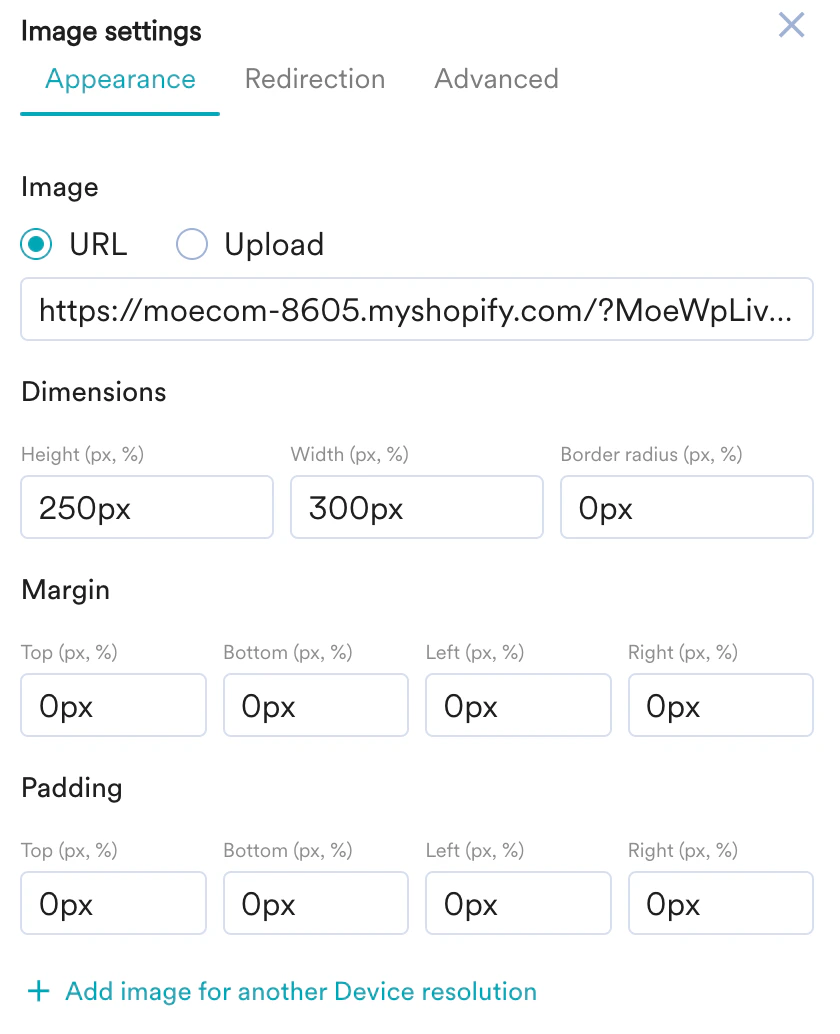 You can upload the same image and define it's width or pixel density that fits the resolution of another device.
 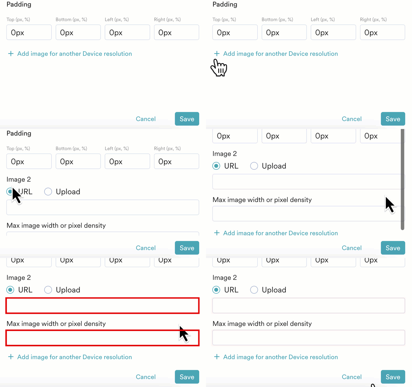 The valid input format for an image is 1024(width) or 2(pixels).
* **Redirection**
* **Enter webpage URL** - Enter a URL that redirects the users to the relevant page when they click the image.
The valid input format for an image is 1024(width) or 2(pixels).
* **Redirection**
* **Enter webpage URL** - Enter a URL that redirects the users to the relevant page when they click the image. 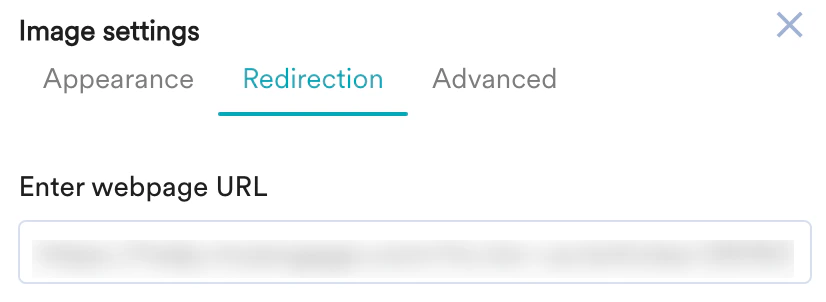 * **Advanced**
* You can also use custom scripts to customize the inserted image.
* **CSS Classes** - Enter the class name to apply the custom styles to the image.
* **Z index** - Enter the Z index value to change how the image is displayed when it overlaps with other elements.
* **Advanced**
* You can also use custom scripts to customize the inserted image.
* **CSS Classes** - Enter the class name to apply the custom styles to the image.
* **Z index** - Enter the Z index value to change how the image is displayed when it overlaps with other elements. 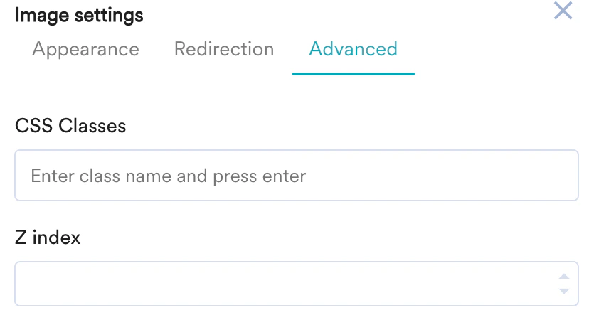 4. Click **Save**.
Follow the steps below to insert HTML/Javascript code:
1. Click the Insert HTML/Javascript tab.
4. Click **Save**.
Follow the steps below to insert HTML/Javascript code:
1. Click the Insert HTML/Javascript tab. 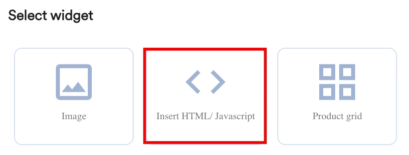 2. You are prompted to select a location to define whether the grid should be added before or after the selected element.
3. Select the **Element Type** and then click **Next**.
2. You are prompted to select a location to define whether the grid should be added before or after the selected element.
3. Select the **Element Type** and then click **Next**. 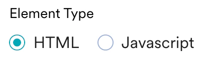 4. Enter the relevant code in the editor and then click **Save**.
 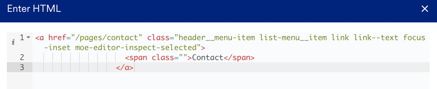 Follow the steps below to insert MoEngage's Product grid:
1. Click the Product grid tab, which will have the recommended items.
Follow the steps below to insert MoEngage's Product grid:
1. Click the Product grid tab, which will have the recommended items. 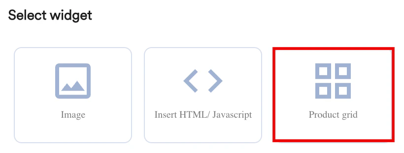 2. You are prompted to select a location to define whether the grid should be added before or after the selected element.
3. Click **Next**.\
The Edit Item Grid pop-up window is displayed where you can define the following:
* How the grid should appear (in terms of the design elements, position, layout).
* All the placeholders to be shown in the grid.
* Mapping information to the concerned placeholders.
2. You are prompted to select a location to define whether the grid should be added before or after the selected element.
3. Click **Next**.\
The Edit Item Grid pop-up window is displayed where you can define the following:
* How the grid should appear (in terms of the design elements, position, layout).
* All the placeholders to be shown in the grid.
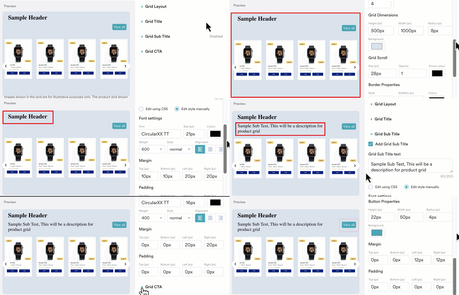
* Mapping information to the concerned placeholders. 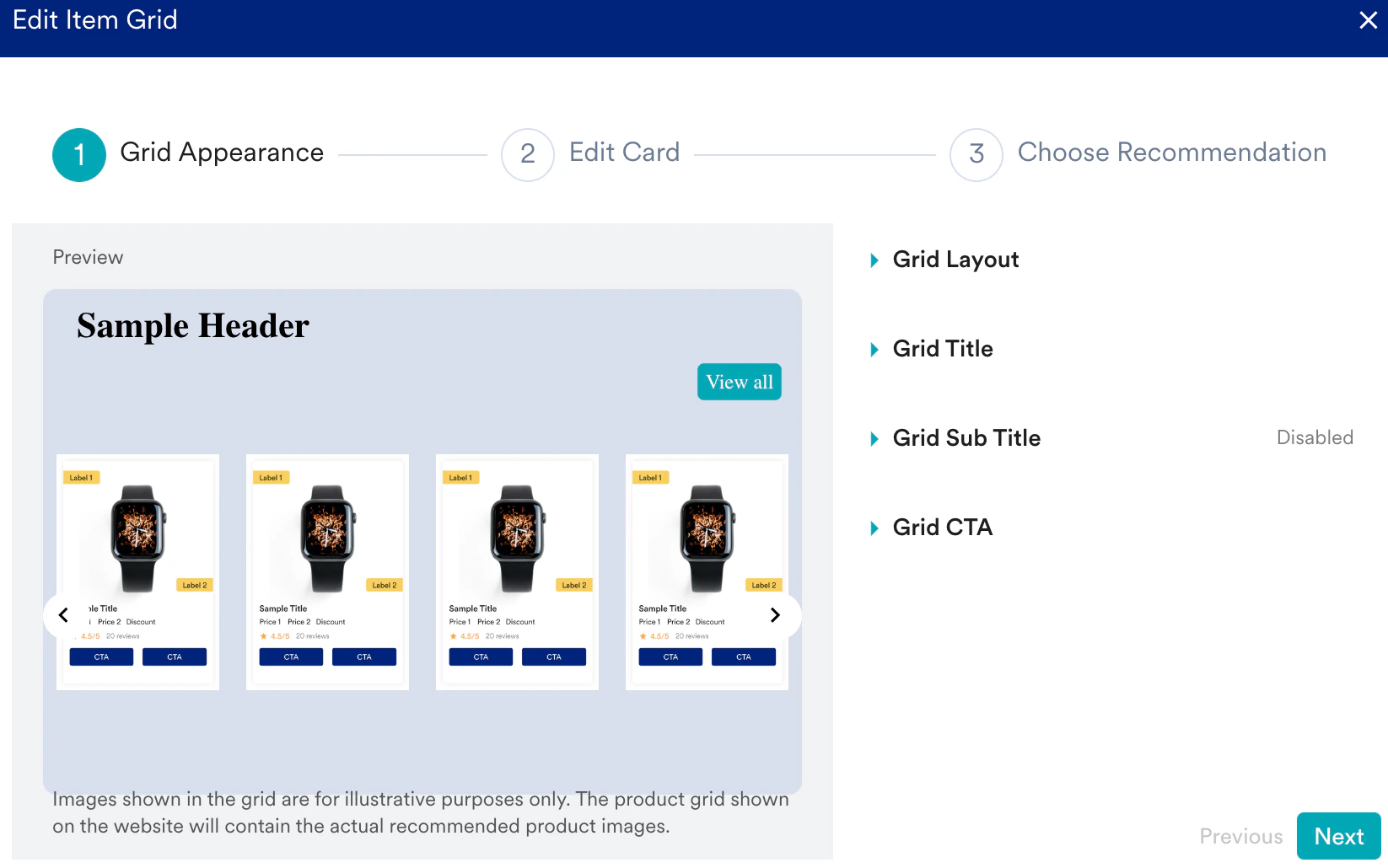 4. In the **Grid Appearance** step, select the cards layout in the grid and define the title, sub-title, and CTAs on the Grid by customizing the concerned dropdown options.
  5. In the **Edit card** step, define how each card in the grid will look like by customizing the following:
* **Title** - The header or name of the card.
* **Sub title** - A brief description on the card.
* **Image** - The image of the product displayed on the card.
* **Label** - A maximum of two labels can be added on a card that gives users essential details such as promotions, instructions, warnings, and branding elements. You can customize the look and feel of the labels either manually or by using custom scripts.
* **Price** - You can specify two price values and a discount value for the selected product.
* **Rating** - You can add the selected product's rating, which specifies its quality and customize it's look and feel either manually or by using custom scripts.
* **Review** - You can add the review details that reflect the reviewer's experience with the product or service.
* **CTA** - You can add a maximum of two CTA buttons on a card and customize their look and feel either manually or by using custom scripts.
5. In the **Edit card** step, define how each card in the grid will look like by customizing the following:
* **Title** - The header or name of the card.
* **Sub title** - A brief description on the card.
* **Image** - The image of the product displayed on the card.
* **Label** - A maximum of two labels can be added on a card that gives users essential details such as promotions, instructions, warnings, and branding elements. You can customize the look and feel of the labels either manually or by using custom scripts.
* **Price** - You can specify two price values and a discount value for the selected product.
* **Rating** - You can add the selected product's rating, which specifies its quality and customize it's look and feel either manually or by using custom scripts.
* **Review** - You can add the review details that reflect the reviewer's experience with the product or service.
* **CTA** - You can add a maximum of two CTA buttons on a card and customize their look and feel either manually or by using custom scripts. 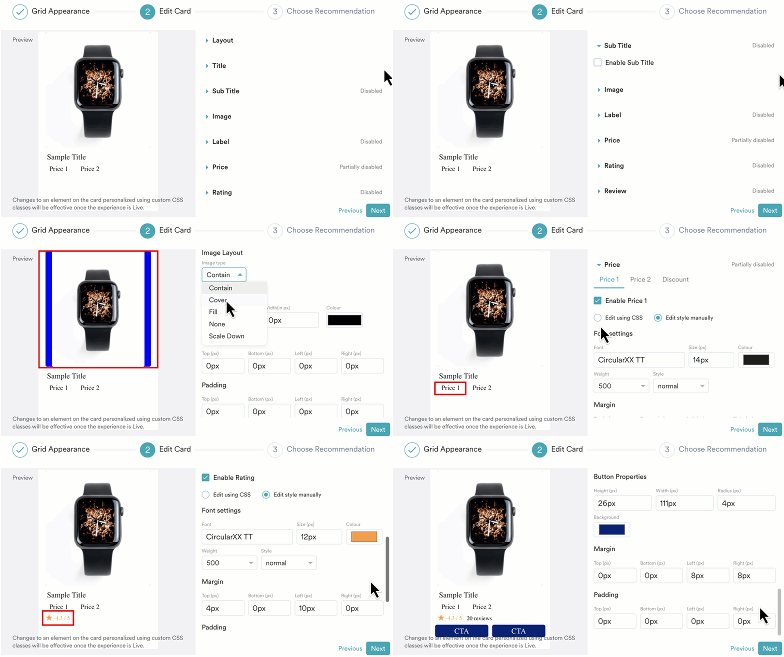 6. In the **Choose Recommendation** step, enter the following details:
* Edit your grid name/title if necessary.\
Grid Name is displayed on the Experience Analytics page of the MoEngage dashboard to show user interaction statistics.\
Grid Title is visible on your website to all eligible visitors.
* Select your Recommendation from the dropdown.\
Ensure to create Recommendations beforehand to include them in the grid. To learn more, see [Create User Action Recommendations](/user-guide/content/recommendations/basic-recommendations/user-actions-model).
* Enter all the necessary card details for the options that you enabled in the **Edit card** step.
6. In the **Choose Recommendation** step, enter the following details:
* Edit your grid name/title if necessary.\
Grid Name is displayed on the Experience Analytics page of the MoEngage dashboard to show user interaction statistics.\
Grid Title is visible on your website to all eligible visitors.
* Select your Recommendation from the dropdown.\
Ensure to create Recommendations beforehand to include them in the grid. To learn more, see [Create User Action Recommendations](/user-guide/content/recommendations/basic-recommendations/user-actions-model).
* Enter all the necessary card details for the options that you enabled in the **Edit card** step. 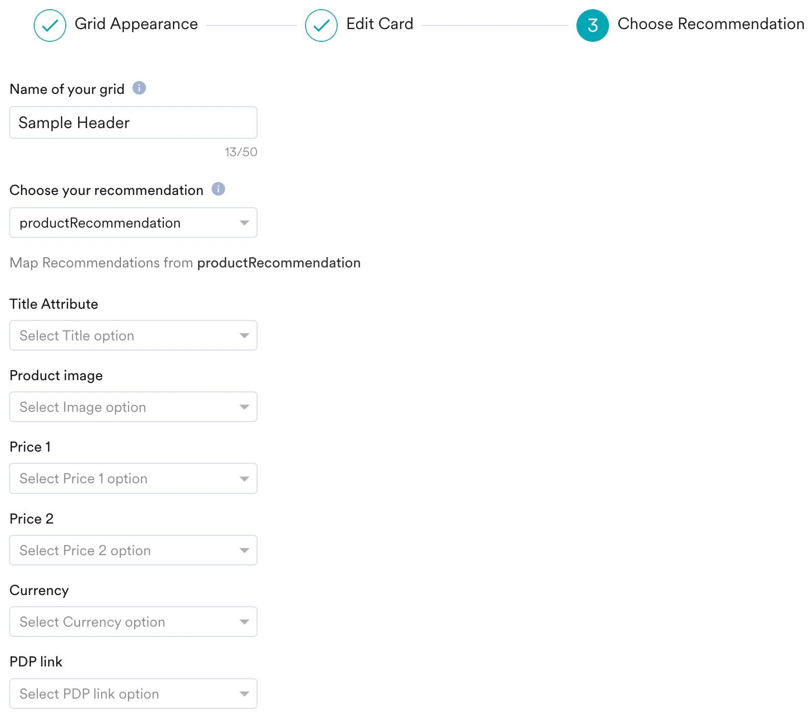 7. Click **Save**.\
**Use Case**:
* [How to Recommend Personalized Products using Product Grids](/user-guide/use-cases/personalize/recommend-personalized-products-using-product-grids)
Follow the steps below to insert a Countdown Timer:
1. Select the **Timer** widget from the list of Standard Widgets
7. Click **Save**.\
**Use Case**:
* [How to Recommend Personalized Products using Product Grids](/user-guide/use-cases/personalize/recommend-personalized-products-using-product-grids)
Follow the steps below to insert a Countdown Timer:
1. Select the **Timer** widget from the list of Standard Widgets 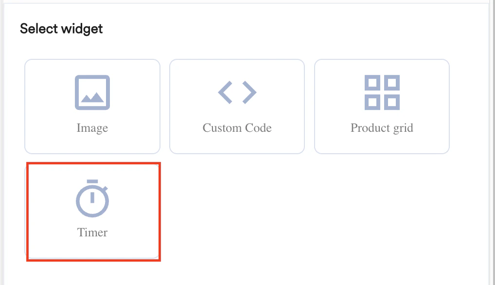 2. You are prompted to select a **location** to define whether the grid should be added before or after the selected element.
3. Click **Next**.\
The Timer settings are displayed where you can:
* Choose the timer layout (in terms of the design elements, position, and layout).
* Customize the timer appearance & content.
* Set the end date for the timer.
2. You are prompted to select a **location** to define whether the grid should be added before or after the selected element.
3. Click **Next**.\
The Timer settings are displayed where you can:
* Choose the timer layout (in terms of the design elements, position, and layout).
* Customize the timer appearance & content.
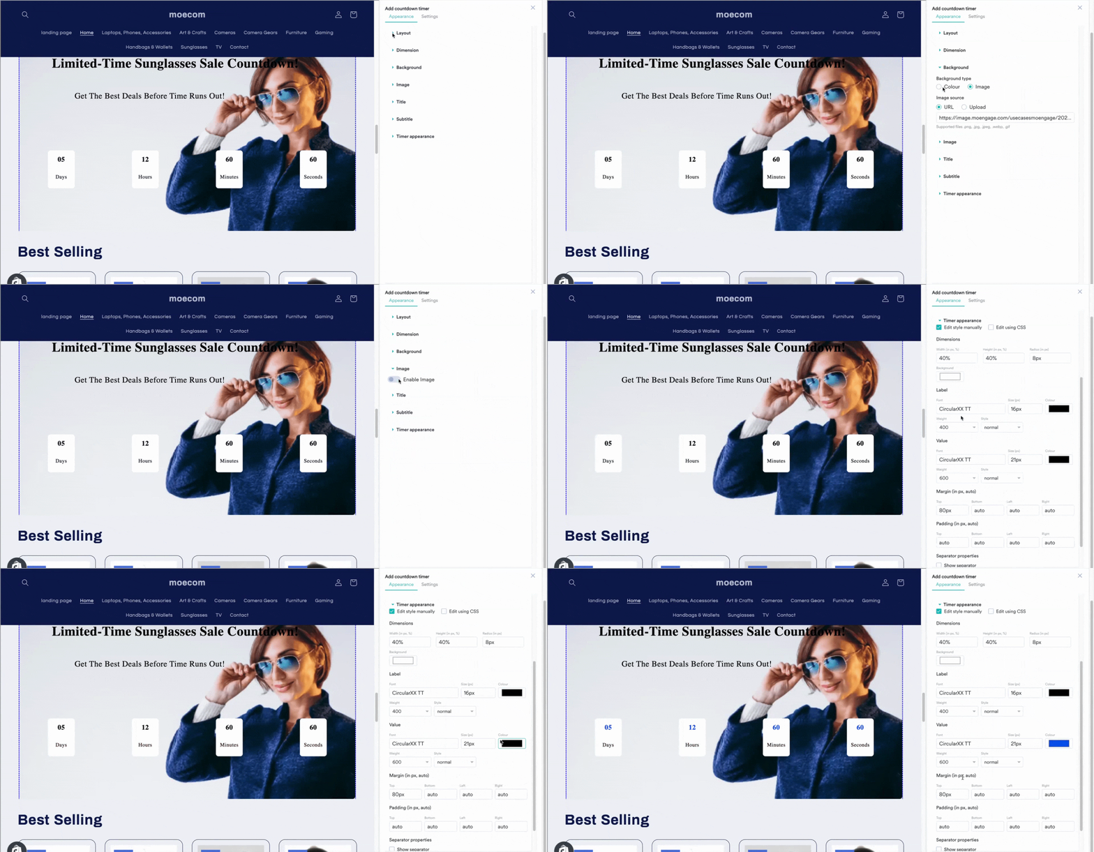
* Set the end date for the timer. 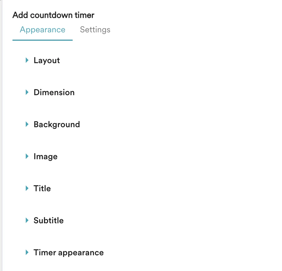 4. Select the layout, define the title, sub-title, and background image/color on the timer by customizing the concerned options.
  5. Under Settings, you can set the following:
1. **Expiry** - Set the expiry date and time for the timer. Once expired, the timer won't be shown on the webpage
* You can choose a different timezone in case you are personalizing the experience for users who are in a different geographical location
2. **Separator** - Choose among different separator options to be displayed between the countdown timer.
3. **Redirection URL -** Optionally, you can choose to redirect users to a specific webpage if they choose to click on the timer.
5. Under Settings, you can set the following:
1. **Expiry** - Set the expiry date and time for the timer. Once expired, the timer won't be shown on the webpage
* You can choose a different timezone in case you are personalizing the experience for users who are in a different geographical location
2. **Separator** - Choose among different separator options to be displayed between the countdown timer.
3. **Redirection URL -** Optionally, you can choose to redirect users to a specific webpage if they choose to click on the timer. 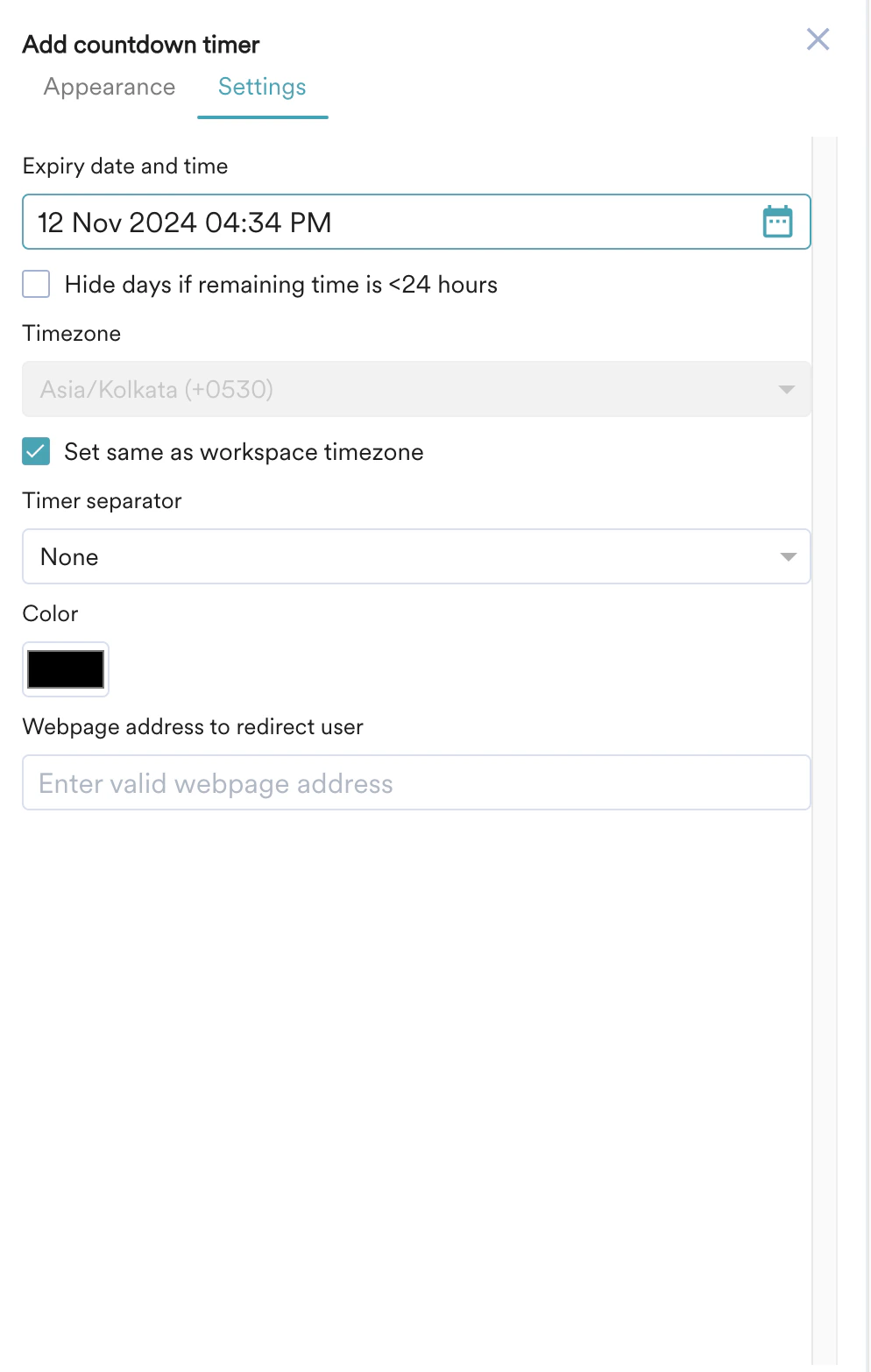 6. Click **Save**.
Perform the following steps to insert a Carousel:
1. In the **Standard Widgets** tab, select **Carousel.**
6. Click **Save**.
Perform the following steps to insert a Carousel:
1. In the **Standard Widgets** tab, select **Carousel.** 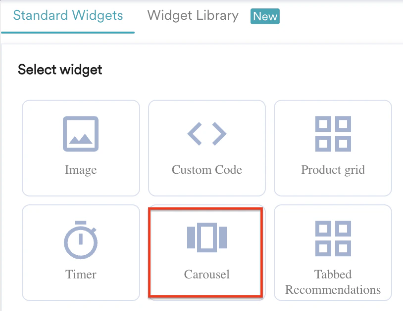 2. Choose whether you want to add the Carousel **Before** or **After** the selected element.
3. Click **Next.**
4. In the **Add Carousel** page, you can view the following tabs:
2. Choose whether you want to add the Carousel **Before** or **After** the selected element.
3. Click **Next.**
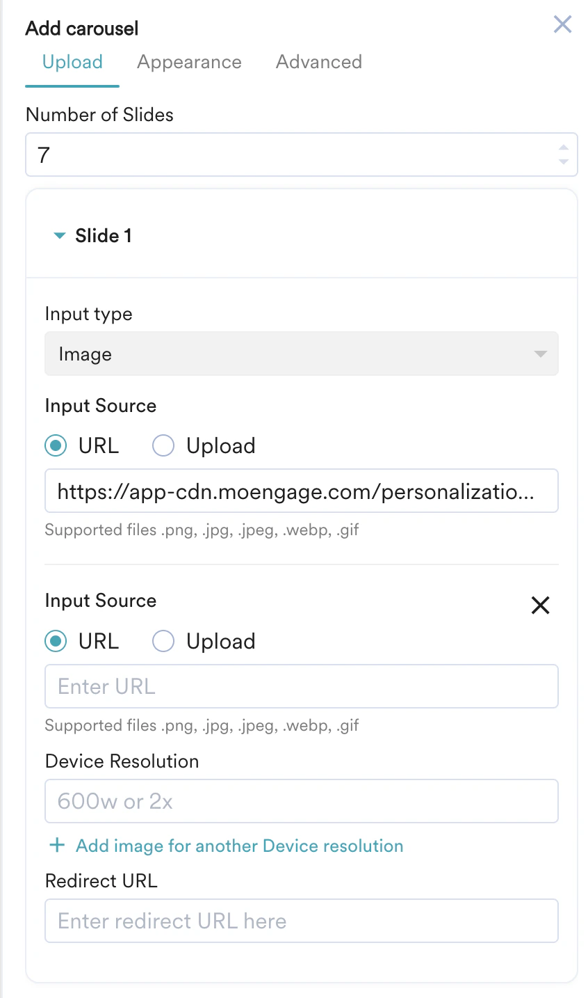
4. In the **Add Carousel** page, you can view the following tabs:  5. **Upload:** This option allows you to upload images for your carousel.
* Select the number of slides you want for the carousel in the **Number of Slides** field. Note that you can add up to 10 slides in a carousel. The slides are listed based on the number of slides you selected.
* Click on any slide to add inputs, as explained below.
* **Input type:** Select the input type for the images to be added to the carousel. The default input type is **Images**.
* **Input** **Source**: Select the input source for your image. You can use the URL or Upload from your device option to insert the image.
* Click **+ Add an image for another Device Resolution** to configure the **Input source** image and **Device** **Resolution** of images to be added for other devices. You can repeat the same process to add resolution for multiple devices.
* Enter the **Redirect URL** to add the URL to which you want your users to be redirected when they click the respective image in the carousel.
* Perform the preceding steps for each slide added.\\
5. **Upload:** This option allows you to upload images for your carousel.
* Select the number of slides you want for the carousel in the **Number of Slides** field. Note that you can add up to 10 slides in a carousel. The slides are listed based on the number of slides you selected.
* Click on any slide to add inputs, as explained below.
* **Input type:** Select the input type for the images to be added to the carousel. The default input type is **Images**.
* **Input** **Source**: Select the input source for your image. You can use the URL or Upload from your device option to insert the image.
* Click **+ Add an image for another Device Resolution** to configure the **Input source** image and **Device** **Resolution** of images to be added for other devices. You can repeat the same process to add resolution for multiple devices.
* Enter the **Redirect URL** to add the URL to which you want your users to be redirected when they click the respective image in the carousel.
* Perform the preceding steps for each slide added.\\
 2. **Appearance:** This option allows you to configure the appearance of your carousel.
* **Carousel Settings:** This option allows you to configure the dimensions, border, padding, and margin of your carousel. You can choose to edit manually, use CSS, or both by selecting the provided option.
* **Dimension**: Customize the **Height, Width,** and **Border** of the image in pixels or percentages.
* **Border:** Customize the **Style**, **Width** and **Colour** of the border.
* **Margin:** Customize the **Top, Bottom, Left,** and **Right** margins for the image in pixels or percentages.
* **Padding:** Customize the **Top, Bottom, Left,** and **Right** padding to generate space around the image and inside the borders of the selected element.
2. **Appearance:** This option allows you to configure the appearance of your carousel.
* **Carousel Settings:** This option allows you to configure the dimensions, border, padding, and margin of your carousel. You can choose to edit manually, use CSS, or both by selecting the provided option.
* **Dimension**: Customize the **Height, Width,** and **Border** of the image in pixels or percentages.
* **Border:** Customize the **Style**, **Width** and **Colour** of the border.
* **Margin:** Customize the **Top, Bottom, Left,** and **Right** margins for the image in pixels or percentages.
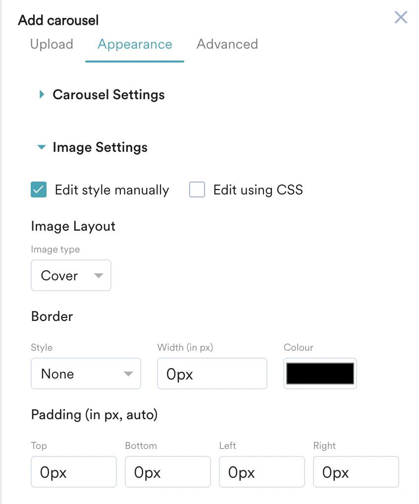
* **Padding:** Customize the **Top, Bottom, Left,** and **Right** padding to generate space around the image and inside the borders of the selected element. 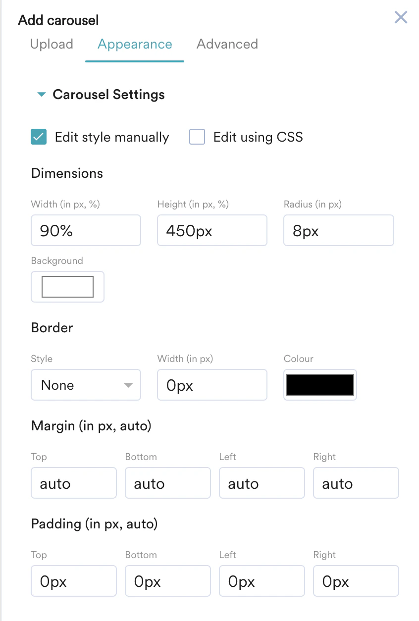 * **Image Settings:** This option allows you to configure **Image Layouts** such as **Image type, Border and Padding** for your carousel Image.
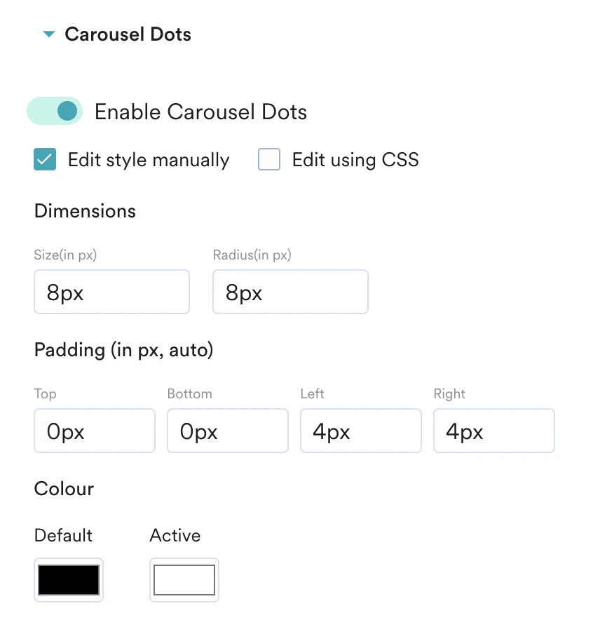
  * **Carousel Dots:** Turn the **Carousel Dots** toggle on to enable carousel dots and configure the **Dimensions, Padding and Colour** of your Carousel dots.
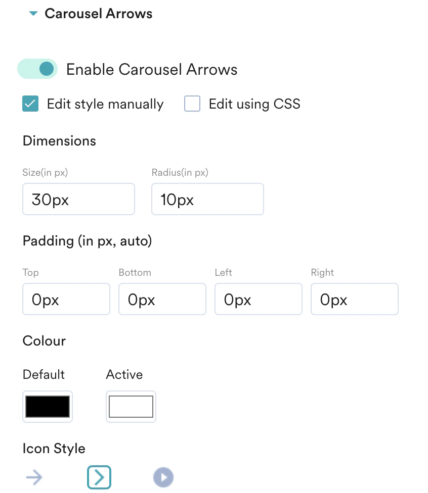
  * **Carousel Arrows:** Turn the **Enable Carousal Arrows** toggle on to add arrows to navigate your carousel and configure their **Dimensions, Padding, Colour, and Icon Style** for the arrows.
  3. **Advanced:** This option allows you to configure advanced settings for your carousels, such as **Autoscroll, Time on slide, and Autoplay behaviour**.
* If you want your carousel to scroll automatically, turn on the toggle to enable **Autoscroll.**
* In the **Time on each slide** field, you can set the duration(in seconds) of the carousel for each slide.
* If you want your carousel to play automatically, You can configure the **Autoplay behaviour** for your carousel by selecting one of the following options:
* **Restart from slide 1**: This option allows you to restart the auto-play from the first slide.
* **Stop at the last slide:** This option allows you to stop the auto-play at the last slide.
* Select the **Add to widget library** checkbox to reuse this widget later from the widget library. For more information, refer [here](/user-guide/personalize/client-side-personalization/personalize-editor-widgets/widget-library).
3. **Advanced:** This option allows you to configure advanced settings for your carousels, such as **Autoscroll, Time on slide, and Autoplay behaviour**.
* If you want your carousel to scroll automatically, turn on the toggle to enable **Autoscroll.**
* In the **Time on each slide** field, you can set the duration(in seconds) of the carousel for each slide.
* If you want your carousel to play automatically, You can configure the **Autoplay behaviour** for your carousel by selecting one of the following options:
* **Restart from slide 1**: This option allows you to restart the auto-play from the first slide.
* **Stop at the last slide:** This option allows you to stop the auto-play at the last slide.
* Select the **Add to widget library** checkbox to reuse this widget later from the widget library. For more information, refer [here](/user-guide/personalize/client-side-personalization/personalize-editor-widgets/widget-library).  Perform the following steps to insert a Tabbed Recommendation:
1. On the **Standard Widgets** tab, select the **Tabbed Recommendations** widget.
Perform the following steps to insert a Tabbed Recommendation:
1. On the **Standard Widgets** tab, select the **Tabbed Recommendations** widget. 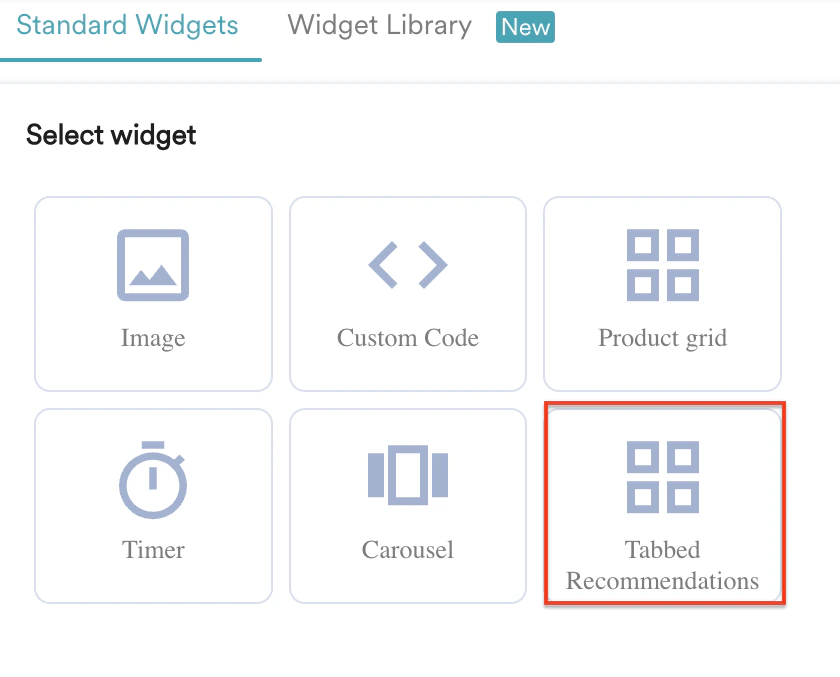 2. In the **Location** list, select whether the tabbed recommendation widget should be placed **Before** or **After** the selected element.
3. Click **Next**.
4. On the **Edit Item Grid** dialogue box, you can:
1. Configure the grid appearance (design elements, position, and layout).
2. Edit the card.
3. Choose recommendations.
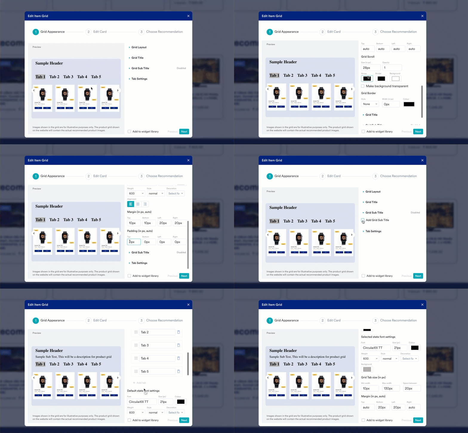
5. In the **Grid Appearance** step, configure the following components:
* **Grid Layout**: Customize the appearance of the grid layout with the provided tools.
* **Grid Title**: Enter the title for your grid and configure it with the provided tools.
* **Grid Sub Title**: Enter the grid subtitle if required and configure its appearance.
* **Tab Settings**: From the tab settings, click + Add tabs to add multiple tabs. You can showcase different products in a grid under each tab based on user interest. You can configure the appearance of each tab in different states from the following settings:
* **Default state font settings**: In this setting, you can configure the font and appearance of the tab name to be displayed by default.
* **Hover state font settings**: In this setting, you can configure the font and appearance of the tab name to be displayed when a user hovers over the name.
* **Selected state font settings**: In this setting, you can configure the font and appearance of the tab name to be displayed when a user selects a tab.
- You can add a maximum of five tabs in a grid.
- You can have only one tabbed recommendation in a variation.
2. In the **Location** list, select whether the tabbed recommendation widget should be placed **Before** or **After** the selected element.
3. Click **Next**.
4. On the **Edit Item Grid** dialogue box, you can:
1. Configure the grid appearance (design elements, position, and layout).
2. Edit the card.
3. Choose recommendations.
5. In the **Grid Appearance** step, configure the following components:
* **Grid Layout**: Customize the appearance of the grid layout with the provided tools.
* **Grid Title**: Enter the title for your grid and configure it with the provided tools.
* **Grid Sub Title**: Enter the grid subtitle if required and configure its appearance.
* **Tab Settings**: From the tab settings, click + Add tabs to add multiple tabs. You can showcase different products in a grid under each tab based on user interest. You can configure the appearance of each tab in different states from the following settings:
* **Default state font settings**: In this setting, you can configure the font and appearance of the tab name to be displayed by default.
* **Hover state font settings**: In this setting, you can configure the font and appearance of the tab name to be displayed when a user hovers over the name.
* **Selected state font settings**: In this setting, you can configure the font and appearance of the tab name to be displayed when a user selects a tab.
- You can add a maximum of five tabs in a grid.
- You can have only one tabbed recommendation in a variation.
 * Click **Next**.
6. In the **Edit card** step, define the appearance of the card by customizing the following:
* **Title**: Enter the header or name of the card.
* **Subtitle**: Enter a brief description of the card.
* **Image**: Add the product image to be displayed on the card.
* **Label**: You can add up to two labels to a card. These labels provide essential details such as promotions, instructions, warnings, and branding elements. You can customize the labels' appearance manually or using custom scripts.
* **Price**: You can specify two Price values and a discount value for a selected product.
* **Rating**: You can add the selected product's rating, which specifies its quality, and customize its appearance manually or using custom scripts.
* **Review**: You can add the review details that reflect the reviewer's experience with the product or service.
* **CTA**: You can add a maximum of two CTA buttons on a card and customize their appearance manually or using custom scripts.
* Click **Next.**
7. In the **Choose Recommendation** step, perform the following steps:
* Edit the name of your grid if required.
* Select each tab you created and add a name. This title is visible on your website to all eligible visitors. Users can select different tabs you created to view different products that are recommended in their interest.
* **Choose your recommendation** from the dropdown. You must create recommendations beforehand to include them in the grid. For more information, refer [here](/user-guide/content/recommendations/basic-recommendations/user-actions-model).
* Enter all the necessary card details for the options you enabled in the **Edit card** step.
* Click **Next**.
6. In the **Edit card** step, define the appearance of the card by customizing the following:
* **Title**: Enter the header or name of the card.
* **Subtitle**: Enter a brief description of the card.
* **Image**: Add the product image to be displayed on the card.
* **Label**: You can add up to two labels to a card. These labels provide essential details such as promotions, instructions, warnings, and branding elements. You can customize the labels' appearance manually or using custom scripts.
* **Price**: You can specify two Price values and a discount value for a selected product.
* **Rating**: You can add the selected product's rating, which specifies its quality, and customize its appearance manually or using custom scripts.
* **Review**: You can add the review details that reflect the reviewer's experience with the product or service.
* **CTA**: You can add a maximum of two CTA buttons on a card and customize their appearance manually or using custom scripts.
* Click **Next.**
7. In the **Choose Recommendation** step, perform the following steps:
* Edit the name of your grid if required.
* Select each tab you created and add a name. This title is visible on your website to all eligible visitors. Users can select different tabs you created to view different products that are recommended in their interest.
* **Choose your recommendation** from the dropdown. You must create recommendations beforehand to include them in the grid. For more information, refer [here](/user-guide/content/recommendations/basic-recommendations/user-actions-model).
* Enter all the necessary card details for the options you enabled in the **Edit card** step. 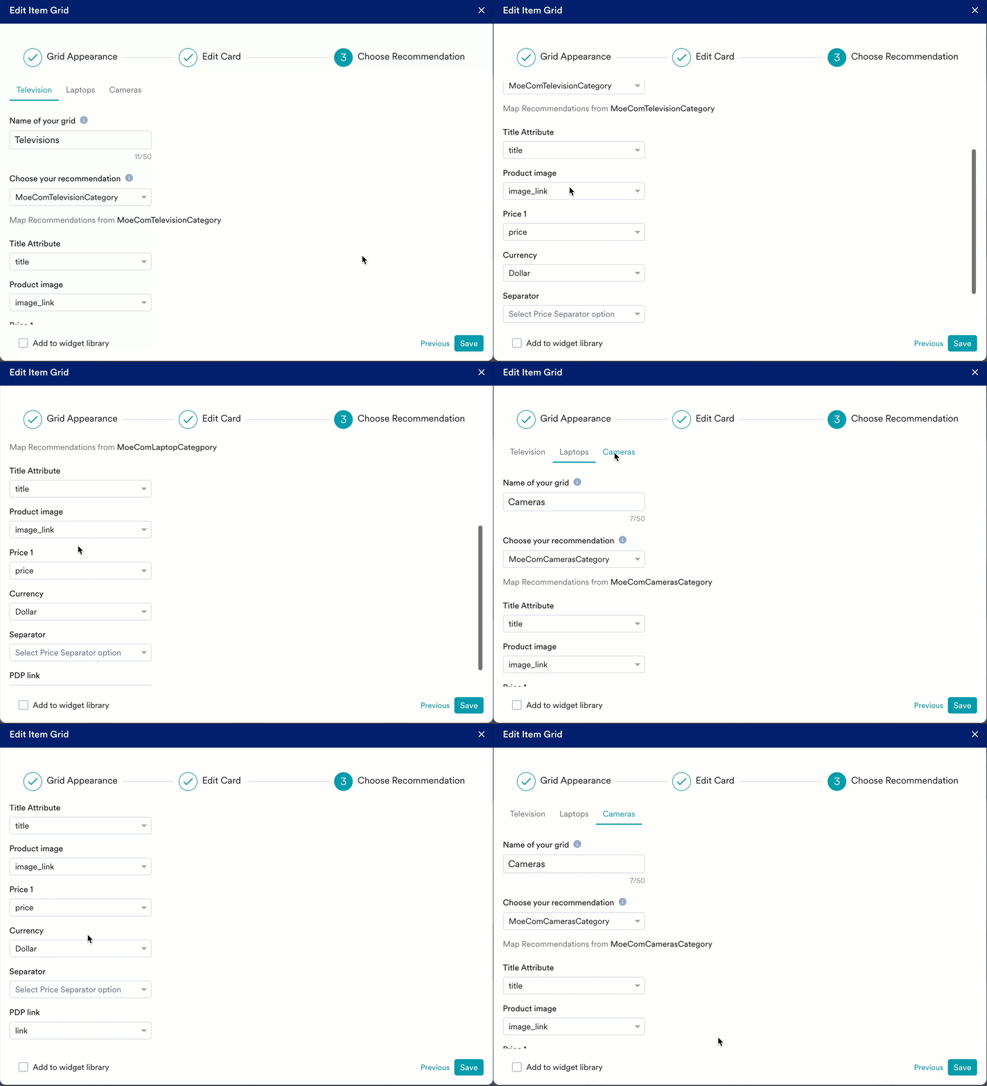 8. Select the **Add to widget library** checkbox to reuse this widget. For more information, refer [here](/user-guide/personalize/client-side-personalization/personalize-editor-widgets/widget-library).
9. Click **Save**.
8. Select the **Add to widget library** checkbox to reuse this widget. For more information, refer [here](/user-guide/personalize/client-side-personalization/personalize-editor-widgets/widget-library).
9. Click **Save**.