

Getting Started
At a high level, you will follow these standard steps to perform these analyses. While the specifics may vary based on the case and needs, this provides a general overview of the process to be followed.Choose Events
Select the events or properties for the analysis, either single or multiple. Choose those that will provide the most value for your analysis. These should generally be relevant to your users and app/website.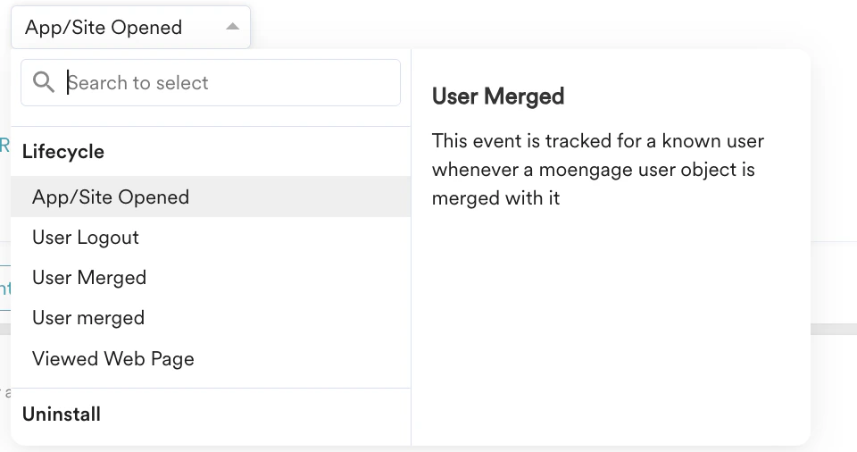
Define Attributes
Select relevant attributes for your event. Attributes provide context for the events you choose, allowing you to filter specific actions or events further.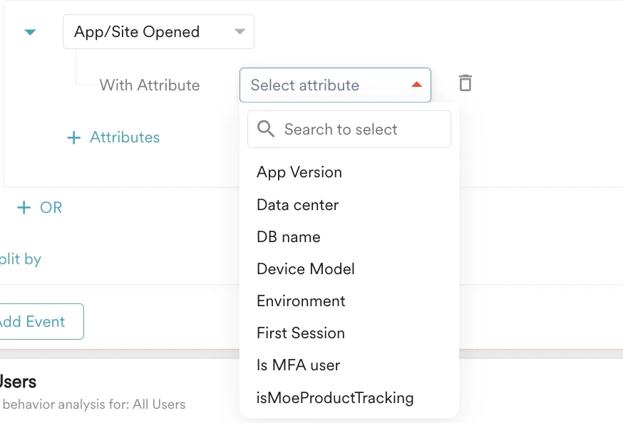
Choose Users
Identify the users on whom you want to perform this analysis. These are the individuals who have completed the set of events that you have selected. For more information, refer to Segmentation.
Analysis Options and Duration
MoEngage offers options for count-level and aggregated analysis. These options vary depending on the type of analysis. You will learn more about these options in the analysis types. After selecting the analysis option, you will specify the duration for which you wish to run the analysis.Charts
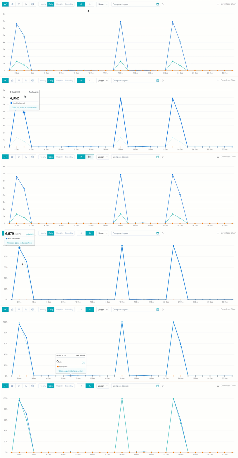
Charts are the results obtained at the end of an analysis. They visually represent data, making it easier to understand large quantities and their relationships with different data. Each analysis type offers different ways to visualize your query. To give you a general overview, the types of visualization options available are:- Line
- Bar
- Column
- Area
- Pie
- Choropleth
Tables
With charts, the data is also presented in tabular form, arranged in rows and columns. Tables are useful for locating specific information and identifying patterns. You can adjust how each table looks and what it shows—resize and reorder columns, sort and filter values, pin the columns you care about, and download the current view—without rerunning your query. These table controls are available across Behavior, Funnels, Retention, Session & Source, User Analysis, and Custom Dashboards.Sorting, filtering, and other column actions only change how the table is displayed. They do not change the underlying query or the chart above the table.
Transpose Table
You can transpose the table. This allows you to view and download the table in your preferred format by shifting its vertical and horizontal orientation.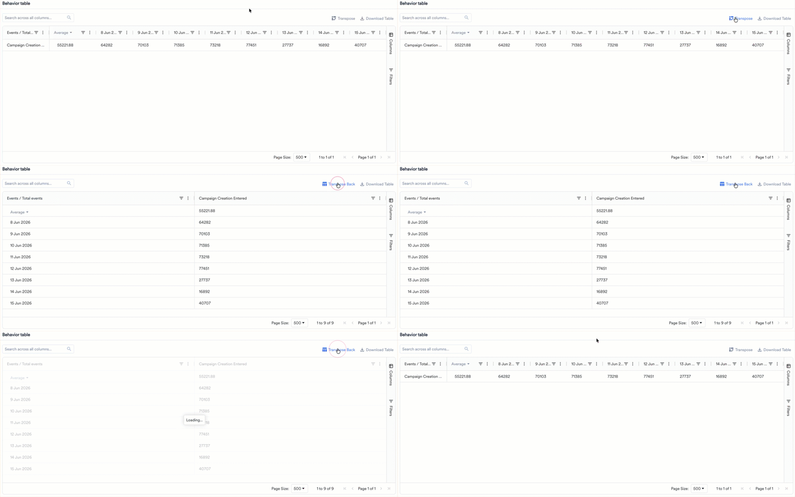
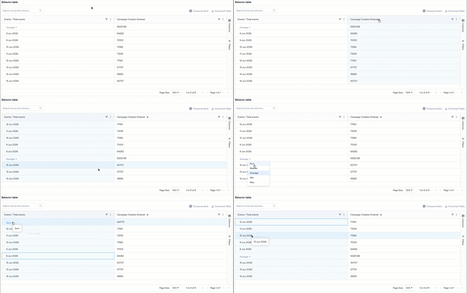
Sorting and Calculation
You can organize the data in the table without external tools. Click the header of any column to sort the table data. Sorting is available on every column.- The first click sorts in ascending order, the second click sorts in descending order, and the third click resets the column to its default order.
- To sort by more than one column, hold Shift and click additional column headers. The table applies the sorts in the order you click them.
- You can also open the column menu (the three-dot icon in the column header) and select Sort Ascending or Sort Descending.
- Sum
- Median
- Average
- Min
- Max
Resize Columns
Drag the divider between two column headers to make a column wider or narrower. Each column has a minimum and maximum width, so content stays readable. To fit a column to its content automatically, open the column menu (the three-dot icon in the column header) and select Autosize This Column or Autosize All Columns. When you resize the browser window, the table adjusts to fit the available space.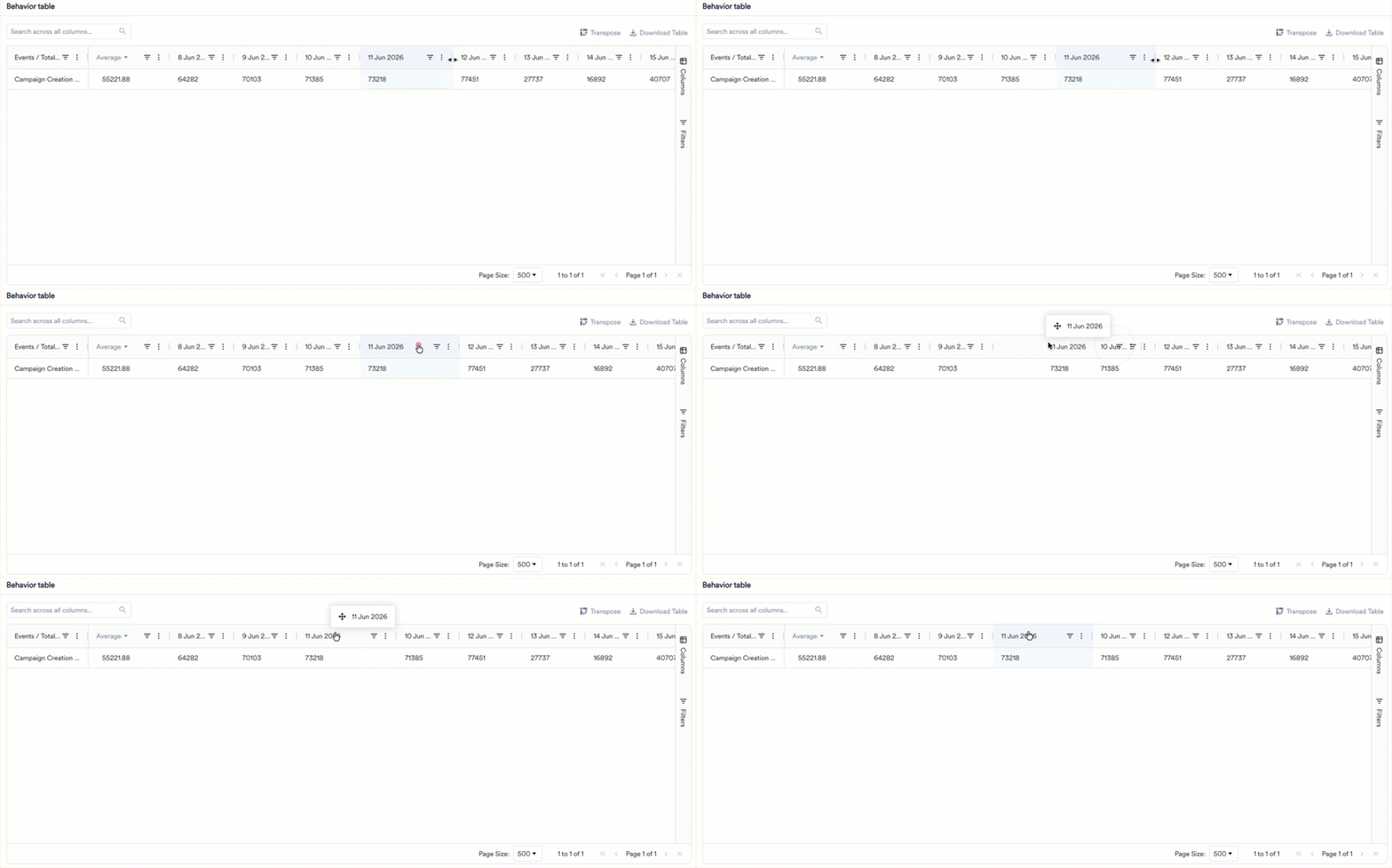
Filter
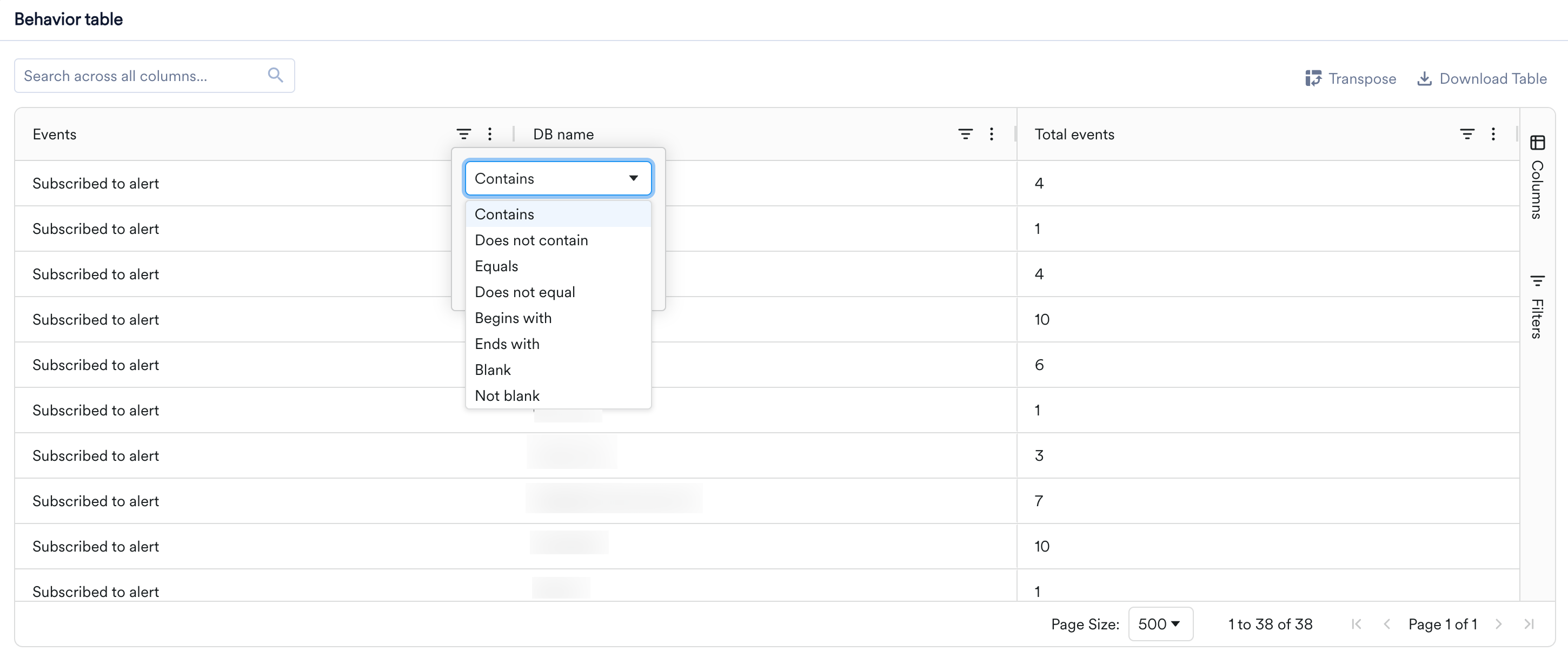
You can narrow the rows shown in a table without changing your query.- Column filters: Click the filter (funnel) icon in a column header to keep only the rows that match a condition. For text columns, the available operators are Contains, Does not contain, Equals, Does not equal, Begins with, Ends with, Blank, and Not blank. You can combine two conditions with AND or OR, and apply filters on more than one column at the same time.
- Quick search: Use the Search across all columns box above the table to find a value across all rows and columns at once. The table updates as you type to show only matching rows.
- Advanced filters: For more complex conditions, open the Filters tab on the right sidebar to assemble multiple conditions into a single filter expression.
Pin, Reorder, and Choose Columns
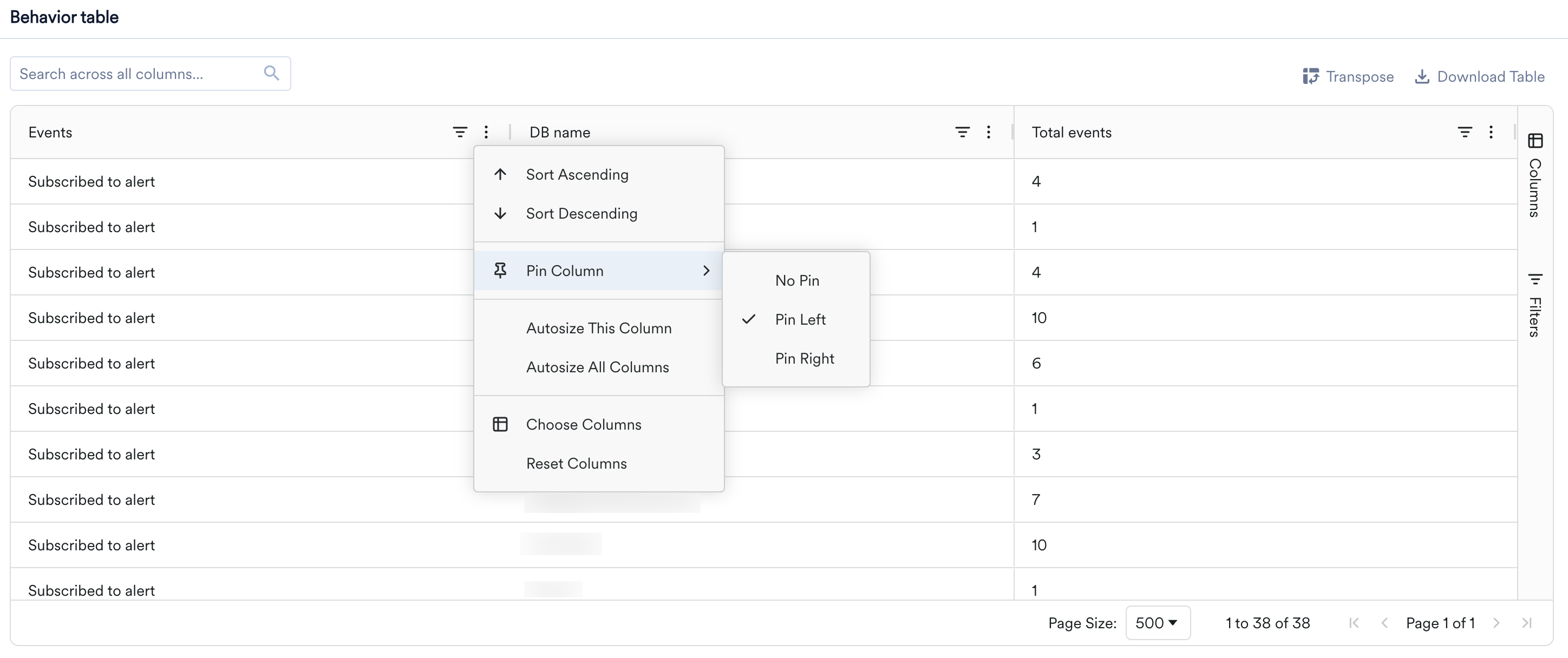
- Pin: To keep a column visible while you scroll horizontally, open the column menu (the three-dot icon in the column header), select Pin Column, and choose Pin Left or Pin Right. Select No Pin to unpin. You can also drag a column into or out of a pinned section.
- Reorder: Drag a column header left or right to change the order of columns.
- Choose columns: Open the column menu and select Choose Columns to show or hide columns, or use the Columns tab on the right sidebar. Select Reset Columns to restore the default layout.
Download the Table
To share or analyze the table elsewhere, click Download Table at the top of the table and choose Download as CSV or Download as Excel. The download reflects the table’s current state, including any filters you applied and the sort order you set, and includes all columns.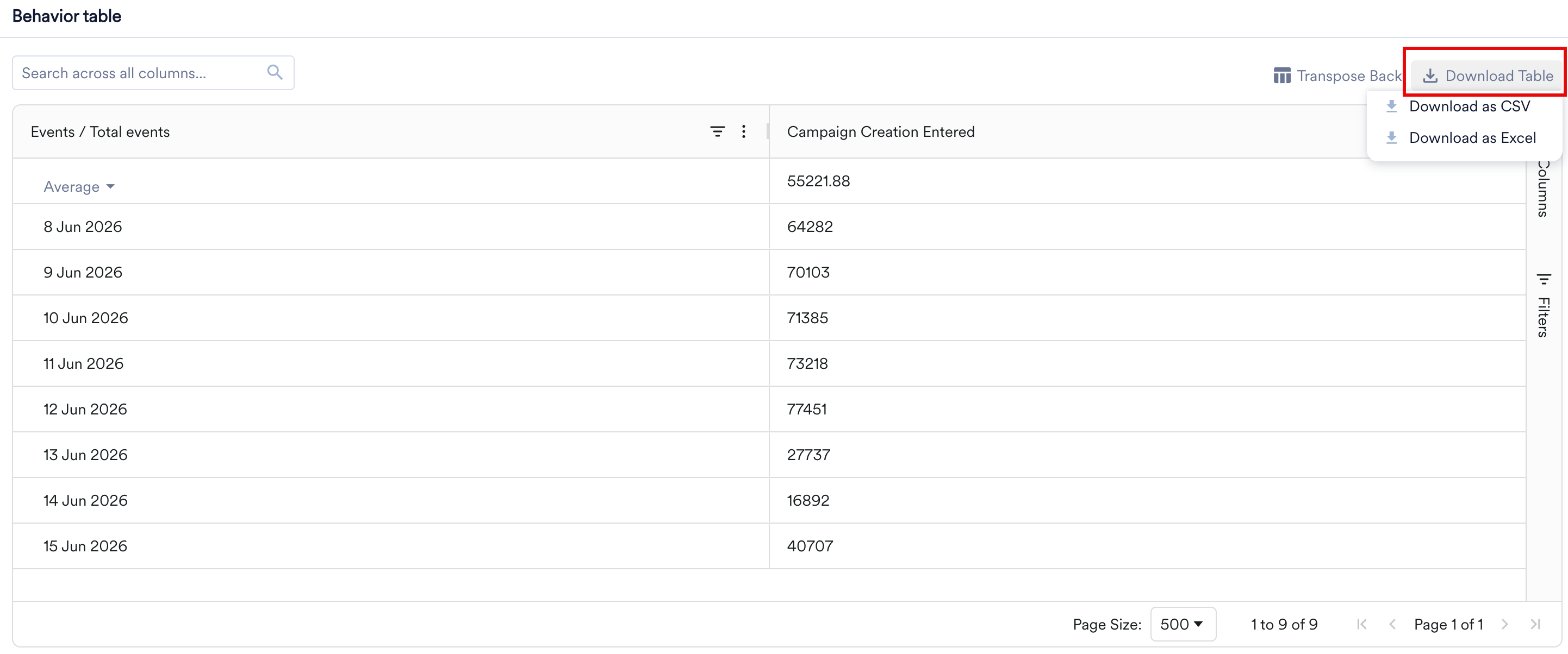
Tooltips and Copy
When a cell value or column header is too long to fit, the full text appears in a tooltip when you hover over it. Values that already fit do not show a tooltip. You can also select one or more cells and copy them to your clipboard—the copied text keeps the order in which you selected the cells.Pagination and Infinite Scroll
How a table loads rows depends on where you view it. On the analysis pages (Behavior, Funnels, Retention, Session & Source, and User Analysis), tables are paginated: a Page Size selector controls how many rows appear per page, a row count shows the current range (for example, 1 to 38 of 38), and page controls let you move between pages. On Custom Dashboards, tables use infinite scroll, loading more rows as you scroll down.Pivot Tables
This feature is only available in the Product Analytics package of MoEngage Analytics. To enable it for your account, contact your MoEngage Customer Success Manager (CSM) or the Support team.
Turn On Pivot Mode
1
Run the Analysis
Set up your Behavior or Session and Source analysis with at least one attribute to split or group by, and click Apply.
2
Turn On Pivot Mode
In the table header, next to Transpose and Download Table, turn on the Pivot mode toggle. The table opens empty, with the message Drag fields into Row Groups and Column Labels to build your Pivot, and the Columns sidebar opens on the right.
3
Build the Layout
Drag columns into Row Groups, Values, and Column Labels. For more information, see Build a Pivot Table.
Build a Pivot Table
A pivot has three parts:- Rows are what you’re comparing, such as platforms.
- Columns are what you want side by side, such as events.
- Values are the numbers you’re comparing, such as daily counts.
- Events, which holds the event names. This column appears in Behavior only.
- One column for each split-by attribute, group-by user property, or source property in the analysis.
- One column for each date in the analysis duration, at the analysis granularity. For example, a daily analysis from 17 Sep 2026 to 24 Sep 2026 lists one column for each of those eight days. A weekly analysis lists one column per week.
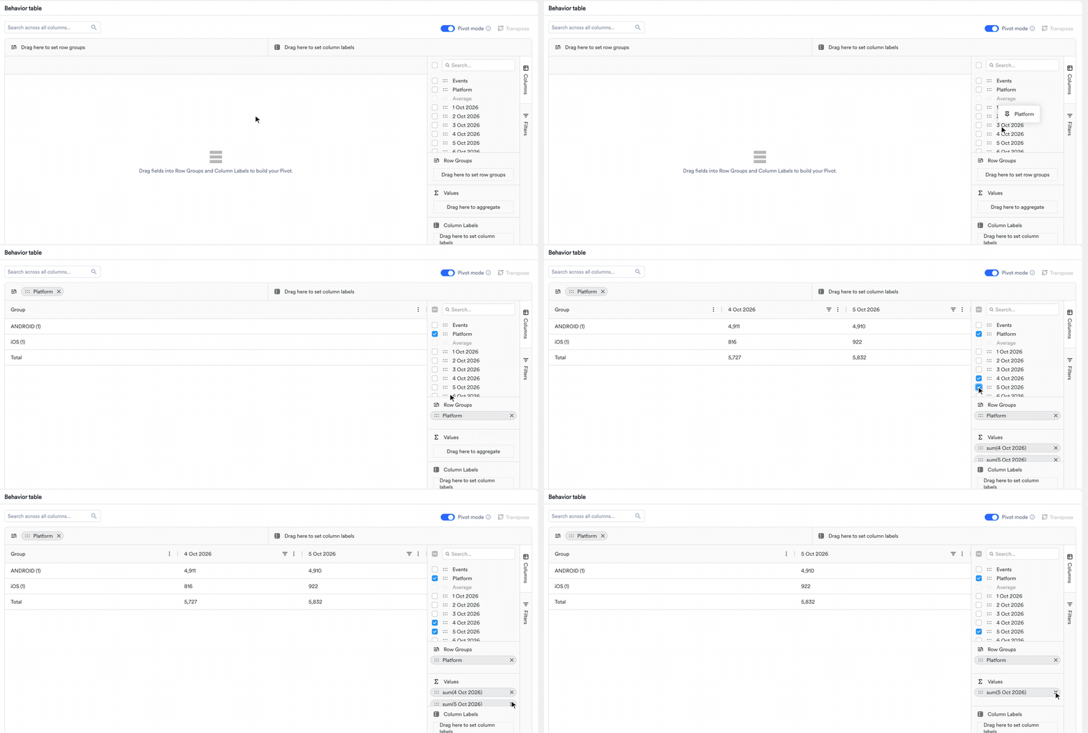
Integer, float, array, and object attributes can’t be used as column labels, because each unique value would become its own column. You can still add them to Row Groups.
- Pivot tables start collapsed, so you see only totals at first. To see the numbers by day, click the arrow next to a group name in the table header. Click it again to collapse the group.
- When you nest row groups, click the arrow next to a row group to show or hide the rows under it.
- The Total row at the bottom of the table aggregates each column across all rows.
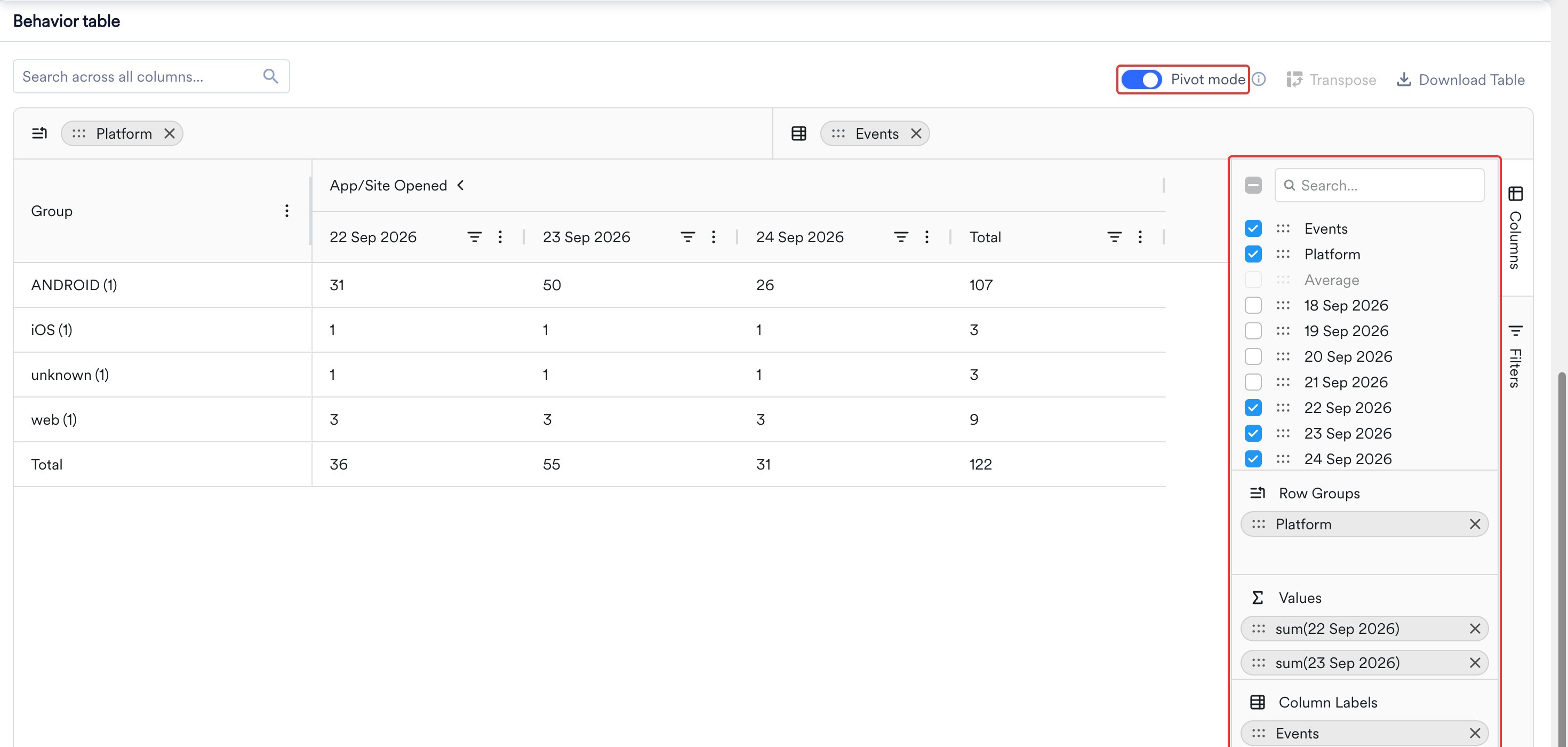
Change the Pivot Aggregation
Each column in Values shows its aggregation function and name, for example sum(17 Sep 2026). Values use sum by default. To change it, click the column in Values and select one of these functions: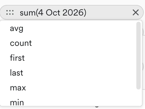
Example: Compare Carts and Orders by Platform
An ecommerce team wants to know whether shoppers on each platform turn their carts into orders at the same rate. In Behavior, the team adds two events, Add to Cart and Order Placed, splits each by Platform, chooses Total events, and runs the analysis daily from 22 Sep 2026 to 24 Sep 2026. The standard table has one row for every event and platform combination, so comparing carts to orders on the same platform means jumping between rows:
To put carts and orders side by side, the team turns on Pivot mode and builds this layout:
- Drag Platform into Row Groups.
- Drag Events into Column Labels.
- Drag 22 Sep 2026, 23 Sep 2026, and 24 Sep 2026 into Values, and keep the function as sum.
The gap is now easy to read. On 22 Sep 2026, web shoppers placed about one order for every seven carts, compared with about one in four on Android and nearly one in three on iOS. The same pattern holds on every date, which points to a web checkout problem rather than a one-day dip. With both groups collapsed, the two Total columns give the same comparison for the whole period: 270 orders from 1,800 carts on web, against 1,020 from 4,050 on Android. The Total row gives the carts and orders across all platforms.
The team can reshape the pivot to answer follow-up questions:
- Compare platforms for each event: Move Events to Row Groups and Platform to Column Labels. Each event becomes a row, and the platforms sit side by side under each date.
- Find where the gap comes from: Add City as a Group by user property and click Apply. Turn on Pivot mode again, rebuild the layout, and drag City into Row Groups below Platform. Expand Web to see which cities have the lowest orders for their carts, and collapse it to return to the platform view.
Download and Pin a Pivot Table
To share your pivot, download it or pin it to a dashboard:- Download: Click Download Table and choose Download as CSV or Download as Excel to export the table in its pivoted shape. In the Excel file, grouped column headers are kept as merged header rows. For more information, see Download the Table.
- Pin to a dashboard: Pin the table to a custom dashboard. The dashboard widget shows the pivot layout as it was when you pinned it. You can’t edit the layout from the dashboard, and the widget doesn’t show the Pivot mode toggle. To change the layout, edit the pivot in the source analysis and pin it again.
Where Pivot Is Available
You can use pivot mode in Behavior and Session and Source analyses. It isn’t available in Funnels, Retention, User Paths, or User Analysis. Pivot works best for counts and totals. It isn’t available for medians, percentiles, or ratio metrics such as bounce rate, because combining those numbers again gives misleading results. For these analysis types, the toggle is disabled, and its tooltip explains why. For example, a median shows Pivot is not available for median or percentile aggregation, and a ratio report shows Pivot is not available for a derived ratio metric like this report type.- Behavior
- Session and Source
Pivot Limitations
- You can’t add custom calculated fields to a pivot.
- You can’t edit a pivot from a dashboard widget. To change it, edit the pivot in the source analysis and pin it again.