Size of Push Template Notifications
Push Templates with 64 dp Height
The dimensions for custom Push notification are inline with the Android guidelines for custom notifications. Because of the lesser height in custom notifications, the height of the default notification is bigger than the customized notification. The reason for this is that the custom Push notification with height > 64 dp was failing on some devices. And because dynamic layouts are not feasible, MoEngage restricted the height to the dimensions according to Android guidelines. In the expanded mode, the available area for an image is as follows:
Because of the restricted space in the expanded mode, the images might get cropped even though those images appear fine in the native notifications.
Push Templates with 100 dp Height
- The new and improved Push templates with more area are available for SDK version 11.4.02 and above and the Push templates module version 2.4.0 and above.
- The look and feel of the improved notifications is similar to that of basic notifications in terms of font size, spacing, and padding.
- MoEngage supports customization of the app name and color. MoEngage is testing more original equipment manufacturers (OEMs) and will whitelist the OEMs.
- The 100 dp notifications will only work for whitelisted OEMs because the 100 dp customization doesn’t render properly on all devices, mostly due to various skin customizations done by OEMs on top of the operating system. As of now, Google, OnePlus, Samsung, Oppo, Vivo, and Motorola are whitelisted. MoEngage is working on adding more OEMs to this list.
- In addition to this, we have the provision of whitelisting OEMs at the workspace level. This means that you can choose to whitelist more OEMs or blacklist the one that is already whitelisted, after doing due diligence at your end. Please contact your MoEngage Customer Success Manager (CSM) or the Support team to modify the set of whitelisted OEMs.
- Whitelisting approach:
- For each OEM, we have tested the latest 3 skin versions because the notification behavior changes with reference to different skin versions. This will cover the latest 3 Android versions (Android 11, 10, and 9). Android 12 is not on the consideration list because the notification layout for Android 12 is very different.
- If 100 dp renders fine for all the 3 latest skin versions, MoEngage will whitelist the OEM else will consider each OEM on a case-by-case basis.
- If MoEngage does not support the 100 dp for a device/OEM, the 64 dp custom push notification will be rendered
- Maintain an Image Aspect Ratio of ~2:1.
Cropping is minimal when the image is close to this aspect ratio. However, you might notice some cropping on a few devices despite images following this aspect ratio. This is because of the following reasons:- The varying device sizes in Android.
- Some OEMs add further customizations on top. For eg: In RedMi devices, additional padding is added around push notifications which leads to further cropping of the Push notification & the image.
- Create images such that the content is center aligned.
This would ensure that the main content doesn’t get truncated even if some cropping is happening around the margins.

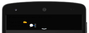
Users Receive Stylized Push Notifications Without Background Color
Some users received the Push notification with HTML content but without the background color. The following are the possible reasons for this issue: Whenever you configure a Push template notification with:- HTML text (meaning, you have either set the text as bold, italic, underlined, strike-through, or added some text color) and
- Background color
- Image
- Renders a basic push notification with HTML text fields and app icon.
- Then, the SDK tries to draw the custom layout containing the background color. If you configure an image, SDK will try to download the image in parallel.
Impact of Background Color Rendering Failure
- If you set your text color as white, users see a blank notification as shown below if their device theme is set as light mode:

- If you set your text color as black, users see a blank notification as shown below if their device theme is set as dark mode:
- Wherever possible, use text colors that contrast with light and dark backgrounds.
- While creating campaigns on the MoEngage dashboard, check the preview in both dark and light modes to make sure the notification looks fine in both modes.