


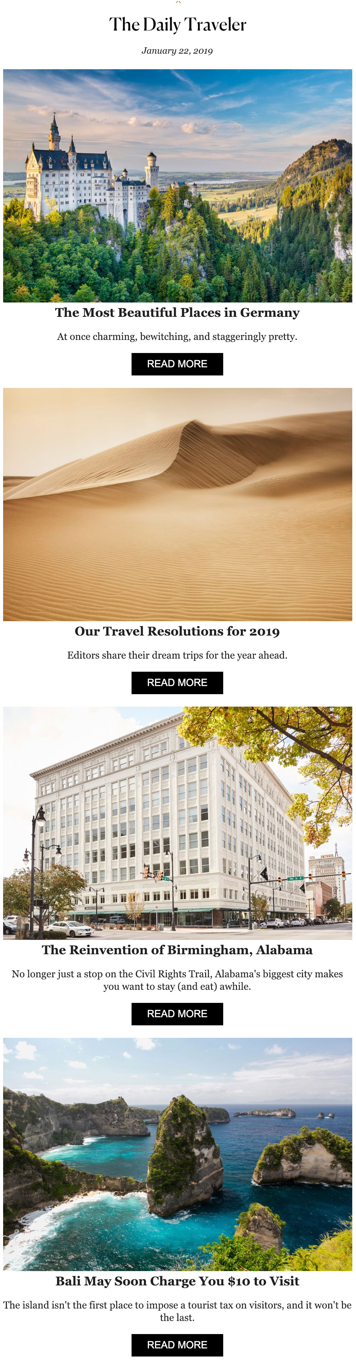
The Ultimate Guide to Email Design Best Practices for Marketers

What’s there to email design, you ask? Well, there’s plenty of artistry, strategic thinking, and a whole lot of drama to begin with. After all, the best emails are the ones that compel the reader to think, pause, and ultimately, take the desired action. Let’s look at what the data tells us:
- According to research, emails with a personalized subject line have a 50% higher open rate than those who don’t.
- Another study claims that emails with longer subject lines (110–140 characters) have higher click-through and open rates.
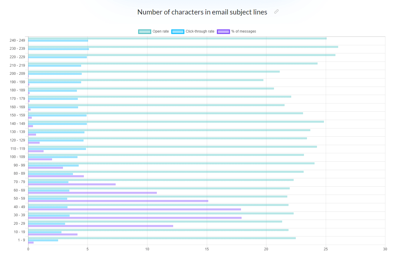
(Note – Open the image in a new tab for a clear view) |
- Additionally, further research claims that emails with an emoji in the subject line boast of 3% higher average open rate than emails without them.
- Finally, certain words and symbols can boost the email’s clickable rate, such as:
 |
Clearly, designing an email is more than just inserting a relevant CTA button and calling it a day.
In this blog, we will deep-dive to understand some of the best email design best practices that have stood the test of time and won over the customer’s hearts. Let’s jump right in.
Top-5 Email Design Best Practices to Follow in 2021
To help you get started, we’ve created this email design checklist that you can use to nail your email design process:
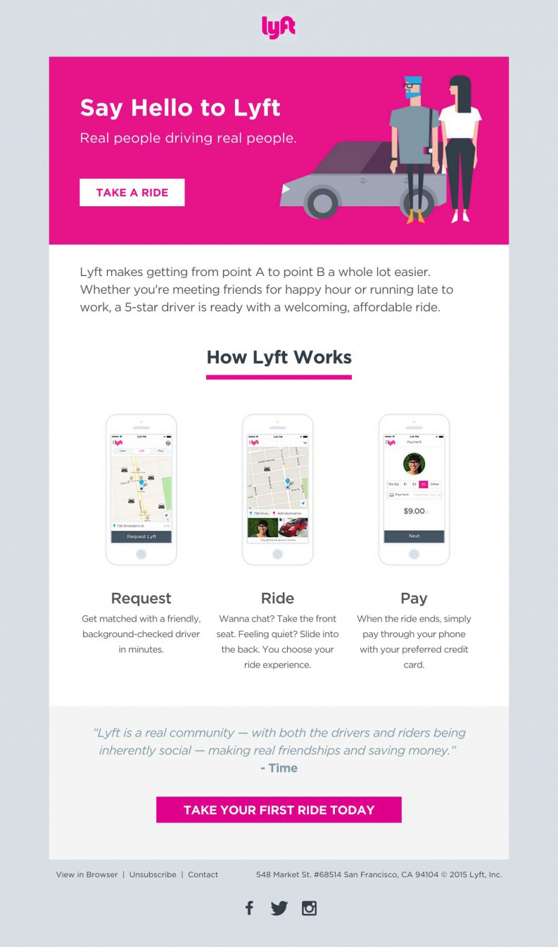
1. Sketch an Email Layout to Get Started in the Right Direction
Before you get into the email design process, you’ll need to create a rough sketch of what your email should look like. Follow these steps:
- Sketch a mockup of your email.
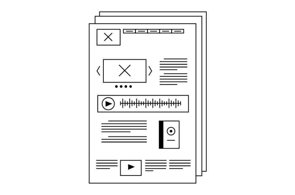 |
- Use a logical hierarchy-complete with bold, large headlines and stand-out images to guide the reader.
 |
- Space out your content into relevant buckets.
|
- Strategically and innovatively think about the kind of images and GIFs you’ll want to use in the email design as Asana does.
 |
- Factor in the content for your header and footer, and keep it relevant and crisp as Lyft does.
|
| Pro Tip: When conceptualizing your email layout, think about how you will guide your reader in terms of what they should check out first and how they should proceed ahead. |
2. Ideas for an Email Design Layout
a) Go for the ‘Inverted Pyramid’ Email Design Style to Focus Subscribers on What’s Most Important
The inverted pyramid is a framework for logically categorizing key elements of your email layout (think: header, content, imagery, CTA, etc.) to reel the reader in and compel them to take action. Here’s an example for your reference:
|
The idea is to guide your subscriber down the page to your CTA button(s) and encourage them to explore your brand’s offerings as seamlessly and logically as possible.
b) Make Intelligent Use of ‘Dynamic Content’ to Engage Better with Readers and Segment Subscribers
To create an eye-catching and appealing email design, you can dynamically change sections of your content as Adidas does.

|
Here, you’re playing with dynamic content to hold onto the user’s attention and offer a different perspective (quite literally) within seconds.
c) Opt for an ‘Angular, Zig-Zag’ Email Design Grid When There are Lots to Talk About
If you’re thinking of rolling out an email that contains plenty of images and information, go angular. Confused? Consider the following example by Sephora for inspiration:
 |
Here’s why this type of email design works
- It is a functional and visually appealing layout.
- It allows the brand to offer a lot more information, without making it look chaotic or cramped.
To create this type of email, follow these steps:
- Build on angles using imagery or color blocking to guide the onlooker at every step.
- Keep the content crisp, short, and easy to read.
- Focus on the layout and may sure that it is proportionate.
 |
The Learning: An angular, zig-zag-driven layout works best to guide the reader’s attention and help them browse through the information quickly, thanks to an organized email design. In simpler words, it makes the email content easy to digest.
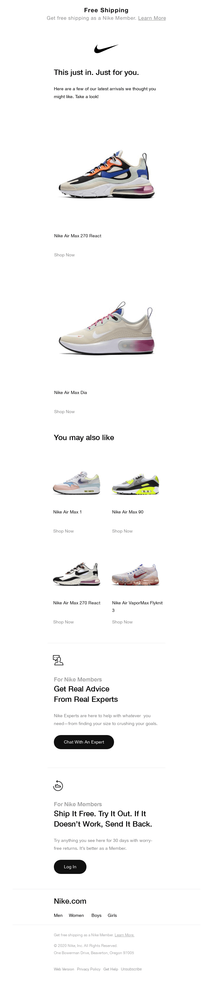
d) Go for a ‘One Column’ Email Design If You Are Blasting Emails for Mobile/Desktop Use
Zooming out and pinching in to read your email is hardly going to help you convert readers. This is why you should think about which device your email is going to be viewed on. Here’s an example of a single column email by Sole Fitness that is promoting a new model of the Nike series:

|
Here’s why this email works:
- The brand uses different close-up images of the product based on the device it will be viewed on.
- Its CTA button clearly stands out.
- Its email preheader reads – “Waffle locket included + up to 60% off sale items!” – setting the expectation for what subscribers can expect inside the email.
In technical terms, we call this a responsive email design:

|
This type of design automatically adapts to the size of the device screen–be it resizing or the ability to be organized differently so the content can be optimally viewed on mobiles, desktops, tablets, etc.
| Bonus Material: If you are looking for a useful template-builder, try MoEngage’s drag-and-drop email template builder. |
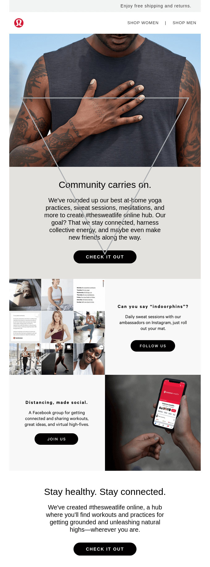
3. Think Through Your Images and Graphics
There are numerous best practices to keep in mind when using images and graphics for your email design. These include (but are not limited to):
- Image Dimension – To ensure an HD quality image display, keep your image at the size of 1200px:
- File Size – Make sure to keep your total image data weight between 600-800k. The smaller the file size, the faster your email will load.

|
- Alt Text – You can add in an alternative text, a.k.a, Alt Text, in case your image doesn’t load. You can use the overlaying text in the image as the alt text.

|
- Image-to-Text Ratio – Ideally, try to follow an 80:20 text-to-image ratio in emails, though it isn’t a hard-and-fast rule.
- Stock Images: Avoid stock images like the plague and use genuine and real brand-centric product images across your emails. You could do photoshoots to give your email a fresh look every single time. Alternatively, you could explore AI-generated art for your emails to give them a unique touch.
 |
| Pro Tip: Don’t use heavy videos when designing your email. Instead, go for a GIF teaser of the video to get more clicks and cash in on fast loading time. |
4. Always Use Web Fonts for Better Legibility Across Devices
It is always safe to use web-safe fonts for live text in your email, such as:
- Arial
- Verdana
- Georgia
- Times New Roman
- Courier
Why? Because these fonts that default fonts that are used across computers, devices, and operating systems.
| Pro Tip: You can use Google Fonts to add web fonts to your emails. Plus, try to play with varying type sizes and grayscale colors to focus on what’s important and what’s less important. |
5. Add Ample White Space to Encourage Click-Throughs
White space–or negative space–refers to the blank area around your content, images, and call-to-action buttons. So how can you ensure there’s plenty of white space within your email design, without making it look disproportionate? Here’s how:
- You can use active white space when you intentionally want to emphasize certain aspects of your email.
- You can use passive white space–or the space around the edges of your email design to give your email layout a breather from all the content, images, and other elements.
Take a look at Pinterest’s email example, which shows the original email:
 |
And the division between the active white space (red section) as well as passive white space (green section):
 |
| Pro Tip: Your CTA button should always have white space around it for it to stand out. Plus, it should at least be 50 pixels tall. You can also color-code your CTA buttons and use different colors for primary and secondary buttons, as shown below:
You can also use bright, contrasting colors or color blocking to allow users to focus on the key message of every email.
|

All in all, adding white space separates different elements visually in your email and boosts the legibility of your email. Use your intuition and play with the layout.
Bonus Pointers to Keep in Mind
|
Wrap Up
Email design is all about keeping the user experience in mind and designing with user data, intuition, and a rock-solid mock-up to start with. Use these tried-and-tested hacks and bring your emails to life, quite literally.
Here’s What You Can Read Next |


