


Email Marketing Dashboard: Best Tools, Metrics & Examples
If you’ve ever felt like your email data isn’t telling you the full story, you’re not alone. Most marketing teams spend hours trying to connect different tools, only to end up with a scattered email marketing dashboard and data that doesn’t say anything.
But the problem isn’t the platforms themselves. It’s knowing which email metrics actually matter, how to organize them properly, and which email marketing automation software won’t break the bank or require a tech degree to operate.
A properly set-up email dashboard does more than display numbers. It becomes the command center that shows what’s working, what’s failing, and what needs immediate attention. But here’s the catch: most marketers skip the planning phase and jump straight into tool selection.
That’s going backwards. The best email dashboards start with clear goals, then choose the right software to match those needs. This guide walks you through both the parts: the strategic setup and the practical software choices that make it all work together seamlessly.
Let’s get started.

What is an Email Marketing Dashboard?
An email marketing dashboard is a centralized interface that displays key performance metrics from your email campaigns in real-time. It combines data from multiple sources into visual charts and graphs that marketers can use to track opens, clicks, conversions, and revenue without switching between platforms.
Most marketers don’t realize how much time they waste bouncing between tabs, trying to answer simple questions like: “Did that last campaign even work?” A good email marketing dashboard gives you those answers at a glance. Instead of logging into five different tools to check campaign performance, subscriber growth, and revenue attribution, everything appears in one place.
The best email dashboard, however, goes beyond basic metrics. It shows trends over time, segment performance comparisons, and automated alerts when something needs attention.
5 Benefits of Using an Email Dashboard
Most marketing teams know the drill: check Mailchimp for open rates, jump to Google Analytics for website traffic through emails, then dig through Salesforce to see which emails actually made money. It’s exhausting and inefficient, honestly speaking. But a proper email dashboard changes how teams approach email marketing by putting everything in one organized place.
Here’s what it brings to the table:
- Instant visibility across campaigns: An email dashboard gives you a real-time, bird’s-eye view of your entire email ecosystem—from executing automated flows to creating email newsletters that stand out. You can track performance, spot trends, and act fast, all without digging into multiple tools.
- No more wasting time on data collection: Remember spending entire mornings just gathering numbers for one report? Log into the email platform, export CSV files, copy numbers into spreadsheets, then repeat the process for three other tools. A dashboard cuts that 3-hour nightmare down to about 10 minutes. Instead of being a data collector, you can now actually think about what the numbers mean and spot trends that matter.
- Faster, more confident decisions: Access to campaign data shouldn’t require a team of analysts. An email campaign dashboard gives marketers the power to act fast and with confidence, based on current numbers, not end-of-week reports.
- Early detection of problems you’d otherwise miss: Without centralized data, issues like a slight dip in open rates or a slow decline in email deliverability go unnoticed until someone says, “Wait… when did that start?” An email dashboard lets you spot subtle issues early. That gives you time to course-correct before small problems become big ones.
- See the whole picture, not just pieces: Email metrics alone don’t tell you much. Sure, a 27.42% email open rate for BFSI brands sounds decent, but what if those opens never turn into sales? When you can see how those clicks turned into actual purchases, or which subject lines led to the biggest orders, suddenly the data makes sense.
- Share results without the hassle: No more scrambling to build PPT presentations before every meeting, hunting down screenshots, or trying to remember which campaign performed best three weeks ago. Stakeholders can check the email reporting dashboard whenever they want, which means fewer “Can you pull some numbers?” requests at 5:30 PM on Friday. Plus, everyone sees the same data in real-time, so there’s no confusion about whether the numbers are current or from last month’s report.
- Scale without adding complexity: More campaigns used to mean more chaos. Five email lists become ten, then twenty. Marketing automation workflow sequences multiply. A/B tests pile up. An email marketing dashboard actually gets more valuable as you send more emails, because it organizes all that complexity automatically. Teams can double their email volume without doubling their workload.
- Track and prove ROI from every email touchpoint: It’s not enough to say, “We sent an email.” You need to know what that email did. Did it drive revenue? Increase traffic? Nurture signups? An email marketing dashboard gives you clear ROI visibility, so you can stop wasting effort on low-performing campaigns and start doubling down on what’s driving real business results.
So now you understand the real value of having an email performance dashboard. But what should it actually track?
In the next section, we’ll walk you through the essential email marketing KPIs (not just the obvious ones) and explain how each one tells a story about your performance (and where it’s heading).
5 Essential Metrics and KPIs to Track Using Your Email Marketing Dashboard
Most email marketers get stuck watching vanity metrics. But if you want your email dashboard to actually help you optimize performance, guide decisions, and drive ROI, you need to focus on actionable KPIs.
These are the email marketing metrics that help you understand not just what happened, but also why it happened and what to do next.
Here are five essential metrics every high-performing email dashboard should track:
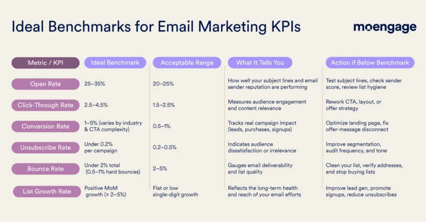
- Open Rate: This tracks the percentage of recipients who open your email. It’s a key signal for subject line performance and inbox placement. If open rates drop, it could point to deliverability issues, audience fatigue, or weak messaging (try using the best subject lines that would boost open rates). A healthy open rate sets the stage for every downstream engagement metric.
- Click-Through Rate (CTR): CTR measures how many recipients clicked on one or more links in your email. It reflects how compelling your content and calls-to-action are. A high open rate with a low CTR usually means the email failed to deliver on its promise or wasn’t relevant enough after the open.
- Conversion Rate: Conversion rate shows the percentage of recipients who completed your intended goal—whether that’s a purchase, form submission, or demo request—after clicking. This is your clearest metric for revenue-driving performance. If your CTR is strong but conversions are weak, the issue likely lies in your landing page or offer alignment.
- Unsubscribe Rate: This metric tells you what portion of your audience is choosing to opt out. High unsubscribes can signal that your content isn’t meeting expectations or that you’re sending too frequently. It’s a quiet but crucial health indicator; if you ignore it, you risk burning out your list and losing long-term trust.
- Bounce Rate: The bounce rate reflects how many emails failed to reach inboxes. Hard bounces usually mean bad or outdated addresses, while soft bounces are temporary issues. A high bounce rate damages your sender reputation and affects future deliverability. Keeping it low helps maintain a clean, healthy list that actually sees your emails.
Use the table below as a practical cheat sheet to understand what your email marketing benchmarks should look like, what ranges are still okay, and what action to take if things start slipping.
But how does this all come together in the real world?
Let’s take a look at top-performing email dashboard examples, including what they show, how they’re structured, and why they work (especially for fast-moving marketing teams).
Top 8 Email Campaign Dashboard Examples to Learn From
The goal of a great email marketing dashboard isn’t just to show metrics, but to surface deeper insights.
Below are eight email marketing dashboard examples, each solving a specific problem, answering a meaningful question, and keeping your team from flying blind.
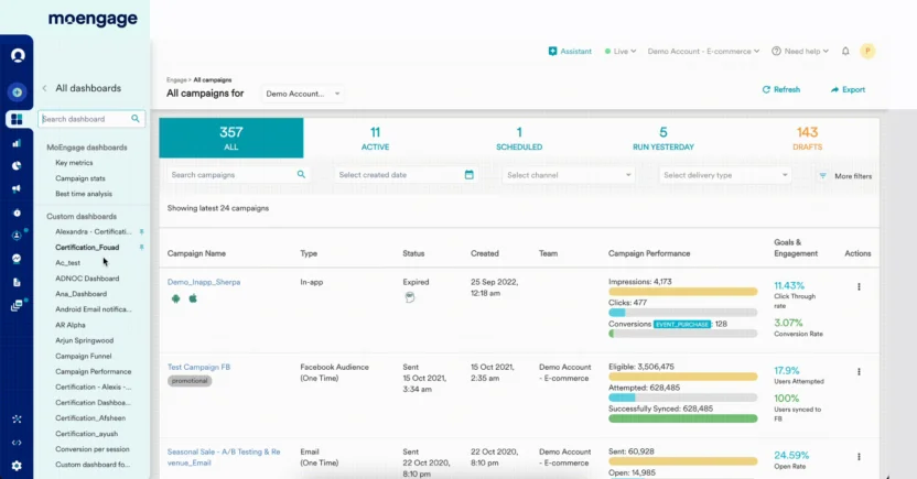
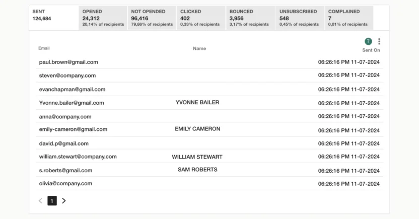
1. Detailed Campaign Insights – The All-in-One View
Core metrics: A full breakdown of individual campaign performance, like delivery stats, email engagement metrics, device usage, geo-location data, time-to-click, conversions, and post-click behavior (like session duration or bounce rate from your site).
Why it matters: This dashboard gives you both the big picture and the microscopic view, which is perfect for analyzing what actually happened after you hit ‘Send’. It’s your campaign’s autopsy, highlighting not just what worked, but why certain elements may have underperformed.
Use this to: Conduct retrospectives, report to the executives, or figure out why a ‘good’ email still didn’t convert. This dashboard connects the marketing and product dots.
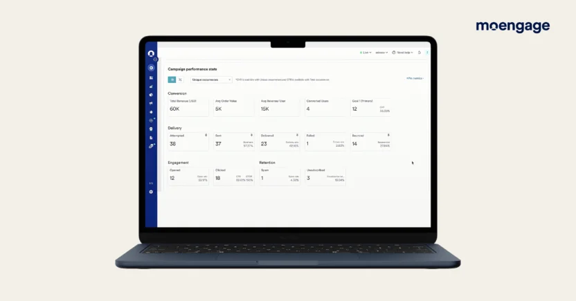
2. Revenue Attribution – Are Our Emails Actually Making Us Money?
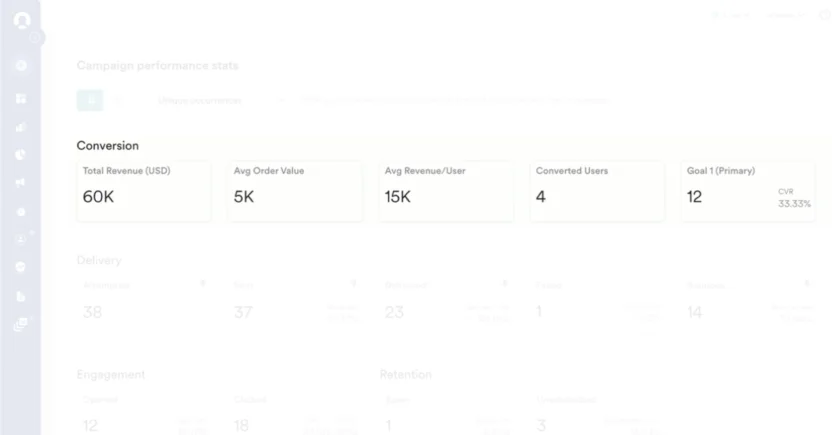
Core Metrics: Total Revenue per Campaign, Average Order Value, Conversions, Average Revenue per User
Why it matters: This performance-focused dashboard ties email activity to the bottom line. It connects campaign engagement to tangible business outcomes, like sales, sign-ups, or upgrades. If you’re being asked to prove email ROI, this email KPI dashboard becomes your strongest argument.
Use this to: Double down on the campaign types that actually drive transactions, and cut the ones that don’t.
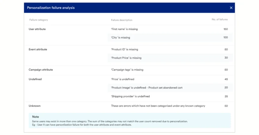
3. Campaign Error Breakdown – Where Are We Losing Users in the Journey?
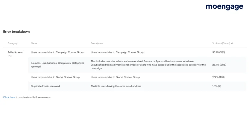
Core Metrics: Open/Click/Conversion rates by flow (e.g., Welcome, Onboarding, Abandonment, Re-engagement).
Why it matters: Lifecycle dashboards reveal where customers are dropping off, converting, or ignoring you entirely in the customer journey.
Use this to: Refine automation sequences and plug performance gaps across the customer lifecycle.
4. Deliverability Dashboard – Are Your Emails Even Reaching Inboxes?
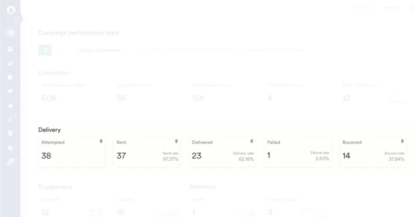
Core Metrics: Bounce Rate, Delivery Rate, Failure Rate.
Why it matters: If your emails don’t reach the inbox, nothing else matters. This dashboard keeps your sending health in check, catching red flags before they affect your email domain reputation.
Use this to: Monitor sudden spikes in complaints or bounces, especially after new list imports or segmentation changes.
5. A/B Campaign Comparison – What’s Actually Working?
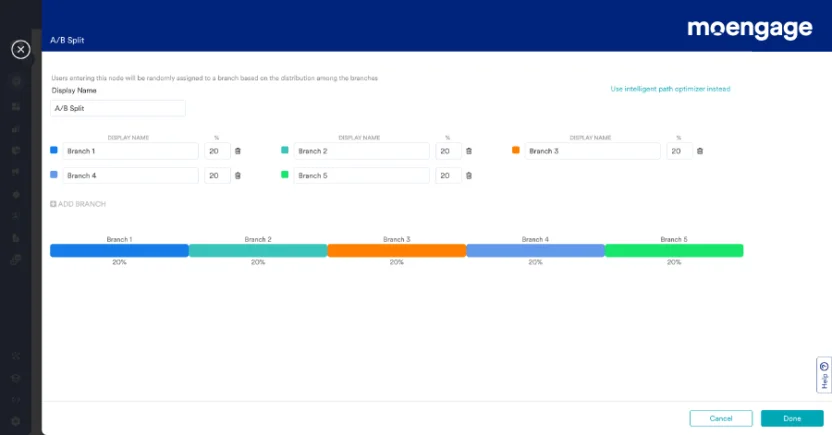
Core Metrics: Open Rate, Click Rate, Unsubscribe Rate, Conversions by variant
This dashboard lets you compare split test variants across subject lines, designs, send times, CTA copy, and more. It doesn’t just show which variant won—it reveals why.
Why it matters: If you’re not testing, you’re guessing. And if you’re testing without tracking performance properly, you’re wasting time.
Use this to: Identify patterns across winners (e.g., shorter subject lines, specific CTA wording) and apply them across future campaigns.
6. Click Map Dashboard – What Are People Actually Clicking?
![]()
Core Metrics: Click heatmaps, Link placement performance, Mobile vs. Desktop engagement
This visual dashboard shows you exactly where customers are clicking inside your email. It helps you understand which elements get attention and which parts are being ignored.
Why it matters: Seeing a ‘3% CTR’ isn’t helpful unless you know where those clicks are happening. Click maps give you clarity.
Use this to: Test different CTA placements, rethink visual hierarchy, and optimize mobile layouts. This is where email design best practices come into play.
7. Custom Dashboard – What Do You Need to Track?
Core Metrics: Mix of engagement, revenue, segmentation, campaign cadence, subscriber source, etc.
Custom dashboards are built around your strategy. Whether you want to track Gmail-specific performance, new vs. returning customer engagement, or campaign frequency vs. unsubscribes, this is where you do it.
Why it matters: Templates are fine, but strategy-specific metrics need custom tracking. One dashboard can’t serve everyone.
Use this to: Get your CMO, product team, or execs aligned on the KPIs you care about.
How to Set Up an Email Marketing Dashboard in Your Tech Stack
You don’t need to be a data scientist or a developer to build a great email marketing dashboard. But you do need to connect the right tools, analyze what actually matters, and set it up in a way that makes your insights usable.
Here’s how to build a dashboard that serves as a decision-making engine for your email marketing strategy:
Step 1: Map Your Existing Data Stack
Before anything else, you need to know what data you already have and where it lives. This is less about ‘tools’ and more about ‘truth’. Where do your opens, clicks, purchases, and customer behaviors actually get tracked? Are they siloed across ESPs (Email Service Providers), CRMs (Customer Relationship Management), and your analytics platforms?
If your email tool says one thing and your CRM says another, you’ve got a trust problem—and dashboards built on shaky data fall apart fast. This audit exposes mismatches, identifies duplicated metrics, and surfaces gaps you didn’t even know were there.
Step 2: Define What You Want to Measure, And Why
Define the core metrics that matter for your goals. Is it subscriber growth? Revenue per campaign? Churn reduction? Behavioral engagement?
Without a sharp focus, dashboards become data graveyards. By defining success metrics first, you build a dashboard that tells a story. It also helps you pick the right integrations later without getting distracted by ‘nice-to-have’ fluff.
Step 3: Map the Metrics to the Funnel
Structure your dashboard to reflect your customer journey: Awareness (open rate), Interest (CTR), and Action (conversions, purchases).
This makes your dashboard narrative-driven. It helps you quickly identify where in the funnel your emails are underperforming and fix the issue fast.
Step 4: Build Clean, Real-Time Data Connections
Set up accurate data syncing among your email platform, CRM, and email analytics tools. Configure triggers, field mappings, UTM tagging, and ensure campaign events are captured in the right format.
This step ensures your marketing, sales, and product teams are all looking at the same reality.
Step 5: Automate Alerts and Schedule Reports
Set up email alerts for anomalies (e.g., a sudden drop in open rate or a spike in unsubscribes). Schedule weekly or monthly digest reports to auto-send to stakeholders.
You shouldn’t have to manually check your email dashboard every day. Automation means you catch problems early, and your team stays informed without reminders.
Step 6: Train and Equip Your Team
Don’t assume your team will just ‘figure it out’. Build documentation, run training sessions, and assign an internal champion to guide the rollout. Schedule follow-ups to fix friction early.
Even the best email marketing dashboards are useless if no one logs in. When your team understands how to read, act on, and trust the data, your dashboard becomes a decision engine.
7 Features to Look For in an Email Analytics Dashboard Tool
Your email dashboard should help you see not just what’s happened, but also what’s ahead, so you can act fast. Below are the key features that separate a good dashboard tool from a truly strategic one.
1. Full-Funnel Campaign Attribution
You can’t optimize what you can’t see. It’s not enough to know your email was opened; rather, you need to know if it led to a sale, a bounce, or a customer drop-off. The best tools track customer behavior across the entire journey, from inbox to checkout (or exit). Platforms like MoEngage shine here, offering multi-touch attribution and revenue tracking that connect every click to a business outcome.
2. Seamless Integrations With Your Tech Stack
Your email campaign dashboard tool should feel like a native part of your marketing stack. Deep integrations with CRMs, CDPs, Ecommerce platforms, and analytics tools ensure data flows cleanly, reducing friction and avoiding silos. MoEngage, for instance, integrates natively with Salesforce, Segment, Shopify, and more, thereby helping brands unify data across touchpoints without messy workarounds.
3. Real-Time, Actionable Analytics
In email marketing, timing is everything. Real-time dashboards let you catch performance issues as they unfold. Whether it’s a subject line that’s underperforming or a surge in unsubscribes, being able to act on the fly improves both ROI and customer experience. MoEngage’s real-time customer insights and analytics feature ensures you’re always ahead, not playing catch-up.
4. Granular Behavioral Insights at the Segment Level
A great dashboard tool doesn’t just tell you what happened — it tells you who made it happen, and why. Look for deep behavioral analytics: device trends, location-based engagement, time-of-day performance, click maps, and lifecycle tracking.
MoEngage’s Custom Segments does this exceptionally well by layering behavioral, demographic, and real-time data to help you uncover what resonates and with whom.
5. Flexible, Customizable Dashboards by Role or Use Case
One-size-fits-all dashboards don’t cut it anymore. Your marketing lead might want campaign-level metrics, while your exec team needs top-line ROI views. Look for tools that let you build multiple, customizable dashboards tailored to different users and objectives.
With MoEngage’s Custom Dashboards, you can easily create stakeholder-specific dashboards that reflect only what matters.
6. Failure Detection and Alerting
Not every dip or spike in metrics should wait for your weekly report. The best email tracking dashboard tools now flag unusual behavior (like a sudden drop in the open rate or unsubscribe rate spikes) automatically.
This means your team doesn’t have to stare at dashboards 24/7. Instead, the tool becomes proactive, alerting you before problems snowball. Take MoEngage Alerts, for instance. It lets you specify a threshold for any metric and a time window. The moment your chosen campaign metrics exceed the threshold within that time window, you’ll receive an alert to help you make informed decisions.
7. Cross-Channel Impact Visibility
Email doesn’t exist in a vacuum. It works alongside push notifications, in-app messaging, SMS, and even paid ads. Your email analytics dashboard should show not just how email performs, but how it influences customer behavior across all these touchpoints. Did an email trigger an app session? Did customers see the email and later convert via push?
MoEngage’s cross-channel attribution framework offers this visibility, allowing marketers to optimize the full customer journey, not just the inbox.
5 Best Email Dashboard Software for Analyzing Performance
Choosing the best email dashboard software is about clarity, speed, and visibility. The best tools today let you catch campaign issues early and clearly tie your emails to revenue.
Here are five standout platforms to consider, starting with the best in the market.
1. MoEngage
MoEngage is an insights-led customer engagement platform that shines when it comes to actionable, performance-rich email dashboards. With real-time analytics, journey mapping, and AI-powered recommendations, MoEngage helps marketers see not just what’s happening, but why, and what to do next.
How pricing works: Starts around $750/month for growth-stage plans, with custom enterprise pricing based on usage volume and advanced feature needs.
Key features:
- Real-time engagement and conversion tracking
- Advanced segmentation and cohort analysis
- Cross-channel campaign attribution (email, push, SMS, in-app)
- Click maps, device/location insights, and predictive analytics
- Pre-built and customizable email reporting dashboard by region, goal, or team
Best for: Brands that want more than just email reporting. It’s especially ideal for cross-channel teams that want a complete customer journey view across all touchpoints. It is also a great tool for growth-focused marketing teams, especially in Ecommerce, BFSI, and B2C SaaS, who need more than just surface-level metrics.
2. Moosend
Moosend provides an intuitive and affordable email marketing platform with a surprisingly deep dashboard for campaign analytics. It’s built for marketers who need powerful automation paired with granular visibility, without enterprise pricing or complexity.
How pricing works: Plans start at $9/month for 500 contacts, going up to $5,840/month for a million contacts.
Key features:
- Real-time campaign performance with open, click, bounce, and unsubscribe tracking
- Visual click heatmaps to understand customer behavior
- Automation performance tracking by goal and flow
- Advanced segmentation and triggered email analytics
- Built-in Ecommerce insights for cart abandonment, product views, and purchases
Best for: Startups and growing Ecommerce brands that want powerful analytics and automation on a budget. It’s especially valuable for teams without a dedicated analyst but who want to make smart, data-informed decisions.
3. Email Meter
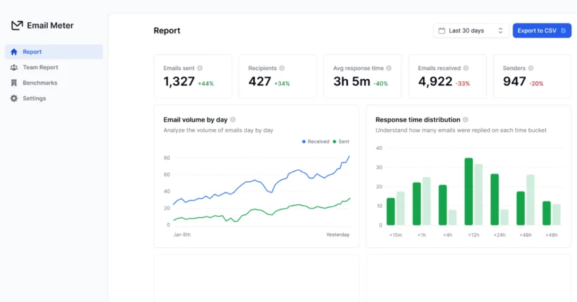
Email Meter is built for teams who need clarity around how their emails are actually being used, not just opened or clicked. It goes beyond traditional marketing dashboards by focusing on operational email analytics, especially within Gmail and Google Workspace environments. If you rely heavily on email for communication or customer support, this gives you the oversight you didn’t know you were missing.
How pricing works: Pricing is tailored based on team size and reporting depth; custom quotes are provided on request.
Key features:
- Tracks volumes, response times, and email threads across individuals and teams
- Visualizes trends in engagement, workload distribution, and communication bottlenecks
- Supports SLA monitoring, benchmarking, and exportable weekly/monthly reports
- Filters performance by sender, domain, label, and custom time periods
Best for: Teams that rely on email as a core channel, such as sales, support, or account management, and want to measure and optimize internal email performance at scale.
4. Campaign Monitor
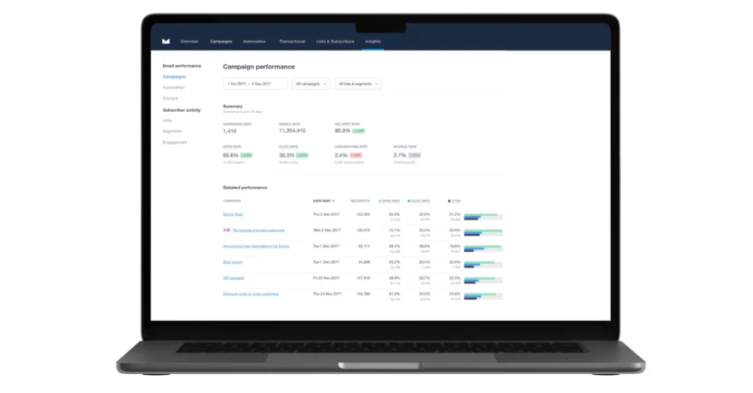
Campaign Monitor is designed for teams that want both control and clarity in their email marketing efforts. The platform offers a focused, email-first experience with reporting dashboards that make it easy to track key engagement metrics at a glance, without digging through cluttered interfaces. Right from subscriber behavior to link-level performance, it gives you a comprehensive view of how your campaigns are actually performing.
How pricing works: Starts at $9/month for basic plans; advanced features such as automation and segmentation are available in higher-tier plans starting at $149/month.
Key features:
- Real-time tracking of opens, clicks, bounce rates, and unsubscribes
- Visual heatmaps for link engagement
- Automation performance metrics and A/B test results
- Detailed segmentation analytics to evaluate audience subsets
- Integrates with tools like Salesforce, Shopify, and WordPress
Best for: Marketing teams who prioritize a streamlined email experience and need clean, actionable reporting to optimize campaign performance.
5. MailerLite
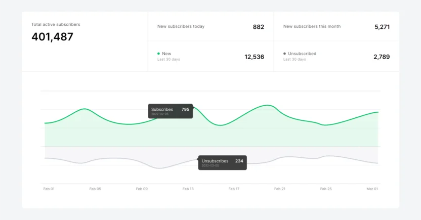
MailerLite is an accessible email marketing platform designed for teams that want powerful features without unnecessary complexity. Its email reporting dashboard provides solid insights, such as subscriber growth, geolocation, click trends, and even Ecommerce revenue, making it suitable for growing brands that need both simplicity and depth.
How pricing works: The free plan covers up to 1K subscribers and 12K emails/month. Paid plans start at $9/month (for up to 500 subscribers and unlimited monthly emails), and scale with list size.
Key features:
- Full campaign reporting: opens, clicks, bounce, unsubscribes, and link-specific performance
- Heatmaps and demographic insights (location, device)
- A/B testing and Smart Sending for optimal delivery timing
- Automation flows, dynamic content, and rich segmentation tools
- Built-in Ecommerce tracking and conversion analytics
Best for: Small-to-mid-sized teams that need clean, actionable reporting and grow-at-your-own-pace pricing. It’s especially effective for startups and resource-savvy marketers.

Upgrade to MoEngage for an Enhanced Email Dashboard
At this point, you’ve seen what a truly powerful email dashboard software can unlock, and that’s exactly where MoEngage shines. It gives you a deeper, smarter, and more actionable view of your email campaigns, all in one place. With MoEngage, you don’t just track clicks, but also unmask customer intent, predict their behavior, and act when it matters most.
You’ve come this far. Now, let us show you what your email dashboard should feel like. Book a quick demo and see the difference.


