


5 Editable Email Marketing Templates You Can Steal
Not seeing the email marketing metrics you’d hoped for? Maybe it’s time to stop blaming your subscribers and start blaming your email marketing templates.
The right email template is tailored to your goals, adapts for any device, and guides readers exactly where you want them to go. The best part is, you don’t have to start from scratch every time you create an email. Your pre-built templates save the day.
In this post, we’re unboxing the art and science of the best email marketing templates. You’ll learn what makes a great template, how to create one, and specific examples tailored to every crucial stage of your marketing funnel.
Ready to leave boring email templates behind? Let’s dive in.

What Makes a Good Email Marketing Template?
A good email marketing template is well-organized and intuitive. It must be responsive (looks great on any device), modular (easy to repurpose for different email campaigns), and UX-friendly (clear flow and readable text). Unlike messy or rigid designs, a great template is built to guide the reader toward action.
More specifically, a good email marketing template should:
- Be responsive – Because mobile users won’t always pinch and zoom, your template must scale cleanly across different screens, ensuring every element looks sharp and works.
- Support multimedia – Whether it’s images, GIFs, or embedded videos, the template should handle them without breaking or slowing load times. Visual variety keeps things engaging.
- Comply with design standards – Pre-built templates should handle quirks across email clients (e.g., Gmail and Outlook), so formatting stays consistent everywhere.
- Be lightweight – Bloated email marketing templates with excessive code can trigger spam filters or cause slow load speeds, especially on mobile. Keep the code clean and the file size small (10-25MB) to ensure solid email deliverability.
- Simplify navigation – Readers shouldn’t feel like they’re reading a book with out-of-order pages. Clear, organized layouts with skimmable sections make your marketing email template usable.
- Include intuitive CTAs – Calls to action (CTAs) should stand out by design, not just color. They need strategic positioning where the reader’s eye naturally lands and enough white space around them to pop.
Now that you know what makes a template great, let’s break it down into the individual components every high-performing template for email marketing needs.
What Should a Successful Email Marketing Template Design Include?
All a template for email marketing needs is grit, spit, and a whole lot of duct tape (Madagascar, anyone?).
We’re kidding, of course.
Here are the three things your email template design should always have to improve open and click-through rates.
1. Subject Lines: The Tinder Swipe of Email Marketing
If your subject line is bad, nothing else in your email matters. Seriously. You could have included the most effective CTAs in the body of that email, but if the subject line tanks, no one’s going to see it.
Your subject line is the swipe-right moment. It’s the first impression, the one-liner that convinces your customers to stop scrolling through their inbox and give you their time. And let’s be clear, time is their most precious commodity (besides maybe Wi-Fi).
So, what makes a subject line magnetic?
- Be Specific: “New features this month” is vague. “Boost sales by 25% with [Our New Tool]” is intriguing.
- Add Urgency: Deadlines, FOMO, and timers work for a reason.
- Spark Curiosity: Pose a question or hint at a solution. Example: “This email could fix your bounce rate. Open it.”
- Keep it Short: Most email service providers (ESPs), like Gmail, cut off subject lines after 40-50 characters, so skip the rambling.
We get that these might seem like a lot of pointers to keep in mind. That’s why you should always have the best email subject lines handy. Oh, and don’t forget to A/B test your subject lines.
2. The Email Body: Don’t Bury the Point Deep Within
This is where things usually go off the rails. Some emails are so long and filled with unnecessary detail, they feel like they belong in the National Archives. Others are so sparse, they might as well say, “Hi [First Name], click here. Thx, bye.”
Neither works.
The body of your email isn’t a blog post, but neither is it a Post-it. It’s the part where you deliver on the promise of your subject line and gently guide the reader to take that next step (without being a pushy lunatic).
Here’s how to nail the body of your email:
- Start Strong: Get straight to the point.
Should Be Skimmable: Make it easy to read by using short paragraphs, bullet points, and bold text (where necessary). - One Email, One Message: This isn’t the place to announce your rebrand, pitch your webinar, and promote your new podcast, all in one go. Pick one goal and stick to it.
- CTA Overload Kills: Every email needs a clear Call to Action (CTA), but don’t spam it. One or two well-placed CTAs are far more effective than five screaming buttons.
Your email body is supposed to be a simple conversation with your customers. Would you buttonhole someone at a party and drown them in technical jargon? No, right? Well, then don’t do it in a marketing email template, either.
3. Signatures: It’s Not a Legal Document
Your email signature isn’t the place to flex every certification or award you might’ve ever received.
That said, your signature is a tiny-but-mighty piece of real estate. It’s where you can add your brand personality and professionalism to wrap up your email with a virtual bow.
Here’s what makes a good email signature:
- Keep It Simple: Your name, job title, company name, and maybe a link to your website. That’s it.
- Add a Personal Touch: A quick “Have a great day!” or “Thanks for reading!” goes a long way. You’re a human emailing a human, after all.
- Include Social Links (If Relevant): No one’s clicking your LinkedIn link if you’re emailing them about 20% off sneakers. Social media links work only when your email is personal.
A painful reminder: please, no random inspirational quotes from a TED Talk that have nothing to do with the body of your email or the subscribers whatsoever.
Email Marketing Template Strategy: 5 Design Insights That Drive Next-Level Results
Every email that a subscriber receives, opens, and reads gives them a taste of your brand. Keeping that in mind, not only does a great email template display your message, but it also looks good enough for your audience to remember it.
Not sure where to start? Let’s dive into five essential email design tips to help you create email marketing templates that craft valuable experiences for your audience.
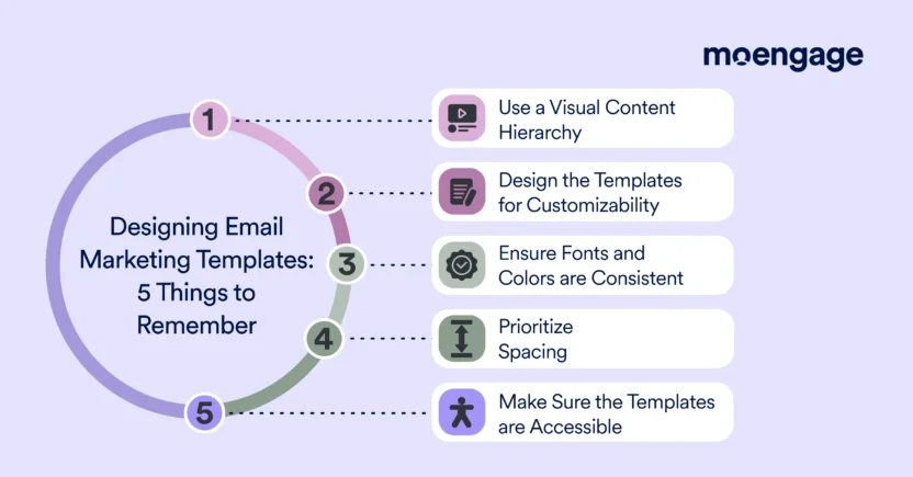
1. Use a Visual Content Hierarchy
A great template organizes content in a way that’s intuitive for the reader to skim and understand.
What to Do:
- Structure Your Email Marketing Template: Divide your template into clear content blocks. There should be separate sections for headers, body content, images, and CTAs. Keep the layout consistent across multiple campaigns to build familiarity for your audience.
- Implement Clean Layouts: Use a Z or F pattern layout to guide the eye naturally. These patterns mimic human reading behavior, leading readers from your header to your key message, and finally to your CTA, without any guesswork.
- Design with the Golden Rule of Visual Flow: Headline > Supporting Content > CTA (in that order).
Why It Matters:
Readers scan emails (we’re sure you do, too). A marketing email template with a logical flow helps you create emails that keep readers engaged and ensure they effortlessly find the ‘meat and potatoes’ of your message. Templates lacking structure can lead to high bounce rates.
2. Design Email Marketing Templates for Customizability
A well-designed email template should be adaptable to every new campaign.
What to Do:
- Customize the Content Blocks: You should be able to easily add, reorder, or remove modular blocks (header, hero image, text blocks, CTA sections, etc.) in the template, depending on the email campaign.
- Make Sure Each Module Stands Alone: You shouldn’t have to redesign the entire template just to replace your hero image block with a video block.
- Don’t Design One-Off Templates: Design a set of email marketing templates to work for each core email type (e.g., newsletters, promotions, or transactional emails). For example, 5 pre-built templates for transactional emails and 3 for newsletters, then you can customize the same templates. If you create a different template for every email, you might as well skip the template-building part.
Why It Matters:
This flexibility allows your template to grow with your email strategy, eliminating the need to design something new from scratch every time. Plus, modularity ensures brand consistency while saving you time.
3. Ensure Fonts and Colors are Consistent
If your email template doesn’t visually align with your overall brand identity, you’ve already lost credibility. A template is just an extension of your brand. Your fonts, colors, and logo matter as much here as they do on your website or social media.
What to Do:
- Avoid Visual Overload: Use up to two or three main colors (your brand’s primary and secondary colors work well) and build the template palette around them. Competing hues might hurt readers’ eyes.
- Stick to 2-3 Fonts: Use one font for headlines, another for the body text, and maybe a third for emphasis. Be careful, though. Clashing typefaces will instantly make your email look unprofessional.
- Establish a Hierarchy: Use consistent typography throughout the template. Headlines should be larger to stand out, body text should be easily scannable (14-16px), and CTA button text should feel cohesive with the overall design.
- Don’t Overlook Your Logo: To reinforce brand recognition, place your logo prominently (but not obnoxiously) at the top or bottom of the template.
Why It Matters:
Consistency builds trust. A cohesive, branded template for email marketing makes every email instantly recognizable, improving familiarity and engagement with readers over time.
4. Prioritize Spacing
Designing a compelling email marketing template isn’t about how much you can cram into one email. It’s about how well you use the limited space to your advantage. You need to use it efficiently, so the important elements can have room to shine.
What to Do:
- Separate the Blocks: Use padding and margins to separate different sections of the template. Your header, body text, images, and footer should each have breathing room, so the email doesn’t overwhelm readers at a glance.
- Find the Right Balance between Content and Space: Avoid overcrowding the email template with too much copy or visuals. We know it’s tempting to load your template with every piece of information, but restraint is your best weapon.
- Use a Minimalistic Design: Stick to a single-column layout for clarity and readability, especially if you’re designing a multi-purpose email template meant for mobile and desktop.
Why It Matters:
Email marketing templates with too much content crammed together feel overwhelming and clunky. Spacing keeps the design clean and focused, making it easy for readers to act without distractions.
5. Make Sure the Templates are Accessible
If your email marketing templates aren’t accessible, you’re unintentionally excluding a segment of your audience and potentially alienating loyal readers. An effective template works for readers with different abilities, ensuring everyone has equal access to your content.
What to Do:
- Leverage the Right Color Contrast Ratio: Use high-contrast color combinations (e.g., dark text on a light background) for better readability, especially for visually impaired readers. According to the WCAG 2.2 Level AA, the minimum contrast ratio for normal text should be 4.5:1, and that of large text should be 3:1. It should be at least 3:1 for graphics, as per WCAG 2.1.
- Add Alt Text to All Images: Make sure the template works even if images don’t load. Include visible alt text for every image, so if the visuals don’t appear, the reader still gets the message.
- Optimize for Screen Readers: Stick to a logical reading order that screen readers can navigate easily. Avoid design traps like overlapping text or unstructured columns that confuse assistive technology.
Why It Matters:
Accessibility is non-negotiable. An inclusive template design not only broadens your audience but also boosts email engagement by ensuring a great customer experience for everyone.
5 Best MoEngage Email Marketing Templates for B2C Lifecycle Marketers
Nobody knows when a customer may drop off the buying process or see it through. But generally, they are said to go through five stages of the marketing funnel — acquisition, activation, retention, referral, and revenue.
To break these AARRR metrics down:
- Acquisition- People visiting your website or app through different channels
- Activation- People signing up for your product to become customers
- Retention- Customers using your product and sticking around for more features and benefits
- Referral- Customers promoting your product to others in their network
- Revenue- Customers paying for your product
This gives lifecycle marketers a generic direction, based on which they can tailor their marketing communications to each of the funnel stages instead of shooting all their messages in the dark.
In the same way, tailoring your marketing email templates to meet specific goals at different funnel stages is the secret sauce for success.
Let’s dive into five pre-built and customizable email templates in an email marketing software platform like MoEngage, and see how you can make them work for your brand.
Best for Acquisition
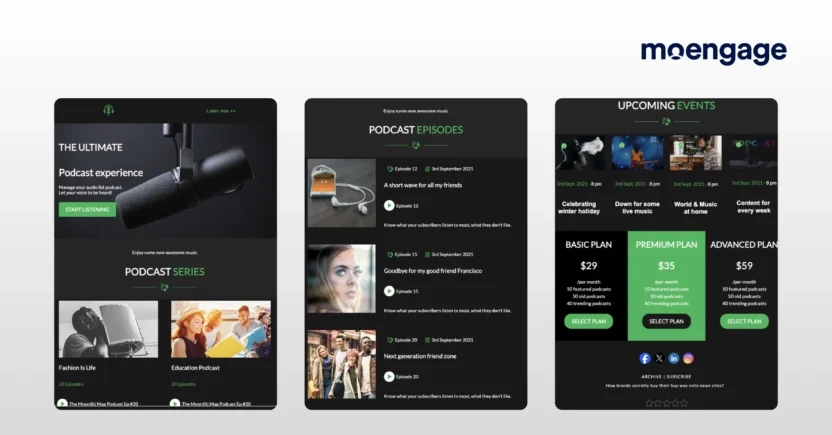
This email template works best for brands in the media and entertainment industry. Featuring a bold hero image followed by clickable podcast thumbnails, it grabs attention fast. It’s built to announce new podcast episodes effectively, while letting you promote pricing plans that subscribers can choose directly within the email.
Adding a star rating feature elevates the value, helping you gather feedback from subscribers on your offerings.
And while it’s tailored toward podcast brands, it’s versatile enough to adapt. For example, you can promote new sports commentaries, highlight fresh music playlists, or showcase newly added video game trailers.
Goal of This Template: To get your brand and your offerings on your target audience’s radar
Funnel Stage: Acquisition
Why It Works: The clean, bold email template design minimizes distractions and guides readers straight toward your CTA, while keeping visual engagement high.
Best Industries: Music, podcast, sports, streaming services, and video games
Best for Activation
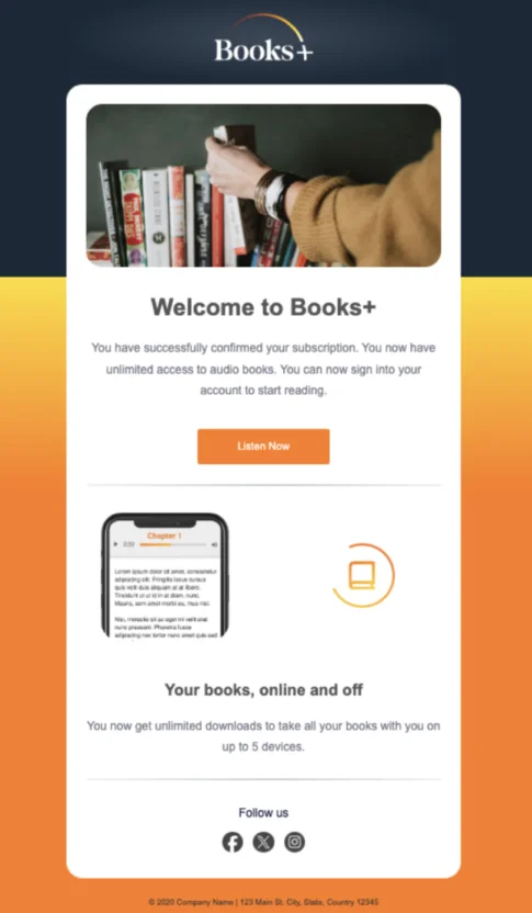
When new customers sign up for your product, it’s crucial to start strong by guiding them toward the next steps. This email template for marketing strikes the perfect balance between a warm welcome and a clear CTA. Whether you want them to complete their profile, redeem a discount, or start using the product ASAP, it’s all laid out beautifully.
For instance, if your email’s for an audiobook platform (say, Booksy), the template can confirm the customer’s subscription while highlighting links to featured audiobooks tailored to their preferences. Sweet, simple, and effective.
Goal of This Template: To welcome new customers to your community
Funnel Stage: Activation
Why It Works: Simple and straightforward onboarding process
Best Industries: Subscription-based businesses, audiobooks, online marketplaces, and hospitality
Best for Retention
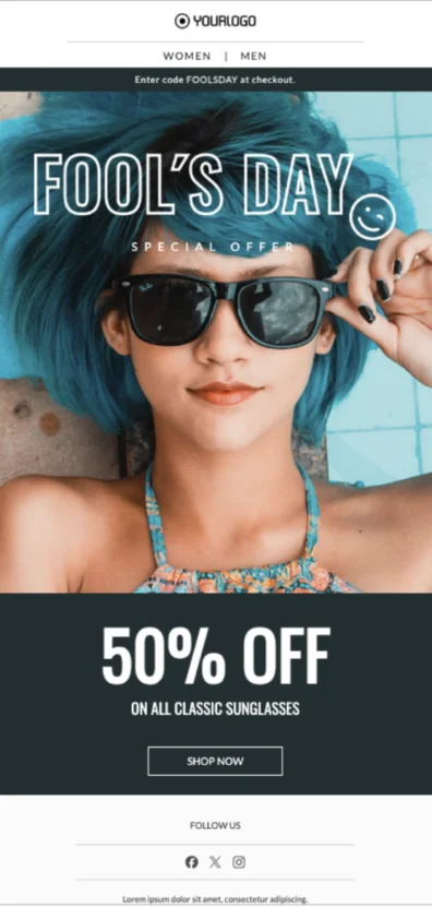
Fashion and retail emails are inherently visual, so why waste customers’ time with blocks of unnecessary text?
This template for email marketing nails the ‘show, don’t tell’ vibe. Front and center is a stunning product image (like sunglasses) complemented by clear, concise messaging about a discount. No paragraphs, no fluff. Just a focus on what the customer cares about: the offer.
Besides fashion, this template’s format works for any industry where visuals do the heavy lifting. Think skincare, home decor, or even electronics — it’s all about turning the spotlight on that one irresistible product and encouraging clicks.
Goal of This Template: To build customer loyalty by enticing them with offers
Funnel Stage: Retention
Why It Works: The minimalist style ensures undivided attention on the offer, while the eye-catching visuals drive greater customer engagement.
Best Industries: Fashion, retail, eyewear, Ecommerce, beauty, and home decor
Best for Referral
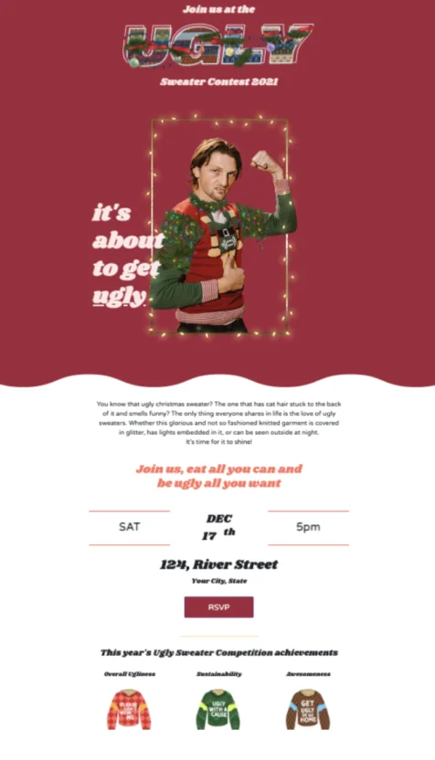
Who says holiday email marketing campaigns have to stick to the script? This email template proves otherwise by injecting fun and creativity into your outreach efforts.
Instead of pushing products with traditional holiday discounts, it promotes a quirky contest like an ugly Christmas sweater competition (because customers would love forwarding to their friends and family).
But that’s just a cover for the main event — in this case, a bake sale. The sweater contest is just meant to drive more attendance. It’s proof that templates with unexpected themes can still seamlessly blend entertainment with conversion.
Goal of This Template: To encourage sharing, engagement, and word-of-mouth referrals
Funnel Stage: Referral
Why It Works: The template uses fun, relatable content to drive emotional connection, which gets people talking and sharing.
Best Industries: Entertainment, food and beverage, event planning, and retail
Best for Revenue
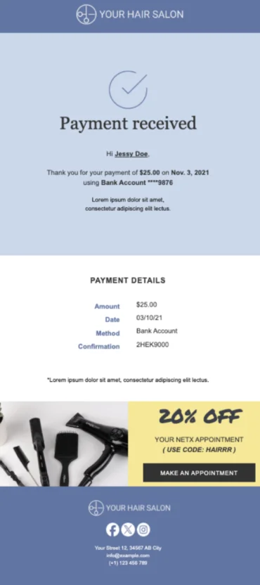
Transactional emails, like payment confirmations, invoices, or order summaries, are the last place you want to spend hours reinventing the wheel every time.
That’s why pre-built templates for transactional emails are a no-brainer. These templates ensure consistency, save time, and provide all the necessary information fields (think order numbers, totals, and payment statuses) while maintaining a professional, on-brand appearance.
Just because these emails are functional, doesn’t mean they can’t double as revenue drivers. Subtle cross-sells or upsells fit perfectly into optional sections of these templates (notice the discount offered at the bottom of the template for the next appointment?)
Goal of This Template: To deliver critical transaction details efficiently, while subtly driving additional revenue opportunities
Funnel Stage: Revenue
Why It Works: It delivers essential information at just the right moment, building trust while sneakily encouraging further purchases or upgrades.
Best Industries: Ecommerce, travel, retail, and finance
How to Create Marketing Email Templates in MoEngage
Did you know MoEngage has 118 editable email templates already? That’s because building eye-catching templates for email marketing in MoEngage is straightforward.
Here’s how you can go about it.
Step 1: Open the Drag-and-Drop Editor
Head to your MoEngage dashboard, then click on Create new > Campaign > Email. Select any one of the email options from one-time, periodic, event-triggered, and business-triggered. Set up your email campaign, entering details like your campaign name, and click ‘Next’.
The drag-and-drop editor opens as the default tab. This is where the magic happens.
Step 2: Choose Your Template Layout
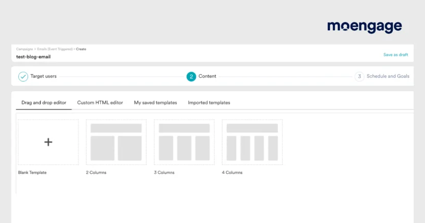
Choose a blank template, or select a layout with 2, 3, or 4 columns. On the next screen, enter the email details, such as the subject line, the sender’s name and email address, and a preview text message. You can also use Merlin AI to create an AI variation of the email marketing template.
Step 3: Drag and Drop Content Elements
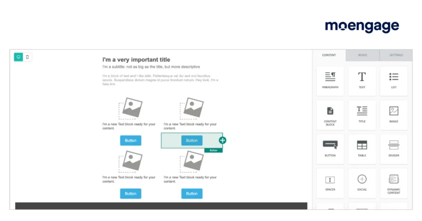
Scroll down to where the screen splits into two parts: the left side (your editing canvas) and the right side (your properties panel). The CONTENT tab is open by default, so you can start populating your email. Drag in text blocks, buttons, images, tables, or dividers, whatever fits your message.
Once placed, click on any element to customize it in the properties panel. You can edit fonts, colors, links, or even make a block dynamic with personalized content.
Step 4: Preview the Template
On the editing canvas, you can switch between desktop and mobile screens to see how the email template would look on these two devices. For a full-fledged preview of the template, select the Preview option above the properties panel.
Next, on the Personalized preview screen, you can see how the email template would look to each recipient. Select the user identifying factor (user ID, email address, or mobile number) and value, and check how those end users would be viewing the email.
The Inbox preview tab shows you how the email would come across in the subscriber’s inbox on different devices, like the Gmail app on Google Pixel 6, Gmail on Firefox, and iPhone 15.
This is a great way to check for:
- Subject line and preview text positioning
- Dark mode compatibility
- Alignment and functionality across devices
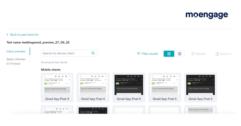
After previewing the email template, tap the Back to editor button.
Step 5: Save and Repurpose Your Template
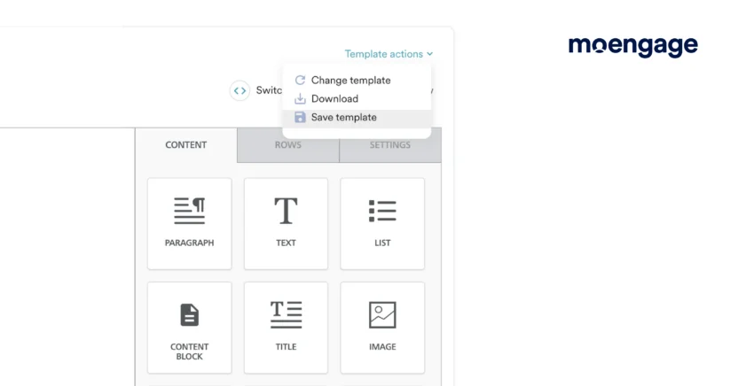
Happy with the template design? Click on Template actions above the properties panel. Then, select Save template from the dropdown list. Enter a name for the template in the ‘Save Template’ dialog box and click Save. You’ll get a message saying ‘[Template Name] saved successfully’.
Congrats, your template’s saved for your future campaigns! You can find it in the My saved Templates tab on the Drag and drop editor page.
Now you’re ready to unleash your email template on the world (or at least your audience).

Craft Engaging Email Marketing Templates That Work With MoEngage
Building email marketing templates that look incredible, perform brilliantly, and adapt to your needs doesn’t have to be a headache. With MoEngage’s powerful drag-and-drop editor, you get all the tools to design emails that engage, convert, and even make dark mode look good.
Ready to see for yourself? Explore how MoEngage simplifies email marketing or try a demo today and take your campaigns from ‘meh’ to must-open in no time.