


How To Use Cohort Retention Analysis To Reduce Customer Churn
Do you ever feel like you haven’t exactly cracked the code on what motivates your customers to buy from you?
Cohort analysis is a powerful tool for understanding customer behavior and preferences.
By grouping customers based on shared attributes, businesses can gain insights into what customers like and dislike about their products or services. These insights can reveal important information about what makes customers stay, thus enabling businesses to improve their products, services, and strategies to increase customer retention.
In this article, we’ll take an in-depth look at the concept of cohort analysis so you can successfully apply this method to retain customers more effectively.
But before we get too far into it, let’s lay the foundation.

What is a Cohort?
A cohort is a group of individuals defined by common attributes or experiences. For a group to count as a cohort, their common characteristics should persist across a period of time to give sustained and consistent results. By anchoring a few of the variables, it becomes possible to analyze the performance or response of a type of cohort to controlled changes.
Such an experimental approach uncovers trends and patterns that power informed business strategies.
What is Cohort Analysis?
Unfortunately, the internet is flooded with hundreds of definitions of cohort analysis, making it difficult to truly understand. On top of that, there is heavy use of jargon like cohorts, RFM segmentation, shifting curves, and much more.
To simplify, cohort analysis involves the study of the common characteristics of these customers over a specific period. These can include new users and existing users and their subsequent behaviors – like if they are conducting repeat purchases, or have been inactive for a long time.
Acquisition Cohort and Behavioral Cohort Analysis
While there are many different ways you can group cohorts for analysis, the two main ways are by acquisition date or based on a certain behavior.
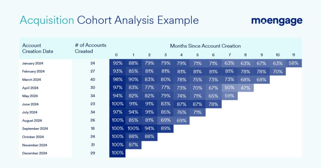
Acquisition cohort analysis involves dividing users based on when they first signed up for a product or service. This can be done by grouping users according to the day, week, or month they joined. By analyzing the retention of these cohorts, we can gain insights into how long users continue to engage with the product from their initial acquisition point.
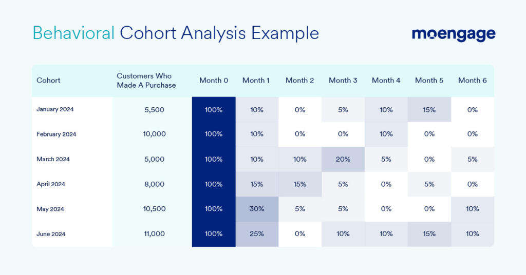
On the other hand, behavioral cohort analysis involves categorizing users based on specific actions they have taken (or not taken) within a defined time period. These actions can include app installations, app launches, app uninstalls, transactions, or any combination of these events. By creating cohorts based on these behaviors, we can monitor how different cohorts of users remain active in the product after performing specific actions.
Other Cohort Analysis Types and Examples
While acquisition and behavioral are the most popular formats being used, here’s a breakdown of some of the additional types of cohort analysis you can perform (with examples):
| Type of Cohort and corresponding Cohort Analysis | Example of Cohort | Example of Cohort Analysis |
| Time-Based Cohort | Seasonal shoppers | Examine how customer engagement and purchase patterns change across different seasons. What motivates these cohorts to spend during a specific season? What are the seasons during which these cohorts exhibit higher spending or engagement? |
| Size-Based Cohort | Age bracket | Investigate the needs, requirements, and characteristics of this specific cohort. What are the unique challenges they face while transacting with your brand? What are their preferences or expectations? |
| Geographic Cohort | Customers based in California | Factor in any cultural or geographical factors that can influence customer behavior. Are your Californian customers less price-sensitive than the ones based in the mid-west? How can you adapt business strategies to cater to such demands? |
| Acquisition Channel Cohort | Customers acquired through social media ads | Evaluate the effectiveness of different acquisition channels in customer engagement and retention. Which channels resonate the most with your target audience? Which channels attract high-value customers? Do customers switch channels for purchase, support, etc.? How can you optimize the customer journey? |
| Product Usage Cohort | Daily app users | Track the product usage patterns for different cohorts. What features or aspects of the product do specific user groups enjoy? How often do they interact with it? How can it be improved for product development or marketing? |
| Retention Cohort | Subscribers who have renewed a service for five consecutive years | Identify the long-term retention patterns within the cohort. What factors contribute to such long-term customer loyalty? How can you apply these findings to enhance overall customer retention? |
In essence, the key is to identify the right customer cohorts and extract actionable insights from them. So, start by scrutinizing what ties these customer groups together and use it as the foundation for selecting the right cohort analysis type.
Why Cohort Analysis is Important?
Cohort analysis is a process that helps you connect with your target audiences, or even better, with your ideal clients. It is also a tool to foster long-term customer loyalty. To achieve this two-fold goal, cohort analysis aids businesses in the following ways:
- It offers insights into how different customer groups behave over a specific period of time, allowing businesses to adapt and deliver to their ever-evolving needs.
- Understanding customers’ likes, dislikes, and preferences to empower marketers in recalibrating campaigns and strategies for maximum efficacy.
- The segmentation of user groups facilitates the personalization of marketing messages, product features, and customer experiences.
- The grouping of customers into cohorts helps identify high-value customer segments that businesses can strategically focus on.
- For online apps and platforms, cohort analysis charts the user journey, especially during onboarding, and removes bottlenecks for the seamless experience of different user groups.
- With cohort-based benchmarks, it is possible to project the Customer Lifetime Value (LTV) of groups and individuals.
- Observing the response of various cohorts to product changes or new features makes the product development and refinement processes continuous and iterative.
- It can be used to compare business performance with that of competitors or against industry benchmarks, shedding light on the strengths and weaknesses in the product/service or processes
- Cohort analysis fosters a data-driven culture, enhancing decision-making by making it swift and more accurate.
- It uncovers trends and patterns that may indicate potential problems or unrealized opportunities for improved business performance.
Measuring the Impact of Cohort Retention Analysis
As noted, cohort analysis plays a crucial role in understanding and measuring customer retention, making it an essential tool for businesses. Let’s delve into the importance of cohort analysis in this context:
- Revenue Stability: Did you know that a mere 5% increase in customer retention can lead to a substantial revenue uplift of 25-95%? This statistic highlights how customer retention contributes to revenue stability and growth.
- Cost Efficiency: Acquiring new customers is significantly more expensive, costing 5-6 times more than retaining existing customers. By focusing on customer retention, businesses can achieve cost efficiency and allocate resources effectively.
- Loyalty: Retained customers are more likely to develop a sense of loyalty towards a brand. This loyalty translates into increased purchasing frequency and higher average order values, with retained customers often spending 33% more per order than regular customers.
- Advocacy: Customer retention also fuels word-of-mouth marketing through advocacy. Research shows that six out of ten customers recommend their favorite brands to friends and family, amplifying brand awareness and attracting new customers.
- Brand Image and Trust: The combination of customer loyalty and advocacy strengthens a brand’s image and fosters trust and confidence among consumers. This positive perception differentiates the brand in the market.
- Feedback and Improvement: Retained customers provide valuable feedback that can drive business improvement. As 77% of customers view businesses more favorably when they actively seek and act upon customer feedback, retaining customers allows for deeper insights into areas of improvement, general concerns, and product or service quality.
- Churn Reduction: Customer churn costs businesses nearly $1.6 trillion annually. By prioritizing customer retention, companies can mitigate these losses and minimize the impact of customer attrition.
- CLV Maximization: Customer retention directly impacts Customer Lifetime Value (CLV). The longer a customer remains loyal, the more they contribute to the overall CLV, maximizing the value they bring to the business.
Given the profound implications of customer retention for long-term success and sustainability, measuring and analyzing it through cohort analysis should be a top priority for businesses.
Formulas for Measuring Customer Retention
Now that we’ve established the importance of measuring customer retention, let’s quickly go over a few traditional methodologies for calculating these metrics. Understanding these traditional methods of measuring customer retention lends context to how cohort analysis offered a nuanced understanding of customer retention dynamics.
They chart how our understanding of customer cohorts has evolved, along with our technique for performing cohort analysis. These cohort analysis methodologies may be “traditional,” but they are not entirely obsolete, as businesses can expand on these and modify them to match their contemporary requirements.
On that note, here are the methodologies used to measure customer retention specifically through the lens of cohort analysis:
- Customer Retention Rate (CRR): The percentage of customers retained by a business over a specific period of time and within the definition of a specific cohort. It offers a granular picture of the customer retention trends across the different segments.
- Churn Rate: The rate of customer attrition for a specific cohort. It sheds light on what makes a customer segment stick and what drives them away. It also highlights whether a particular customer group exhibits a greater propensity for churn or otherwise.
- Cohort Repeat Purchase Rate: The percentage of customers within a cohort who make multiple purchases from a business. It helps identify the patterns of customer loyalty and engagement for a specific group.
- Renewal Rates by Cohorts: Often used for subscription-based products or services, it is the percentage of customers within a cohort who renew or extend their subscriptions. It helps identify trends in subscription renewals among various customer segments.
- Net Promoter Score (NPS): A scale-based metric that measures loyalty for a specific cohort based on the likelihood of them recommending a product or a service. NPS analysis for different cohorts offers a targeted understanding of advocacy trends among the various customer groups.
- Customer Lifetime Value (CLV): The total revenue projected to be earned from a single customer within a specific cohort during their lifetime. Using this approach helps discern variations in the long-term value of customers across the various segments.
- Purchase Frequency: The average number of purchases (or transactions) a customer belonging to a cohort makes during a fixed timeframe. Focusing on this parameter supports a focused exploration of purchase patterns for certain customer groups.
- Customer Satisfaction (CSAT) Scores: A metric that calculates customer satisfaction rates for a specific cohort based on the responses to a customer satisfaction survey. Such a strategy helps acquire a targeted understanding of the customer satisfaction rates as a function of the corresponding segment.
- Complaints and Resolution Time: Number of complaints received from customers belonging to a particular cohort and the average time taken to resolve them. It sheds light on cases where certain customer groups experience higher or lower levels of issues or dissatisfactions and how efficiently the business responds to them.
In essence, the integration of cohort analysis within the traditional methodologies of understanding customer retention grants a more refined understanding of the interplay between the two.
Use these to gain broad insights into how different customer segments behave or react and how these responses change across segments and over time.
How Does Cohort Analysis Maximize Customer Retention?
Below are seven use cases for deploying cohort analysis:
- Comparative Analysis: The grouping of customers into different types of cohorts based on characteristics like demographics, geography, acquisition channel, product usage, etc., allows businesses to focus on customer groups that display high retention rates. The resulting focused approach helps optimize business strategies and manage resources for higher retention.
- Time-Frame Analysis: Cohort charts track customer segments over defined time periods. The observations offer a granular understanding of the evolution of customer requirements or behaviors as a function of customer retention and time. For instance, you may notice a drop in retention after six months of using the product. This decline in active users indicates its loss of value beyond the 6-month mark. We’ve done a compelling case study on Threads, which witnessed something similar.
- Identifying Patterns and Trends: With cohort analysis, businesses can identify trends and patterns that indicate retention or churn. Accordingly, they can orchestrate targeted interventions to retarget customers and prevent attrition. For example, no activity for 90 days may indicate attrition. To mitigate this, businesses may run retargeting campaigns to regain customer engagement and improve retention.
- Product or Service Personalization: Cohort analysis highlights the problem areas or friction points that cause churn within specific user groups. Based on these findings, businesses can re-engineer their product, tweak the customer experience, or rethink marketing campaigns to deliver hyper-personalized experiences or solutions to affected segments.
- Predicting Future Behavior: Apart from maintaining a historical record of actions and responses, cohort analysis also enables businesses to predict future behaviors. This foresight can regulate proactive retention strategies. For instance, an increase in subscription rates often results in high unsubscription rates amongst younger demographics. As such, you can offer discount coupons to this type of cohort to prevent churn.
- Customer Journey Mapping: Cohort analysis goes hand-in-hand with customer journey mapping. Different cohorts experience the product or service differently, which is why mapping, optimizing, and standardizing their journey – from the first interaction to the loyalty hyper loop – becomes vital for a rich and engaging experience that translates to retention.
- Introducing loyalty programs: Using loyalty points, rewards, and similar gamification systems for customer retention is popular among marketers. But, the challenge in introducing these loyalty programs is identifying the right set of customers who are loyal and who will remain loyal for a certain period of time. With cohort analysis, you can narrow down the exact set of customers who can be retained longer with loyalty programs.
In short, the findings of cohort analysis can govern and optimize customer retention strategies. From identifying retention drivers to addressing pain points, cohort analysis lends greater visibility to business processes from the customer retention perspective.
How to Use a Cohort Analysis to Measure Customer Retention: A Step-by-Step Guide
Now that the intersection of cohort analysis and customer retention has become apparent, it is time to walk you through the cohort retention analysis process. Here is a step-by-step guide to help you perform cohort analysis for customer retention:
Step 1: Cohort Data Collection
As cohort analysis is rooted in data, gathering this information is the essential first step to begin the process. So, start by collecting a spectrum of data that coincides with the type of cohort you wish to build.
For example, if you were to create usage-based cohorts to measure app usage beyond downloads, you might want to capture the sign-up dates, frequency of product use, account age, list of daily or monthly active users, and more. On the other hand, if you’re probing into the behavioral aspect of customer actions, you might benefit from user behavior data.
Employ tools like a Customer Engagement Platform (CEP) like MoEngage, a Customer Relationship Management (CRM) solution, or analytics platforms like Google Analytics. You can also sift through your organization’s custom database. However, keep in mind that you shouldn’t necessarily just analyze any old available data…
It’s crucial to ensure data cleanliness and verify its relevance, accuracy, and timeliness. The quality of your analysis will directly correspond to the quality of the data utilized.
Step 2: Segmentation
Once you have sourced your customer data, it is time to classify and categorize these customers into appropriate cohorts. Select the cohort criterion that aligns with the objectives of your cohort retention analysis.
For instance, you might carry out behavioral segmentation to recognize behavioral patterns or triggers. You can look at the customer’s purchase history, usage patterns, loyalty score, engagement levels, content or product preferences, etc. for behavioral segmentation. On the other hand, you’ll use age, gender, income level, marital status, ethnicity, and other such parameters for demographic segmentation.
Upon identifying these variables, use them as a compass for constituting distinct cohorts.
Step 3: Analysis
Now comes the part where you crunch all the numbers to get down to the tangible metrics. We’ve already shared a list of metrics, such as Customer Retention Rate, Net Promoter Score, Customer Satisfaction score, etc., to quantify customer retention. Calculate these values for the various cohorts.
Once you have this data, use it to prepare cohort charts or tables to visualize the trends and patterns within a specific cohort. Similarly, compare these cohort charts and tables across the different cohorts to view how these patterns, trends, preferences, and behavior change from one cohort to another.
Step 4: Interpretation
Next, read the results to form conclusions.
Start by identifying cohorts with high retention rates and analyze what sets them apart. For example, if you notice impressive customer retention rates for accounts belonging to high-income individuals or households, it means that your products cater to customers with high spending capacities.
Conversely, analyze the cohorts that show low retention rates to understand potential issues or areas for improvement. Continuing with the above example, you may notice low retention rates amongst customers with lower purchasing powers. Such a trend could indicate that pricing is a major barrier to expanding your customer base.
Be sure to account for any anomalies or outliers within the customer insights, which may introduce variations in the set patterns or trends. Understand how they impact customer behavior.
Step 5: Translate Insights Into Actions
Finally, use your findings and key takeaways to develop actionable strategies.
First, you have to strengthen what already works for you. So, you may employ marketing strategies to present the product or service as luxurious and premium to entice loyal customers with high spending capacity.
Next, you can release “lite” versions of the product or service to gain favor among the cohorts with low retention rates.
Along the same lines, capitalize on opportunities and address drop-off points or bottlenecks in the customer journey to foster customer loyalty. Make the entire cycle iterative through continuous monitoring and improvement to adjust strategies based on customer behavior or feedback.
Top Four Cohort Analysis Tools & Software To Amplify Your Efforts
Given the data-heavy nature of cohort analysis, you will need an array of tools to effectively perform cohort analysis. Seeing as how you’ll have to handle data collection, segmentation, analysis, and visualization, here are some tools and software solutions that you may require:
1. MoEngage (analytics and in-app engagement platform)
MoEngage is a highly versatile analytics and customer engagement platform that empowers businesses to conduct comprehensive cohort analysis, understand users and user behaviors, and optimize engagement strategies for higher customer retention rates.
2. Amplitude (dedicated cohort retention analysis tool)
Amplitude specializes in cohort retention analysis and comes packed with features to dissect user behavior, measure retention metrics, and derive actionable insights for rich user experiences. You may also consider combining MoEngage and Amplitude for improved results.
3. Google Analytics (free web analytics service)
Google Analytics is a popular web analytics platform that shines a light on user behavior to facilitate cohort analysis. Businesses can use it to track and understand user journeys to prepare effective retention strategies.
4. Salesforce (CRM platform)
As a powerful CRM solution, Salesforce allows businesses to efficiently store, manage, and organize customer data. Additionally, you can leverage it for segmentation, tracking customer interactions, and personalizing strategies for enhanced customer retention.

How to Perform Cohort Analysis Using MoEngage
Running a cohort analysis using MoEngage’s Analytics platform is very simple. The UI is intuitive, and all you’ll need to do is select just the events that you want to analyze. MoEngage Analytics is a powerful tool in terms of the analysis that can be derived through cohorts.
To get started with a cohort analysis using MoEngage Analytics, follow these steps.
Login to the MoEngage dashboard and click on Analytics -> Cohorts in the navigation panel to your left. You’ll see the screen as shown below.
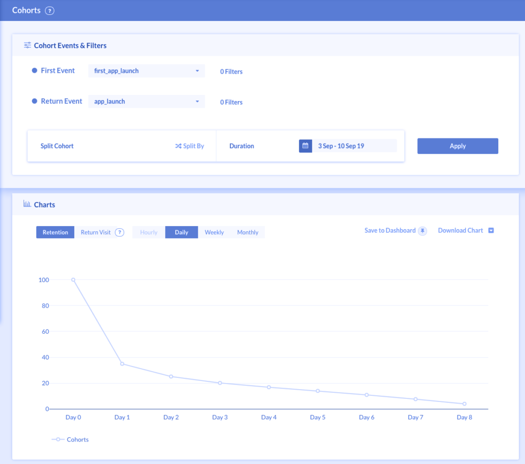
At the top of this page, you will find options for Event Selection, Date Range, and Split Functionality. Event Selection determines the analysis and insights that you’ll get out of the report.
Here’s what each of these means:
- First Event and Return Event: Select ‘First Event’ to include the user base on which the analysis will run. Select ‘Return Event’ to specify the user action that determines user retention, churn, activeness, time to execute, etc.
- Date Range: The time period for which you want to do the cohort analysis is set in the date range.
Pro Tip: Google Analytics offers the date ranges for a month, for the last 2 months, and last 3 months. However, with MoEngage, you can choose a custom time period for the cohort.
- Compare Cohort: You can compare different cohorts for a specific attribute. For example, you can compare cohorts across different cities, mobile device platforms, categories, product types, and more.
Cohort Analysis for Customer Retention: Conclusion
That’s a wrap on how to use cohort analysis to measure customer retention. The key highlights of this post can be summarized in the following bullet points:
- A cohort is a group of logically correlated individuals defined by attributes like behavior, geographic location, acquisition channels, etc., or experiences like product usage or loyalty.
- Cohort analysis involves meticulous tracking of customer cohorts over time to gain insights into customer behaviors and actions.
- Cohort analysis is tightly linked to customer retention as the former highlights any trends and patterns that can point to retention.
- When done right, cohort analysis can be used to maximize customer retention by comparing cohorts, identifying patterns and trends, personalizing products or services, and more.
- You’ll need tools like MoEngage, Amplitude, Google Analytics, Salesforce, etc. to perform cohort analysis.
The blend of cohort analysis and customer retention involves setting up a holistic environment for nurturing long-term relationships, fostering loyalty, and laying the foundation for sustained growth and success.
As such, businesses that prioritize customer retention maximization through cohort analysis will thrive in competitive markets, adapt to customer expectations, and register sustained growth.