

How to Reduce Customer Churn and Boost Retention
To reduce customer churn (the number of existing customers who leave for whatever reason), churn rate is one of the most important customer engagement metrics that a brand must keep an eye on. While you can always acquire new customers, the downside is that it takes three new customers to compensate for the value of one lost customer.
Thus, successful brands have consistently sought ways to reduce churn and build lasting customer relationships.
Reducing customer churn can give you a competitive advantage. Why? Since a large percentage of your revenue likely comes from your existing customer base, retaining this base is the foundation for consistent growth.
In this article, we’ll see what churn prevention is, how to identify customer churn in your business, and, more importantly, how to reduce customer churn to keep your customers engaged.
What is Churn Prevention?
Churn prevention is a set of proactive strategies and steps a brand uses to reduce the number of customers that leave. It involves, among other things, identifying and solving customer frustrations, analyzing drop-off patterns, and delivering timely interventions that improve engagement and loyalty.
Effective churn reduction requires both reactive fixes and proactive engagement.
These strategies help you identify when you’re about to lose a customer, determine the necessary action to take before they’re lost, and learn how to keep them engaged enough with your brand that they start to develop long-term customer loyalty.
What are the Different Types of Churn Prevention?
With that definition out of the way, it’s important to emphasize that churn prevention varies across different industries and business models. Here are some of the various types of churn prevention that an organization might deploy based on its unique situation.
Mobile App Churn Prevention
Here, you’re most likely looking to implement mobile app engagement strategies to prevent users from abandoning or uninstalling your app. Some of the areas you’ll be looking at here include:
- Habit formation (repeated use of the app via push notifications and reminders)
- Early stage drop-off (onboarding completion)
- Technical issues (performance issues, bug fixes, app crashes)
Ecommerce Store Customer Churn Prevention
Here, you’ll focus on reducing the number of customers who fail to make repeat purchases from your Ecommerce store. The areas you’ll look at might include:
- Reactivation (via email/SMS messages when they look likely to churn)
- Personalization (discounts, product recommendations based on browsing history or past purchases)
- Loyalty programs (points and badges)
Quick Service Restaurant (QSR) Churn Prevention
For this type of churn, you’ll likely focus on the number of customers that switch to a different restaurant or visit more infrequently than usual. What often matters most in churn prevention here might be:
- Value targeting (targeting price-sensitive customers with specific discounts or deals)
- Menu personalization (using past ordering history to recommend items)
Subscription Service Churn Prevention
If you run a subscription service, then you’ll be focused on preventing users from canceling their subscriptions. To prevent churn here, you’ll likely consider key drivers such as:
- Onboarding (letting your users experience your value proposition as early as possible)
- Payment failure recovery (smart retries and card updates to prevent involuntary churn).
Why is Reducing Churn Important?
It’s important to reduce customer churn because high churn rates have significant financial and strategic implications for businesses. For one, when a customer leaves, they take money they could have spent with you elsewhere.
Furthermore, losing a dissatisfied customer can lead to even more problems, as their negative word of mouth can prompt others to stop using your products or services.
Internally, increased churn can negatively impact employee morale, ultimately affecting their productivity. That’s why customer churn prevention should be a priority across your entire organization, not just your customer success team.
How is Customer Engagement Linked to Churn Prevention?
Customer engagement and churn prevention are intertwined.
Why do we say so? Because engagement is one of the strongest predictors of customer retention or churn. The more meaningfully a customer interacts with a brand, the less likely they are to leave.
When discussing churn prevention, the truth is that most strategies are predicated on customer engagement. In other words, if churn prevention were a fire, customer engagement would be the fuel that keeps it going.
Let’s now consider how you can identify customer churn on your platform.
How to Identify Customer Churn On Your Platform
Before you can reduce customer churn effectively, you need to understand where it occurs and what it looks like in your business. After all, you’d be skeptical of receiving treatment from a doctor who doesn’t ask you what’s wrong before giving you a diagnosis.
Churn doesn’t happen in a vacuum; instead, it’s a pattern of behaviors that tell you when you’re losing a customer. By identifying these signs early, you’ll be better equipped to pinpoint the weak points, gain a deeper understanding of the problem, and then focus retention and engagement efforts where they’ll yield the best results.
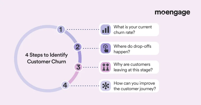
1. Get a general sense of your current churn rate
This step involves measuring the number of customers leaving and the rate at which they are leaving. It’s essential to know your current churn rate because it’s impossible to improve something you don’t measure. It helps you know whether your churn rate is unusual and whether your business model, in its current state, is sustainable.
Once you have this baseline, you can set realistic goals to reduce churn over time.
How to do it
Your business model dictates how you’ll calculate your current churn rate.
For example, suppose you’re running a subscription-based model. In that case, you calculate your churn rate by dividing the number of customers who canceled during a period by the total number of customers at the start of the period.
To get a complete picture, track multiple time periods (weekly, monthly, quarterly, and annually). You can also go further by breaking down the rate by segments, for example, location, acquisition channel, product tier, etc. This will help you uncover any variations in the segments.
A customer engagement platform like MoEngage makes this easier by letting you view and analyze these metrics in one place, with dashboards that update regularly so you can spot trends as they happen.
2. Isolate where drop-offs happen
You must identify the exact moments where customers lose interest and churn, using customer journey mapping tools.
This is critical because customers don’t leave at random. Instead, they leave because a friction point hasn’t been smoothed, they feel they aren’t getting enough value, or they simply fail to complete a key action. When you know where the drop-off happens, you’ll be able to focus your churn reduction efforts on that stage in the lifecycle.
How to do it
Here’s how to do this effectively:
- Identify where engagement drops, using MoEngage’s funnel analysis. This drop-off depends on your business model and will vary by industry. Some common indicators of drop-off include skipped visits, cart abandonment, and fewer logins.
- Analyze the behavior of customers who stay versus those who leave, drawing your conclusions based on their behavior.
When you can identify where churn begins, you can then gear your efforts to intervene at the right moment.
3. Assess why customers are leaving at this stage
After identifying where customers leave, it’s now time to understand why they are leaving. Here, you’ll try to understand the frustrations, circumstances, or motivations that lead customers to leave.
This assessment is vital because, although identifying where they drop off is beneficial, understanding why they drop off is even more valuable.
While customers may leave at the same point, they may have different reasons for doing so.
Understanding these nuances is what separates superficial fixes from strategies that reduce churn.
For example, abandoned carts can be due to a variety of reasons, ranging from confusing payment options to unexpected shipping costs, decision paralysis, or competitive pricing. When you understand the why, you’ll be better equipped to take adequate measures.
How to do it
Start by collecting the data. Your customers are the best source of information, so don’t skimp on utilizing tools like surveys, support tickets, exit flows, and reviews.
Also, use segmentation and personalization to your advantage. Analyze segments separately because different customer types churn for different reasons. You should also look to tie churn to specific problems, for example, do customers cite confusing onboarding, irrelevant messaging, or slow load times, among other things, as reasons for leaving?
4. Improve the customer journey and experience
Describe the step. Be sure to explain the step, why it’s critical, and how to do it effectively.
Now that you’ve identified where the drop-off happens and why it occurs, you can move on to optimizing the customer experience to remove friction and generally make it easier for your customers to stay with you.
Above all, preventing churn involves keeping your customers engaged and satisfied. By making strategic improvements and automations in the customer journey at the right time, you can significantly increase your chances of retaining customers.
How to do it
Personalization is one of the most effective ways to keep customers engaged, as it makes them feel seen and understood, which goes a long way towards building long-term loyalty.
Additionally, creating churn profiles (personas based on the data you’ve uncovered) will help you identify at-risk customers and proactively send lifecycle messages and nudges to re-engage them before they lapse.
And, of course, you must always test any changes you make and measure their impact on the churn rate.
How to Reduce Customer Churn to Keep Customers Engaged
Let’s discuss strategies you can implement to reduce customer churn and keep those valuable customers engaged.
1. Deliver Personalized and Meaningful Communications
Engagement is the bedrock on which to build a foundation for churn reduction. Regular, personalized communication with your customers can build loyalty and keep them engaged. This communication involves using customer behavior and preferences to send timely, relevant messages that keep them engaged.
This strategy is impactful because a lack of engagement is a strong predictor of churn. Personalized, relevant, trigger-based communication will catch customers before they start thinking about leaving and reinforce the value you offer when they need it most.
However, when communicating with customers, it is essential to strike a balance; a barrage of irrelevant or persistent messages can increase customer churn. Hence, communication should reflect their interests and actually mean something to them.
How to do it
There are several ways to apply this strategy, depending on your business model. Here are some of the effective ways successful businesses have done this:
- Use automated email marketing campaigns to keep your customers informed about your products, services, and promotions.
- Personalize the offers you send based on past behavior. For example, you can send offers based on your customers’ favorite categories, most-used features, and so on.
- Ensure you use the right channel for communication. Some customers respond better to push notifications, SMS, or email.
- Trigger communications based on actual behavior, for example, inactivity, browsing patterns, or skipped visits.
YouTube Music is an excellent example of a successful company that uses communication to keep customers engaged and loyal.
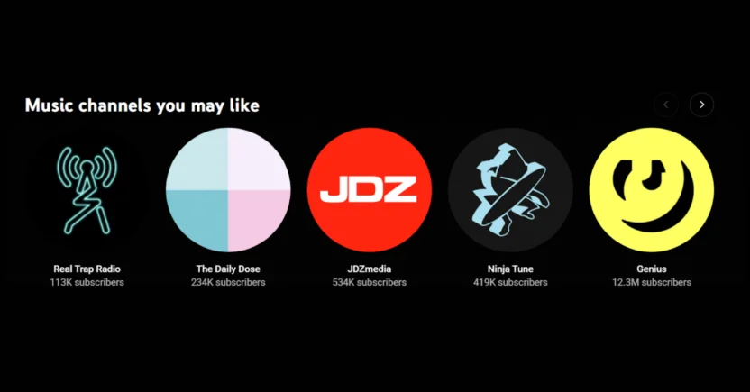
For instance, it sends out music recommendations to customers based on their previous listening history. This makes it likely that customers will enjoy listening to specific genres and continue to return to the app.
2. Offer Incentives That Pique the Customers’ Interest
This strategy involves offering rewards, perks, and offers that motivate customers to increase their engagement or re-engage with your brand. These incentives should be based on what your customers actually value, not what you assume they want.
This strategy works because a well-timed offer that provides value can rebuild customer engagement and nudge them to make a purchase or simply keep your brand in mind.
However, as with every good strategy, it must be used correctly to achieve the best results and not devalue your brand. If you always offer rewards or discounts, your margins will suffer, and customers will simply wait for deals before making a purchase. So how can you use this strategy correctly?
How to do it
- Instead of simply offering discounts on blanket services or items, consider offering discounts based on customer behavior and preferences. Do your customers have a favorite category? Do you want them to take specific actions, e.g, activate certain features? Or do you want to encourage past habits? Then offering discounts and rewards tied to these will likely work well for you.
- Another way to use this strategy is to personalize rewards by customer segment. Not all customers are the same; price-savvy customers may want to save money, while loyal customers might prefer exclusivity or early access.
- You can use rewards to entice inactive customers; for example, you could offer them time-limited upgrades.
- Using game mechanics, you can further hook users by offering rewards and badges based on usage. Some of what might qualify them for special rewards can include usage frequency, purchase amount, or some other parameter.
Starbucks offers Rewards, a points-based loyalty program that rewards customers based on the value of their purchases.
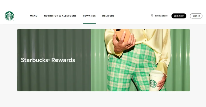
However, the brand goes even further, offering personalized benefits and rewards that genuinely matter to its customers. It’s no wonder that it’s one of the most successful loyalty programs a brand has run.
3. Improve User Onboarding
This strategy involves making the onboarding experience as enjoyable and rewarding as possible. Customer onboarding is your first opportunity to gain users’ trust and fulfill their expectations.
A lot of churn happens early, which is why a great onboarding strategy is so impactful, because it increases the chances of retaining the user. When onboarding is effective, it helps your customers reach the ‘Aha!’ moment quicker.
However, effective onboarding extends beyond simply sending a welcome email. It’s a continuous effort to help your customers get more value, experience less friction, be excited to use your product, and use your offerings with greater ease.
How to do it
- One way to use this strategy is by offering users step-by-step tutorials or product walkthroughs. This will reduce unnecessary friction and make it easier for customers to get value from the get-go.
- You can also liven up the onboarding process by providing personalized support; for example, some successful brands offer a dedicated success manager.
- Another way to use this strategy is to guide customers on what to do. This involves setting clear goals for them, for example, asking them to complete their profile. You can sweeten the deal by offering rewards for completing specific actions.
Grammarly is one of our favorite brands for user onboarding. It employs a ‘learn-by-doing’ approach, allowing users to see value immediately.
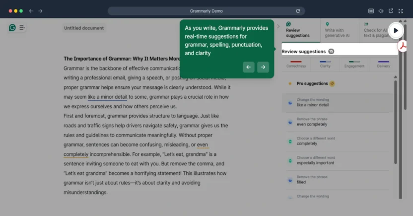
For example, the demo document introduces users to how the product works, and the walkthrough guides them in getting started with the features immediately.
4. Leverage Feedback and Data
This strategy involves taking what many companies dread, customer feedback and complaints, and leveraging it to improve your service and reduce customer churn.
Collecting and acting on feedback and data is crucial because it provides an avenue for you to build trust, address issues, and turn unhappy customers into loyal ones. If you don’t receive any feedback, then you might be in trouble down the road. After all, while only 1 in 26 customers complain, the rest actually leave.
How to do it
- First, you must have a process that makes it easy for customers to provide feedback. Hence, you must prominently feature feedback options in your product and communications.
- When you receive feedback, whether positive or negative, use it to address issues or improve your offering.
- After receiving feedback, let users know that they have been heard and that their input has been taken into account.
Amazon is perhaps the best example of an organization that leverages feedback and data successfully.
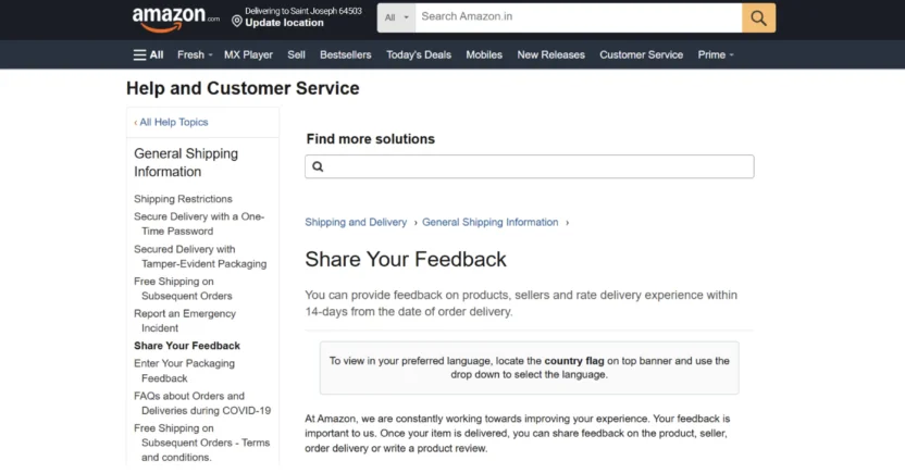
The company provides users with multiple opportunities to leave feedback on its products and services, utilizing this feedback to continually improve its offerings.

Reduce Customer Churn by Increasing Engagement With MoEngage
Customer churn is inevitable, regardless of the strategy you use; however, you can reduce customer churn and retain your most valuable customers by following the strategies we’ve discussed in this article.
Ready to see how MoEngage can help you reduce churn rate and retain your customers? Book a demo with us to see how it works.